|
|
|
Showing 311 - 320 of ~922 |
| Image |
Comment |
| 09/27/2004 06:07:32 AM | Whisperby digistouneComment: I like the effect a lot. However, on my screen, it's just a touch too brigh for perfection. 8 |  Photographer found comment helpful. Photographer found comment helpful. |
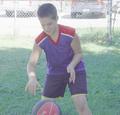
| 09/24/2004 12:31:58 PM | Beep Beepby elru21Comment: *critique club*
Greetings!
First of the bat, I'll bet you're wondering why you got 4 positive comments yet a score of under 5. I'll try and answer that here. But before we begin, I looked at your 'baby botanist' tryptich and my wife said 'kawaii' and 'toriaizu, taberu ne', which means 'cute, I like that' and 'just for the moment, I'll try eating it (as babies do)'. Fun shots, and they'll be a welcome addition to your family album.
Compositionally, your photo is fine. You've got two very clear sections, the one with the action and the other, neatly set off by the background grass, showing the reflection. You've shown the challenge theme well here. You needed to realise the negative strength of the top left side: having so much out of the main focal range and in such an important area makes the whole photo feel like a snapshot, not a winning DPC entry. The arm, placed where it is bang right in the centre, brightly coloured and having such a strong line, is a clear candidate for the main subject, even though it's not. So, compositionally, you needed to deal with that problem by cropping. If I had had the same file, I might have used a horizontal cropping, using only a touch of the unreflected head, extending rightways to the mirror and deleting everything unhelpful.
I feel that the greenery is too dark for the bright mood intended. I don't know which software you use, but all allow for overall brightening and some allow for spot brightening. I'd brighten and blur the grass a bit.
Computer processing is obvious on the shirt sleeve on the bottom left. It looks unnatural. (Cropping it out would save a lot of heartache) but otherwise, you need to be careful how you deal with pure whites in digital photography.
The last point I'd like to make is about the face in the mirror. Simply put, the more the better.
I'll put up an edited version of your photo in my portfolio for a while. Look at it and tell me what you think. It's 'elru1.jpg'.
Best wishes,
Jim
ps. My edit isn't at all perfect, just a few strokes to show the ideas I've mentioned here. | | Photographer found comment helpful. |
| 09/24/2004 11:51:15 AM | Back Yard Funby Crafty SueComment: When the challenge is over, ask in the forums about this. You'll get a lot of help. | | Photographer found comment helpful. |
| 09/24/2004 11:48:13 AM | Breakfast kaleidoscopeby JinjitComment: *critique club*
Greetings!
There's obviously been a lot of thought put into this photograph. Well done on a neatly arranged piece.
My only real comment is about the colour scheme you chose. Mirrors darken on reflection. Darkening is usually the opposite of the 'wow' feeling DPC requires for their winners. Rather than feel at ease with the presentation, I feel depressed by it, due to the darkening scheme moving rightwards.
Also, mirrors reflect. In a photographic frame, we need to consider the total effect, yet when we know that mirrors are involved, it becomes difficult to look beyond the reflection. The line that the eggs, in total, make is negated by the knowledge that it's just a reflection, intensified by the darkening of the furthermost eggs.
I'm not sure why you choose your colours as you did. The lighting is skillfull and indicates an awareness of lighting possibilities. But I can't see any impact of your technique on the impression. Sorry.
If you have any comments on this critique, please feel free to contact me.
Best wishes,
Jim
| | Photographer found comment helpful. |
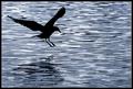
| 09/24/2004 11:35:48 AM | Larus fuscusby AmasonComment: At first I thought, 'nice'. But after looking, I began to feel confused. 1 The silhouetted bird needs a proper reflection, and 2 the horizontal lines are very dynamic, adding movement to the bird's stopped action. However, the waves inhibit a clear water-based reflection, which ultimately impedes the overall composition. Still, a very good photo. 7 | | Photographer found comment helpful. |
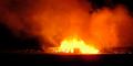
| 09/24/2004 11:31:31 AM | The Cane Fireby NodeComment: *critique club*
Greetings!
(There seems to be a thread about this photo which I don't know about. So, sorry for any duplication.)
The photo certainly fits the challenge theme well - the smoke covers over a 1/2 of the total frame. From the single comment below, I guess that you were surprised at you (perceived) low ranking and lack of comments. I'd like to address that here.
There are a few problems here that I'd like to talk about. The first is the subject. Your title includes 'fire', indicating the main point of the photo. Yet, there's little in the frame to make me feel something about this fire. Is it a big one? a small one? a controlled one? what is it? I might imagine that 'cane' means 'bamboo', but I can't see why that's being burnt here? There's nothing in the frame to answer these questions, or to hint to anything more than something burning. So, the subject feels weak - I'm left looking at something which means nothing to me, and at a frame where no clues are given. A human figure would give some indication of scale. A close up would give some clue about the nature of the fire. These are missing, yet something of the kind is required to take a burning object into the realm of the universal.
Technically, you could have chosen a more appropriate way of capturing the moment. I don't know the S7000, but I can imagine. (If I'm wrong, forgive me.) You say in your comments that it's difficult to capture both the flame and the smoke. That's because the dynamic range of the scene falls outside the captureable range of your camera. There are ways to get round that, some DPC-legal. Your shutter speed was 1/6 at iso 200 and aperture 4.4. Remembering that this was a members' challenge, you could have reduced the iso to 100 and the aperture to around f8 which would necessitate a much longer shutter speed, requiring a tripod. Calculate an exposure which would bring the brightest part of the scene just inside the histogram range and, using your photo manipulation software, bring up the darker areas. The lower iso would reduce noise, but that could be done using NeatImage. The tighter aperture would increase clarity and detail all around.
Compositionally, there isn't much involved here, and that's the crux of the matter. You haven't really thought about the shape of the smoke clouds or the placing of the fire in the frame, except for central and low. The smoke clouds themselves seem aimless, too. For this type of shot, you need to forget about the realism of how a bundle of canes on fire and concentrate on on or two graphic lines within the scene. If you had a human present, you could use that vertical to create a dynamic with a smoke or flame line. At any rate, your photo shows how the eye might see such a scene, not how a graphic artist would interpret the action and create a sense of wow from the given material.
If you have any comments on this critique, please feel free to contact me.
Best wishes,
Jim
| | Photographer found comment helpful. |
| 09/24/2004 10:50:43 AM | Watching Mommy's Makeupby DougPazComment: *From the critique club*
Greetings!
I like the different expressions on the two faces - the serious intention of the mother and the playful learning of the kid. The three heads form a good visual line across the frame, and there are a number of strong lines present here which add to the punch of this candid snapshot. The colours are clear with no serious cast. The kid's face being brighter helps support the message of the title. You've chosen a good dof to highlight the foreground people at the same time as blur the background, but not so much as to destroy the context.
Being a members' challenge, you could have burned a little on the mother's face. The darkness takes away from the overall frivolity. The challenge is 'mirror', and you felt compelled to add quite a lot of the mother's hair on the left. I feel that this detracts somewhat from the composition. Too much front of focal range in the foreground gives a slightly messy feeling. Maybe there could be another way to include the mirror without this.
I have to say that the capture of the girl is simply wonderful. The expression, the skin tones, the lighting are all spot on. I suspect that you centred that in your composition and left the camera to do the rest, leaving the mother darker. Oh well.
I'd have given a 5 or a 6 for this, had I voted, but if the crop had been to the right (to include some right hand mirror) and closer in on the girl, probably a 7 or 8.
Please feel free to contact me about this critique.
Jim. | | Photographer found comment helpful. |
| 09/24/2004 10:32:09 AM | Defy Gravityby trainComment: ...by turning the photo upside down. I don't think so. I don't like the border, either. 3 | | Photographer found comment helpful. |
| 09/24/2004 10:29:09 AM | | | Photographer found comment helpful. |
| 09/24/2004 10:27:38 AM | | | Photographer found comment helpful. |
|
Showing 311 - 320 of ~922 |
Home -
Challenges -
Community -
League -
Photos -
Cameras -
Lenses -
Learn -
Help -
Terms of Use -
Privacy -
Top ^
DPChallenge, and website content and design, Copyright © 2001-2025 Challenging Technologies, LLC.
All digital photo copyrights belong to the photographers and may not be used without permission.
Current Server Time: 12/21/2025 09:02:21 AM EST.
|