| Image |
Comment |
| 03/05/2008 01:33:06 PM |
|
 Photographer found comment helpful. Photographer found comment helpful. |
| 03/05/2008 01:31:39 PM |
|
| Photographer found comment helpful. |
| 03/05/2008 01:28:21 PM |
|
| Photographer found comment helpful. |
| 03/05/2008 01:17:47 PM |
|
| Photographer found comment helpful. |
| 03/05/2008 01:16:16 PM |
|
| Photographer found comment helpful. |
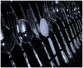
| 03/04/2008 07:34:51 PM |
Calm Cool and Collected (Textures V redo)by LadyKComment: I just realized that the cats in both of your submissions is the same singular cat. It's amazing how different (s)he looks depending on what is going on.
I mentioned before the background issue. With this picture, a nice tan or brown blanket would have done the trick and added more texture. I referenced my original vote and I thought it was well done on my first sight. |
| Photographer found comment helpful. |
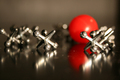
| 03/04/2008 07:32:17 PM |
Ball and Jacksby LadyKComment: I tend to agree with the other comments. The red ball should have been the focus. The eye sees it first as the black & silver act as neutrals.
The idea is great and the placement of the jacks is good. |
| Photographer found comment helpful. |
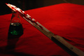
| 03/04/2008 07:29:21 PM |
The Love of Romeo and Julietby LadyKComment: I thought about this long and hard...
My biggest problem is that red & green are opposites. Because of that the poison is really difficult to see. I read the other comments...I don't have a problem with the numbers showing on the beaker, just the inability to focus on the poison.
Perhaps a different table covering (or even a lighter shade of red)...but I think that solution would take away from the story.
I would go with a black or a yellow poison color.
And perhaps just a hint of a cross (again, maybe simplicity is better), but they do die trajically. |
| Photographer found comment helpful. |
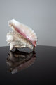
| 03/04/2008 07:25:51 PM |
Memoirs of Blue Oceanby LadyKComment: This seems slightly oof to me. The problem with soft focus vs. oof is that there is a fine line between "oops" and "I meant to that." If your purpose was soft focus you didn't go far enough, if your purpose was just to show the shell and the reflection...it is oof. |
| Photographer found comment helpful. |
| 03/04/2008 06:51:45 PM |
|
| Photographer found comment helpful. |
Home -
Challenges -
Community -
League -
Photos -
Cameras -
Lenses -
Learn -
Help -
Terms of Use -
Privacy -
Top ^
DPChallenge, and website content and design, Copyright © 2001-2025 Challenging Technologies, LLC.
All digital photo copyrights belong to the photographers and may not be used without permission.
Current Server Time: 08/26/2025 03:24:01 AM EDT.