| Image |
Comment |
| 11/01/2004 08:26:29 AM |
|
 Photographer found comment helpful. Photographer found comment helpful. |
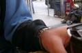
| 11/01/2004 08:25:05 AM |
Mobile Homeby tyt2000Comment: What an expressive face you got there. He seems to be full of dignity. The pic is a little overexposed. A tighter crop would also help IMO Good luck! |
| Photographer found comment helpful. |
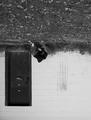
| 11/01/2004 08:19:41 AM |
empty cupby clictacameraComment: I don't really get what the hand stands for... My eyes are looking at it filliing more then 50% of the frame and barely get the guy outside. There is also some bad reflection of the window you took the pic through. Sorry... 3 |
| Photographer found comment helpful. |
| 11/01/2004 08:08:34 AM |
|
| Photographer found comment helpful. |
| 10/31/2004 10:28:43 PM |
Breaking Pointby aznymComment: I think your picture deserves much more than mine. Great job! Ribbon should be yours... |
| Photographer found comment helpful. |
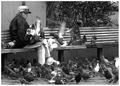
| 10/29/2004 01:42:56 PM |
Bird Ladyby BKerrComment: Don't necesarelly says poverty but it's a strong picture. I like the grain, the composition and the look of her eyes that you got here. Good luck. |
| Photographer found comment helpful. |
| 10/29/2004 12:53:43 PM |
A World Upside Down¿by mrwaffles989Comment: The title gives a clue. But the picture itself looks better the way it was taken. I have downloaded it and rotated and really is not bad... This way does not really tell me much. Maybe I am too traditionalist. Other wise the composition is OK and a very good use of B&W. Good subject, too. |
| Photographer found comment helpful. |
| 10/29/2004 12:31:19 PM |
|
| Photographer found comment helpful. |
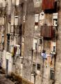
| 10/29/2004 12:26:01 PM |
housesby carlosmfernandesComment: I think it would be better without the tilt. Otherwise good colours, crisp image. It is depicting poverty. Good luck! |
| Photographer found comment helpful. |
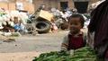
| 10/29/2004 12:17:38 PM |
rich in spiritby MR_PComment: Would like to see different lighting. More light on the baby's face and less on the garbage pile. Good representation of the challenge |
| Photographer found comment helpful. |
Home -
Challenges -
Community -
League -
Photos -
Cameras -
Lenses -
Learn -
Help -
Terms of Use -
Privacy -
Top ^
DPChallenge, and website content and design, Copyright © 2001-2025 Challenging Technologies, LLC.
All digital photo copyrights belong to the photographers and may not be used without permission.
Current Server Time: 08/05/2025 01:55:03 AM EDT.