| Image |
Comment |
| 03/17/2004 05:55:56 PM |
|
 Photographer found comment helpful. Photographer found comment helpful. |
| 03/17/2004 05:47:58 PM |
|
| Photographer found comment helpful. |
| 06/27/2003 06:49:15 PM |
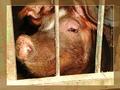
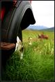
Pigby giampoComment: hehehee. I love it. I have only given two 10s for this challenge, and this is one of them. Nice texture for the pig/pig's hair/mud on pig, I also like the DOF so that the background is slighty out of focus. What I really like though is the composition. While I think the border is a little too big, I like how it really brings out the lines of the pig pen, and for once I really like the that two aren't parallel. Good work. |
| Photographer found comment helpful. |
| 06/25/2003 03:42:46 PM |
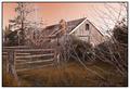
In days gone by...by andrewlrComment: wow. i really like the tone and color of your photo - in some places it looks almost painted. Very nice composition and DOF as well. 9. excellent job. |
| Photographer found comment helpful. |
| 06/25/2003 03:39:32 PM |
Country Wheelsby heidaComment: I don't mind an out of focus background (if its intentional), but since your title refers the the wheel, i would like to see the wheel itself in sharper focus. |
| Photographer found comment helpful. |
| 06/25/2003 03:37:32 PM |
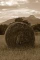
Life in Western North Carolinaby nbortonComment: In the background it looks like there is a white line between the mountains and the sky. is that from over-sharpening or sharpening edges?
Otherwise, I like it. Good texture in the hay and the grass. |
| Photographer found comment helpful. |
| 06/23/2003 03:25:12 PM |
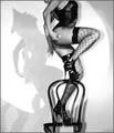
Cabaret Dancerby dimitriiComment: Its very grainy, but i suppose that was the effect you were going for, and it does work very well. Its a solid photo technically, but I think the composition is just great. The lighting and shadows are wonderful. The crop along the top sort of bothers me, since you can't see her head, but I think the fact that you can see her head in the shadow makes up for it. good job. |
| Photographer found comment helpful. |
| 06/22/2003 11:17:20 AM |
Me, Myself & Iby jonpinkComment: It seems like a lot of people went for the side lighting/ half of the face darkened idea, but you did it well. I really like the fact that your white color keeps your whole left side from becoming too dark. Nice composition and cropping. |
| Photographer found comment helpful. |
| 06/22/2003 11:13:57 AM |
The Devil in Bluejeansby PedroComment: Its an interesting angle, and certainly more creative than most of the entries. I like the slightly washed out colors, the idea that the image and the title together sugest. The only thing that bothers me is the street line. I feel like it should be parallel with the edge of the photo, although maybe thats hard to do from your angle. Anyway, good work, I like it a lot and you get a 9. |
| Photographer found comment helpful. |
| 06/22/2003 11:10:00 AM |
Windows of the Soulby KINGComment: I like the photo a lot, but I find the brightness of the blue eyes a little scary. I think a more subtle coloring of the eyes would've been more efective. On the whole though, I like the texture of your skin, and you have a good range of grays. I also like the somewhat serene look you have. 8. |
| Photographer found comment helpful. |
Home -
Challenges -
Community -
League -
Photos -
Cameras -
Lenses -
Learn -
Help -
Terms of Use -
Privacy -
Top ^
DPChallenge, and website content and design, Copyright © 2001-2026 Challenging Technologies, LLC.
All digital photo copyrights belong to the photographers and may not be used without permission.
Current Server Time: 07/15/2026 12:08:10 PM EDT.