| Image |
Comment |
| 05/16/2004 09:26:43 PM |
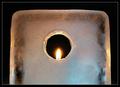
Ice Flameby anirenoComment: one of the better fire and ice shots in the challenge. I'd still like to see more interaction between the 2 elements than is presented, but I like the circular cut out and the candle glow on the ice. |
 Photographer found comment helpful. Photographer found comment helpful. |
| 05/16/2004 09:17:06 PM |
|
| Photographer found comment helpful. |
| 05/16/2004 12:22:12 PM |
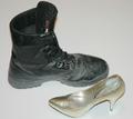
Coming and Goingby candycornComment: the lighting looks a bit strange here with a harsh shadow under the pump and no shadow at all under the hiking boot. also the lighting is very flat and the tonal ranges rather narrow. The blacks in the image should be deeper and richer to bring out the textures in your subjects. |
| Photographer found comment helpful. |
| 05/16/2004 12:18:04 PM |
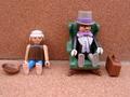
Poor & Richby trunkiComment: clever use of subject material. really no excuse for being so out of focus though. |
| Photographer found comment helpful. |
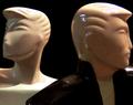
| 05/16/2004 12:17:03 PM |
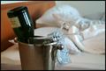
Cold - Hotby tyrkinnComment: clever interpretation of the challenge. I think you could have brought out "hot" a little more with some additional props in the background (a discarded shoe or piece of clothing) but the rumpled sheets do a good job. |
| Photographer found comment helpful. |
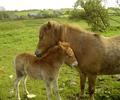
| 05/16/2004 12:15:08 PM |
Filly and Foalby PatrolComment: cute shot. nice colors and sharpness. Could have been improved by not cutting off the hoofs out of frame. |
| Photographer found comment helpful. |
| 05/13/2004 11:35:24 PM |
|
| Photographer found comment helpful. |
| 05/13/2004 10:56:46 PM |
Charged Oppositesby drgsoellComment: good idea for a macro shot, but I think you should have come in even tighter (or just cropped tighter) The batteries are just floating within the whitespace above and below them. The whitespace is not complementary to the subject in this case. |
| Photographer found comment helpful. |
| 05/12/2004 12:13:19 AM |
|
| Photographer found comment helpful. |
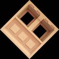
| 05/05/2004 09:06:06 PM |
Night and Dayby jjbeguinComment: The shape here is very interesting, but I don't care for the rotation within the frame. The points of the square crowd the edge of the frame too much. I would have preferred to see it with either more negative space as you have positioned it, or to have it rotated 45 degrees within the frame the size you have here. |
| Photographer found comment helpful. |
Home -
Challenges -
Community -
League -
Photos -
Cameras -
Lenses -
Learn -
Help -
Terms of Use -
Privacy -
Top ^
DPChallenge, and website content and design, Copyright © 2001-2025 Challenging Technologies, LLC.
All digital photo copyrights belong to the photographers and may not be used without permission.
Current Server Time: 08/14/2025 05:32:58 AM EDT.