| Image |
Comment |
| 02/02/2004 09:51:48 AM |
|
 Photographer found comment helpful. Photographer found comment helpful. |
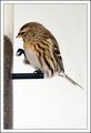
| 02/02/2004 09:50:58 AM |
Bird and Seedsby JackoComment: I like this image, but I would have preferred to see you position the bird lower in the frame, making better use of the whitespace around and above it. |
| Photographer found comment helpful. |
| 02/02/2004 09:47:46 AM |
Soda & Iceby katlynComment: I think there might have been a more visually interesting way to show the relationship between soda and ice, perhaps with the beverage pouring over the ice. As it is, it is pretty static. |
| Photographer found comment helpful. |
| 02/02/2004 09:45:19 AM |
Titanicby sherComment: nice use of color and negative space. I don't know of the steam swirl was digitally added, but it looks good. |
| Photographer found comment helpful. |
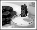
| 02/02/2004 09:44:30 AM |
Milk and Cookiesby RHoldenSrComment: I'll be interested in reading how you set up the shot to have the cookie floating like this. |
| Photographer found comment helpful. |
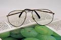
| 02/02/2004 09:36:43 AM |
Reading glassesby sn4psh07Comment: nice and sharp, but I think the illustration in the foreground detracts from the glasses. |
| Photographer found comment helpful. |
| 02/02/2004 09:32:37 AM |
Salt and Pepperby sfaliceComment: I like the closeup detail in this shot, as compared with the several other entries that attempted the same thing. The rock salt gives nice textural contrast to the whole peppercorns. I don't like the background though. I don't know if you masked it out but it looks very unnatual to me. I would have preferred a more appropriate setting for the subject and natural shadows. |
| Photographer found comment helpful. |
| 02/02/2004 09:30:22 AM |
Black & Whiteby soupComment: I like this a lot, but would have preferred to see the sunglasses withought the rectangular reflections in the lenses. nicely cropped and composed. |
| Photographer found comment helpful. |
| 02/02/2004 09:29:33 AM |
Togetherby roy204Comment: simple and elegant. I would have preferred greater depth of field to get the back piece more in focus, but it still works OK. |
| Photographer found comment helpful. |
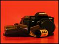
| 02/02/2004 09:28:47 AM |
|
| Photographer found comment helpful. |
Home -
Challenges -
Community -
League -
Photos -
Cameras -
Lenses -
Learn -
Help -
Terms of Use -
Privacy -
Top ^
DPChallenge, and website content and design, Copyright © 2001-2025 Challenging Technologies, LLC.
All digital photo copyrights belong to the photographers and may not be used without permission.
Current Server Time: 08/06/2025 06:07:12 AM EDT.