DPChallenge: A Digital Photography Contest You are not logged in. (log in or register
 
Browse Settings
Currently viewing:
Registered UserRianBotes

Show comments:

Per page:

Order:

Comments:


Comments Made by RianBotes
Pages:   ... ... [186]
Showing 151 - 160 of ~1856
Image Comment
• r e f l e c t i n g •
09/27/2014 08:38:36 AM
• r e f l e c t i n g •3rd Place
by Ja-9

Comment:
From the Critique Club

Janine, just my luck commenting on a ribbon shot.... :)
Whats left to say on a shot which met the standards for right angles and also a perfectly executed shot in taste with DPC.

Just earlier I was commenting on how a person could improve on their shot and in opening this shot I find exactly what I suggested. Again well done on framing this. Its so easy to ruin this and believe the BW works for this. The framing on the top right, one could easily miss how important this is in making this image work as the eyes get drawn from left to right diagonally and are met by further angles.

Nothing more needs to be said. Textbook shot

Regards
Rian
Photographer found comment helpful.
The Right View
09/27/2014 06:27:04 AM
The Right View
by KMcC

Comment:
From the crit Team

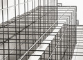
That voting graph should look different for a shot like this. You did well with this image and the right angle them comes through strongly. The exposure on the reflected glass is perfect, pleasing to eye and the clouds are making this work even better. Love the touch of greens - growth coming in on the right bottom corner. These are basic strong elements which makes it work.

Ways to improve maybe the following.
The slant in the building is one drawback in this image which weakens the right angle theme a bit and just the overall strength the building is supposed to portray. Of course any tilt of camera in relation to building will do this on a wide angle approach and only TS lens or a higher angle for you to shoot from could help for this.

You chose a time of day that worked for the image and cant say the light is all that bad except for the sky itself which with a bit more TLC in the PP could have helped to make that part of the scene not as bland as it currently is. It looks flat and further causes the potential punch of this image to be swayed to a lesser level of image. Challenging light requires a bit more work in PP. The contrast between sky and reflection makes it more of a challenge.

The comp itself could maybe have been improved slightly by playing around with moving around the points of intersection... That is where building enters and exits frame of image. Especially on top part of the frame and by creating further right angles in this imaginary way, if you follow what I mean, the general feel of the image could have been enhanced... And the slant of the building maybe even downplayed a bit.

Either way, it remains a shot with lots of potential and focus, exposure was handled well and surprised by depth even at 6.3. Not sure of the growth at bottom suffered on the focus end and cant judge on this scale but I would have been inclined to shoot at a closer stop to be sure the DOF is good.

Well done on eyeing this shot.
Regards
Rian
Photographer found comment helpful.
Double the Skyscape
09/26/2014 11:05:52 AM
Double the Skyscape
by juliannj

Comment:
From the Critique Club

Just short of a 6 on the DPC voting scale and High on your score rankings.

The idea is good for the challenge and original even though reflections comes a dozen at a time. It's a simple yet effective shot with comp good sticking to some basic rules Im sure you are familiar with. It's a very peaceful shot and in essence there truly is nothing wrong with it on a technical level.
Simple things that could have been done to create a stronger effect and have voters tip more towards the higher end of the voting scale is
1) Slower shutter and have some motion blur in the sky and have the water turn softer
2) wait for another time of day to have the light softer and in event of being morning or evening the colours richer
3) Lower angle to get closer to the water and bring the viewer more in contact with the scene.

All of the above creates an entirely different scene which is maybe not what you wanted.. But it does create a stronger image in the general viewer's mind and automatically moves the image up in the rankings.

Congrats on a good shot and keep them coming

Regards
Rian Botes
Photographer found comment helpful.
• r e f l e c t i n g •
09/24/2014 03:47:12 PM
• r e f l e c t i n g •3rd Place
by Ja-9

Comment:
Well done Janine. Great image. Love it :)
Photographer found comment helpful.
Solar Storm
09/24/2014 03:46:21 PM
Solar Storm2nd Place
by MargaretNet

Comment:
Congrats. HDR seems to do well on DPC
Photographer found comment helpful.
Right Angles, Right Curves
09/24/2014 12:57:46 PM
Right Angles, Right Curves
by JakeKurdsjuk

Comment:
From the club! :)
Right angles...? Who could miss it in a shot like this. 100% meeting the requirements set by the challenge topic. As always the voting graph rather harsh and yes it should have scored better but why not?

The processing works well in bringing out the colors and detail in all the multitude of elements such as bottles, shelves, etc etc.... And that is part of the problem in the image especially given the glaring white section of the image demanding attention but presenting the viewer with very little other than a lady/bartender who herself seems disengaged from anything in the scene. Such a busy scene needs a stronger point of interest that must contribute to the story as well as even if possible to the right angles theme.

In short I believe this image will be transformed if you had the backside of a person sitting either on left or right chair or even one person on left and right with bartender right in middle. This will have a triangular line effect and for this the lady should look straight at me the viewer. This then immediately adjust the focus and have me return my wandering between all the busy elements back to the people and finally to our lady serving the customers/drinkers/ wandering souls. The lady as pretty as she is also further looking at me will also strengthen the contrast between Beauty and cruelty/harshness of the environment she finds herself in and works in.. As this is a cold world for most people to drink in.

Its a good shot... But you need to get the attention of people and get them to search the image that will tell a story.. One that unfolds as they further wander their eyes through the image.

Regards
Rian
Photographer found comment helpful.
Once upon a hill
09/11/2014 04:19:25 PM
Once upon a hill
by elinias

Comment:
From the critique club

This image has so much going for it and yet it only managed to grab attention from selected people. As an avid landscape photographer myself I always am over analytical and forgive me if Im doing this on your image but ill attempt to first say what works, what don't work and then venture on possible ways in which it could have been improved. This purely hypothetical as its always easy to make comments on an image when you were the only person there and truly know what this case is, could have worked and the viability of my suggestions

Iceland always gets peoples attention. They expect something special. Something out of this world. This scene does have that. Contrast galore - also noted by others. The blacks, greens and then grey black sky works well. The clouds does help in generating a mood and atmosphere in this scene always good for landscape work. You tried to present the viewer with same feeling you had when you first saw this. I believe you have succeeded in doing this but only limited. The comp is not entirely there for this kind of landscape. It is pleasing but im finding myself glued to the green hill and thats it. Black in the front and moody clouds... But then back to the green hill and there is not much else. Yes pleasing.. But expecting more but not getting it. No lines that allow me to flow with the scene. You have lines in the fg as well as sky line and circles in the middle with river and hill strengthening this but these are not working together.

Processing looks good but it does look like the clouds have been worked on a bit and maybe some voters saw this as over the top? It almost looks like it has an HDR effect.

So what could have been done differently? Comp wise i cant say apart from suggestions as made above... You know what it looks like there and must play around with the elements before you and wow do you have elements to work with!!! I dont think Ill make much progress with the hike if I could visit this place. To much to appreciate.
Possible things you could have opted for.
Tripod. Drop that f stop and get some more depth and sharpness throughout. FG could do with some more interest and a lower angle would have brought the viewer in touch with the scene and be involved and not a mere spectator. Having done the above Im already seeing the effect that a slow shutter would have in helping solve the problem with my drifting clueless eyes.. Where the clouds will have movement creating a sense of direction and pulling me in.. Even be it sideways. This will also play right in to the contrast theme you have here.

Hope the above helps a little. These are merely one persons observations and suggestions and you should always stay true to your own style but also appreciate the basics that help your vision and creativity come to the fore.
Regards
Rian
Photographer found comment helpful.
Hung up
09/08/2014 05:56:22 AM
Hung up
by snaffles

Comment:
This could score Blue any day. There is nothing to choose and in pure action genre this is hands down a favorite. Sharp.. action frozen. Nice lines emphasizing the drag of gravity to the right yet opposing force of the horse's head to left is great and enhances the tension and you can feel it. Not much disturbance in the background and the BW conversion and post processing helps the main subject/s to come to the fore. Well worked
PS (Edit) Congrats on the HM 5th place!

Message edited by author 2014-09-08 05:57:01.
Photographer found comment helpful.
Finding His Wings!
09/08/2014 05:51:27 AM
Finding His Wings!
by JayneRyan

Comment:
Congrats on the HM in the Free study!
Photographer found comment helpful.
Raw Africa
09/08/2014 05:50:18 AM
Raw Africa
by HarveyG

Comment:
Hey Harvey. Gruesome shot and raw Africa for sure. Notice you comments on light and shooting at 1600 ISO. A very close and personal shot that is needed to bring out the effect of what's happening here. Not much one could do with the IQ on these settings but maybe this enhances the RAW effect..?
Photographer found comment helpful.
Pages:   ... ... [186]
Showing 151 - 160 of ~1856


Home - Challenges - Community - League - Photos - Cameras - Lenses - Learn - Help - Terms of Use - Privacy - Top ^
DPChallenge, and website content and design, Copyright © 2001-2025 Challenging Technologies, LLC.
All digital photo copyrights belong to the photographers and may not be used without permission.
Current Server Time: 08/24/2025 11:46:52 PM EDT.