| Image |
Comment |
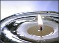
| 06/05/2003 02:41:21 AM |
molten waxby magnetic9999Comment: Hmm... I think too bright of lighting for your subject. I know that just the candlelight might not have sufficed to capture the melting, but I think you could have toned it down somewhat -- I'm kind of surprised the flame is still so visible, in fact, so I'm wondering a bit how you did up the lighting. |
 Photographer found comment helpful. Photographer found comment helpful. |
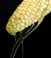
| 06/05/2003 02:39:57 AM |
Corn Syrup, Freshly Squeezedby ScottKComment: That's a clever thought, definitely. Although not bad as is by any means, I think the imperfections present in the tips of corn cobs, while unavoidable, are distracting, and wonder if you could have gotten a better effect by tilting the cob differently and taking the shot so the syrup ran over the 'sides' of the cob so you could highlight the more perfect kernels. That is really a nitpick, which is a good sign from me, really. :) |
| Photographer found comment helpful. |
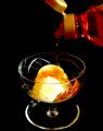
| 06/05/2003 02:37:30 AM |
Sweeter Treatby hughletherenComment: Mmmm. That looks yummy even if I'm not entirely certain what is being poured -- syrupy something, but it looks too thin to be actual caramel sauce.
Unfortunately I think the tone is a little too dark -- I can't tell if it's just too-focussed lighting (the way the glass edges dim out sort of suggests this) or if the background contributes. There's a decided colour difference between the pouring liquid and the bulk of the bottle, which is what makes me fairly certain that's a lighting issue.
But the composition is good, framed well, and it meets the topic. |
| Photographer found comment helpful. |
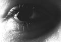
| 06/05/2003 02:31:44 AM |
Tearby olegComment: ...oh, I hate to say this, I really do, because this is a beautiful shot, but...
I really think of tears as 'water'.
As there's an argument for that not being the case it won't detract a lot from my vote, but it does affect it to some extent.
Let's see. Other minor flaws: a little shift of focus or angle might have helped make the title less necessary to me to see what you're doing; I think I would have missed it at first otherwise simply BECAUSE the close-up on the eye is so nicely done. And the lighting is just a bit too bright on the left part of the skin, I wish you could have adjusted that slightly.
Also, kudos on entering a B&W photo I think really really ought to have been; normally I'm either ambivalent or outright prefer colour. |
| Photographer found comment helpful. |
| 06/05/2003 02:27:02 AM |
Warm as Iceby fotomann_foreverComment: So much of this involves ice that I feel it doesn't do a good job of capturing either the 'liquid' or the 'non-water' parts. The liquid in the glass does appear to be something other than water, though it's hard to tell.
Now, if this were just a glass of wine, shot at that same level of lighting, angle, same backdrop, etc., I would probably have thought it was quite pretty and on topic, but the ice also sort of mars the 'pretty' part.
Looks like you have a minor 'hot pixel' or lighting artifact problem just over from the glass base., by the way. |
| Photographer found comment helpful. |
| 06/05/2003 02:23:08 AM |
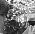
Coke Classic....aaahhhhhby OneSweetSinComment: If I make it through even half the photos in this challenge I'm probably going to be really sick of the person-drinking theme. Luckily for you I'm not YET but it's not the world's most original interpretation as I'm sure you're aware.
Inasmuch as the shot goes... I like the focus, the shot is very crisp on the bottle and the face. Side view is reasonable; a slight angle might have been a little nicer. The kid looks to not be drinking but rather just holding the bottle for the shot -- some of that is how flat the soda looks, some is just placement of both hands and lips. I don't know if that's the case or just the impression. |
| Photographer found comment helpful. |
| 06/05/2003 02:16:23 AM |
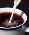
Two Milk, No Sugar.by BigSmilesComment: Tea, not coffee? Or just a fairly light brew of cofee?
I think w/o the bubbles would have been more interesting as more of the swirl could have been seen then. I like the framing of the shot, and the border is thankfully very inobtrusive. |
| Photographer found comment helpful. |
| 06/05/2003 02:15:04 AM |
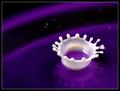
Dairy Queen by crabappl3Comment: Hmm, well, my only real problem with this is it's been done so often that it's lost some of its interest to me. I like the choice of purple for your contrast. There's a kinda neat planetary thing going on here that may or may not be intentional, but does help a bit to counteract that "seen it" reaction. |
| Photographer found comment helpful. |
| 06/05/2003 02:13:23 AM |
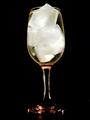
Sapphire & Spriteby DiversqComment: Not a drink I would mix, I must admit.
I like this concept, and the composition with the reflection. I think there's a bit too much glare off the front of the glass, particularly on the stem. The focal point is interestingly centered but I think it fades into foreground blur a little too quickly; the base of the glass is much blurrier than I would have expected given an eye's view of this, for instance. |
| Photographer found comment helpful. |
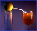
| 06/04/2003 05:34:58 AM |
Transfusionby moodvilleComment: I presume that's cider, then.
I like the idea overall. I like the condensation being not only on the glass but on the straw, but I think I would have preferred it not be on the apple. Using the straw container as the stand for the apple is a nice touch. |
| Photographer found comment helpful. |
Home -
Challenges -
Community -
League -
Photos -
Cameras -
Lenses -
Learn -
Help -
Terms of Use -
Privacy -
Top ^
DPChallenge, and website content and design, Copyright © 2001-2025 Challenging Technologies, LLC.
All digital photo copyrights belong to the photographers and may not be used without permission.
Current Server Time: 08/17/2025 10:50:34 PM EDT.