| Image |
Comment |
| 10/08/2003 08:41:06 PM |
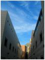
U-turnby swaroskjiComment: Wonderful colours and textures. I'm not entirely convinced by this unusual composition, but it's certainly striking. 9 |
 Photographer found comment helpful. Photographer found comment helpful. |
| 10/08/2003 11:23:12 AM |
Where the Sidewalk Endsby GrandmomComment: Such a shame the horizon is wonky. A little too much noise, and too much magenta in the shadows. Other than that, great shot... very atmospheric. The person on the beach in the distance really makes this picture. 7 |
| Photographer found comment helpful. |
| 10/08/2003 11:10:47 AM |
A Brief Moment In Timeby robsmithComment: I thought this was a cheating entry at first, but it turns out it is an almost identical shot to one in this month's Total Digital Photographer magazine (page 113, by Richard Wentk). I'd like to give it a 10, but the fact that there is an almost identical photo on the newstands this month knocks it down for me. It also needs more sharpening. 7 |
| Photographer found comment helpful. |
| 10/08/2003 09:04:54 AM |
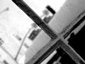
dirtyby JenHallComment: An interesting shot, but I'm not sure this really meets the challenge which asks for buildings. I know the window has to be IN a building, but this seems against the spirit of the challenge for me. For what it's worth though, I really like this photo, just not in this challenge. 6 |
| Photographer found comment helpful. |
| 10/08/2003 09:00:13 AM |
Capitol At Sunsetby rickhd13Comment: Could do with a much tighter crop, there is too much space here for the eye to know where to settle. Great colours, nice sillhouette. 7 |
| Photographer found comment helpful. |
| 10/08/2003 08:28:43 AM |
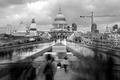
I Love New York...by tolyanchikComment: A great shot, but I really wich you hadn't chopped the people in half at the bottom. This looks careless, and confuses the viewer. Are they supposed to be there? Either crop them out altogether, or make them an integral part of the shot. 6 |
| Photographer found comment helpful. |
| 10/08/2003 08:25:32 AM |
duotone townby rhipsterComment: Needs straightening. I'm not convinced by your choice of colour. I think the photo needs more tonal contrast. Score: 5 (6 in normal black and white, and straightened). |
| Photographer found comment helpful. |
| 10/08/2003 07:57:17 AM |
|
| Photographer found comment helpful. |
| 10/08/2003 07:49:04 AM |
Small Town Courthouseby MustbelostComment: Way too much sharpening, you can see artifacting all around the building. Nice architecture. Composition doesn't strike me as very imaginative though. 5 |
| Photographer found comment helpful. |
| 10/08/2003 07:42:47 AM |
Tueborby TooCoolComment: Very overexposed, you've lost loads of detail in the highlights. 4 |
| Photographer found comment helpful. |
Home -
Challenges -
Community -
League -
Photos -
Cameras -
Lenses -
Learn -
Help -
Terms of Use -
Privacy -
Top ^
DPChallenge, and website content and design, Copyright © 2001-2025 Challenging Technologies, LLC.
All digital photo copyrights belong to the photographers and may not be used without permission.
Current Server Time: 06/28/2025 10:27:09 AM EDT.