| Image |
Comment |
| 10/13/2003 10:07:04 AM |
Fall Colors Revealedby alanfreedComment: Maybe I'm being picky, but I don't see autumnal colours as having been concealed. They didn't exist. This photo is so oversaturated, it hurts my eyes to look at it! 3 |
 Photographer found comment helpful. Photographer found comment helpful. |
| 10/13/2003 10:00:54 AM |
Exposing A New Dimensionby ColeyComment: Strange ratio of negative space to subject here. Also a strange crop. I think I'd have liked to see more space above the head, and less below the hand. Perhaps in portrait orientation as well. Shame, as this is a very strong shot otherwise. Great idea, and great colours. 7
Edit: Only one helpful comment? That seems to be insulting on all the other people who bothered to comment on your picture. Message edited by author 2003-10-20 06:24:24. |
| Photographer found comment helpful. |
| 10/13/2003 09:58:08 AM |
baby teethby grigrigirlComment: Hmm, this feels like it was shoehorned into the challenge. Without the title, I'd be struggling to see the connection. 4 |
| Photographer found comment helpful. |
| 10/13/2003 09:49:23 AM |
Them Bonesby Firstrich1Comment: Interesting shot, great textures and exposure. This would have been one of my favourites this challenge but for the composition, which in my opinion lets it down. I'm not a fan of bottom-left/ top-right diagonals unless there's a strong reason for it. This diagonal also cuts the picture almost exactly in half, and I don't think this works here. 7 |
| Photographer found comment helpful. |
| 10/13/2003 09:45:15 AM |
Mystery Revealedby TarbiniComment: Interesting interpretation of challenge. Good use of narrow dof. Shame about the text which is visible on the other side of the page. I'm not a fan of the yellow/orange colour, maybe this could have worked better in black and white? Or black and white and then tinted another colour. 8 |
| Photographer found comment helpful. |
| 10/13/2003 09:30:31 AM |
a cone exposed in a single shotby ursulaComment: Interesting idea to use a double exposure, but I can't help but feel that this technique could have been much more interesting to the viewer with a different subject. Strangely, although I usually hate large borders, this one works nicely here. Good colours and lighting. Effective crop. 8 |
| Photographer found comment helpful. |
| 10/13/2003 09:27:00 AM |
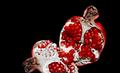
Pomegranate - Punica Granatumby JC_HomolaComment: Shame there's so much negative space, I'd have prefered a tighter crop. The ratio of negative space to subject seems very arbitrary and not pleasing to the eye. Otherwise, quite a striking shot. Effective combination of white, black and red. 7 |
| Photographer found comment helpful. |
| 10/13/2003 09:25:29 AM |
Imprisoned Soulby thelselComment: Creative idea, a bit too NeatImaged for me though. Not sure about your title... I'd have liked to interpret the shot differently, perhaps a sense of mystery would be good here by not stating what you think is in the box.
I think the top-left/ bottom right diagonal is stronger when using a diagonal as the basis of your composition.
Perhaps magenta was the wrong colour to push in Photoshop, it works well inside the box, but makes the outside look like there is a bad colour cast to the shot.
Score: 6 |
| Photographer found comment helpful. |
| 10/13/2003 09:21:34 AM |
Secret Keyboard Revealed...by jas0420Comment: Well taken picture, good lighting, effective backgound, fits the challenge. The choice of subject doesn't do much for me personally though. It just looks like you're showing off your new gadget! 8 |
| Photographer found comment helpful. |
| 10/09/2003 05:10:45 PM |
|
| Photographer found comment helpful. |
Home -
Challenges -
Community -
League -
Photos -
Cameras -
Lenses -
Learn -
Help -
Terms of Use -
Privacy -
Top ^
DPChallenge, and website content and design, Copyright © 2001-2025 Challenging Technologies, LLC.
All digital photo copyrights belong to the photographers and may not be used without permission.
Current Server Time: 06/28/2025 05:59:45 AM EDT.