| Image |
Comment |
| 03/25/2004 06:37:57 PM |
Water Gardening Magazineby ellamayComment: The lighting looks a little odd here, some strange shadows are on the wall. I'm trying to find any element of beauty in this shot but can't quite find it. Compositionally seems a little awkward. |
 Photographer found comment helpful. Photographer found comment helpful. |
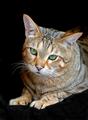
| 03/25/2004 06:30:14 PM |
Cat Fancyby SharonSComment: Great cat photo, the lighting is possibly just a tad too harsh, and I would have liked to see more dof... his/her nose is a little too much out of focus. There is a strange blur around their left ear. Other than that, I love the mood and character of this shot. |
| Photographer found comment helpful. |
| 03/25/2004 06:27:43 PM |
Cat Fancyby smittyComment: Lovely cat, almost a great picture but let down by some overexposure on the fur, and an annoying green distraction in the background. The background in general seems random and takes away from the possible impact of this shot. |
| Photographer found comment helpful. |
| 03/25/2004 06:21:09 PM |
Marathon Runner Magazineby PaulMdxComment: Nice shot, well taken. The motion blur of the left hand makes me really appreciate the sharp focus of his face and torso. Great expression of concentration captured. It's a shame the background doesn't work so well. No shapes there help with your composition, and it looks a bit mundane. The dof works well though. |
| Photographer found comment helpful. |
| 03/25/2004 06:07:10 PM |
Cheese & Wine Magazineby TrollManComment: Nice composition, but a few things let this down. The picture must be sharp and in focus! The reflections on the bottle and glasses are distracting. The lighting needs to be much softer, the shadows look unintentional and too sharp. There are burnt out highlights on your candles. It's a shame about the marks on your background. Your tablecloth doesn't quite work for me, as it looks like you've gone for a symmetrical composition but not quite managed it. I would have taken this shot with the wine and cheese taking up more of the shot. Basicallly lighting is everything in a shot like this, and it looks like you haven't thought about it enough. Have you tried with several lamps, most or all of them diffused in one way or another? A tripod is a must as well. If your camera allows it, extend your dof. |
| Photographer found comment helpful. |
| 03/25/2004 05:52:27 PM |
Dog Worldby willtataComment: Some nice textures in here, it's a shame it's underexposed. The part of the photo that should draw the viewer's eye in any shot of an animal is where the eyes are, and here that doesn't happen. It doesn't help that your model has lighter parts of his/her coat just above the eyes that draw attention away, so you need to be quite inventive with your composition to counteract this. Also, the eyes are just too dark with very little shadow detail. The crop doesn't quite work for me. |
| Photographer found comment helpful. |
| 03/25/2004 05:43:41 PM |
Dog Fancyby shkelly587Comment: Humourous shot, although this looks too much like a snapshot for it to be effective as a magazine cover. Because you are using average metering with a bright background, the picture is underexposed. You should have exposed for the dog's coat. |
| Photographer found comment helpful. |
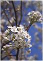
| 03/25/2004 05:41:41 PM |
Our State - North Carolinaby MJENNIComment: Nice composition, although I would have been tempted to flip it horizontaly... I prefer the top-left to bottom-right diagonal. Great colours, and nice use of limited DOF. Personally I think there's just a little too much going on in the foreground... the composition would work better if there was more overall simplicity in the white elements. |
| Photographer found comment helpful. |
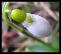
| 03/25/2004 05:38:18 PM |
Your Gardenby MonaComment: Very nice shot, good use of top-left to bottom-right diagonal. Very effective use of limited depth of field. However, the shot is very noisy, I would have cleaned this up with NeatImage. IMO the flower needs much more sharpening in PS. I think your thick black border detracts from your photo. Your camera needs a bit of help in PS with colours and saturation... the colours seem a bit dull and lifeless. |
| Photographer found comment helpful. |
| 03/24/2004 10:40:06 AM |
Backstage Magazineby rhipsterComment: Nice shot, I like the motion blur. Shame you can see the background, it would have worked a lot better if the background was completely black. I would also have liked to see more of the acrobat's face. |
| Photographer found comment helpful. |
Home -
Challenges -
Community -
League -
Photos -
Cameras -
Lenses -
Learn -
Help -
Terms of Use -
Privacy -
Top ^
DPChallenge, and website content and design, Copyright © 2001-2025 Challenging Technologies, LLC.
All digital photo copyrights belong to the photographers and may not be used without permission.
Current Server Time: 06/27/2025 04:34:05 PM EDT.