| Image |
Comment |
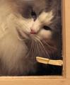
| 04/15/2004 09:07:22 AM |
Wishful Thinkingby ddmckinney1954Comment: Nice cat shot, but several things let it down. The noise levels are terrible, possibly caused because it is too dark. This has also affected the saturation levels, which seems a but washed out to me. The shot is not sharp enough. It's a shame the windowframe isn't parallel to the edge of the picture. The cat's expression is great though. |
 Photographer found comment helpful. Photographer found comment helpful. |
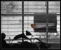
| 04/15/2004 09:04:39 AM |
Lunch Breakby sherComment: Very nice... shame you weren't a fraction lower so the bird was entirely in between the shutters. The narrow dof doesn't work for me here... either less dof or much more is needed here I feel. I wish the bird was much sharper. I like the selective desat. The picture looks wonky to me, I'd have tried 'distort' in Photoshop to get everything straight. I'm not sure the centred composition works here. |
| Photographer found comment helpful. |
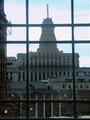
| 04/15/2004 09:01:34 AM |
Looking Out from the Eaton Centreby gerdagriceComment: Looks too much like a snapshot to me. Loss of detail in the highlights in the sky, converging verticals in your window frame caused by not pointing the camera straight ahead, This could have been fixed by using 'Perspective' in Photoshop. The overall shot needs more contrast IMO. It looks like you were aiming for the window panes to be symmetrical, but the right hand panes are too small here. |
| Photographer found comment helpful. |
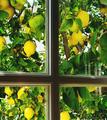
| 04/15/2004 08:56:12 AM |
Ripeby meloniousComment: Beautiful lemon tree, but the shot looks too much like a snapshot. How many shots did you try of this, using as many different angles as possible and at as many different times of the day for different light levels and colours as possible? The composition seems a bit haphazard... are the lines of the frame meant to be parallel to the edge of the picture? Is the centre of the cross meant to be on one of the junctions of thirds? The reflection on the right looks untidy. |
| Photographer found comment helpful. |
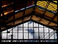
| 04/15/2004 08:51:15 AM |
View from platform Bby jjbeguinComment: Some beautiful colours and lines here. I think the sky doesn't quite do it for me though... this picture could be stunning with the right sky. The exposure is very effective leaving just the right amount of shadow detail. |
| Photographer found comment helpful. |
| 04/15/2004 08:49:28 AM |
Spring Shower Through Old Glassby vtruanComment: Some interesting textures and colours here. I'd have been tempted to make a tighter crop so you see the frame but not the lower right pane. Not enough sharpness here for my taste. |
| Photographer found comment helpful. |
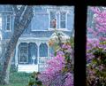
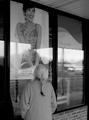
| 04/15/2004 08:46:43 AM |
Longing for Springby jmritzComment: Not quite sure what you were going for here, the overall effect is one of a snapshot. I think it's the glare and reflections in the windows that let the photo down. It's not entirely clear what your point of focus is... is it the woman looking in the window? The writing? The model in the poster? The arrangement of all these elements seems haphazard and not pleasing to the eye. |
| Photographer found comment helpful. |
| 04/15/2004 08:40:42 AM |
|
| Photographer found comment helpful. |
| 04/15/2004 08:39:32 AM |
Window Artby SonifoComment: Nice portrait, what a huge shame about the burnt out highlights near the nose. |
| Photographer found comment helpful. |
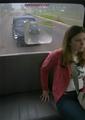
| 04/15/2004 08:37:01 AM |
Back of the busby DefyTimeComment: Not sure what you're trying to achieve here. I feel like the shot is trying to tell a story, but it's not clear enough. The view out of the window is too cluttered, and the reflections are very offputting. I don't like that part of your model's face has been cropped off. |
| Photographer found comment helpful. |
Home -
Challenges -
Community -
League -
Photos -
Cameras -
Lenses -
Learn -
Help -
Terms of Use -
Privacy -
Top ^
DPChallenge, and website content and design, Copyright © 2001-2025 Challenging Technologies, LLC.
All digital photo copyrights belong to the photographers and may not be used without permission.
Current Server Time: 06/26/2025 05:24:39 PM EDT.