| Image |
Comment |
| 05/17/2004 05:02:03 PM |
Smile For The Camera Harry!by GolferDDSComment: Great capture... but you need to reduce the noise in the background using NeatImage. Shot has perhaps a little too much contrast... I'd like to see the tree trunk a tad darker and the background a tad lighter. |
 Photographer found comment helpful. Photographer found comment helpful. |
| 05/17/2004 04:57:54 PM |
laser webby shutterflyComment: Great shot, spoilt by a few blemishes that could have been cloned out (Bottom left of frame, top third of frame off-centre to the right). I'd have prefered a tad more contrast. Great colour, composition and effect. |
| Photographer found comment helpful. |
| 05/17/2004 04:55:21 PM |
Crawling Around My Lifeby mirdonamyComment: Interesting snapshot... but would have been much more interesting with a real spider! Highlights are a bit burnt out. Very effective dof. |
| Photographer found comment helpful. |
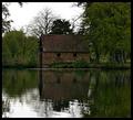
| 05/17/2004 04:54:07 PM |
The Old Boathouseby browntComment: Nice, technically competent shot. Shame the sky is overcast. Lacking the 'wow' factor for me here. |
| Photographer found comment helpful. |
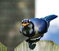
| 05/17/2004 04:52:23 PM |
Wanna nut ?by JC_HomolaComment: Great shot, shame the lighting is a bit too harsh. Some nice colours. More sharpness would also have been good. Maybe this is picky, but I wouldn't call this centred. The head/eyes are the focal point of any animal, which is not in the centre here. I'm not convinced by your post-processing which has left a posterised effect as the different levels of colour don't run into each other smoothly. I suspect this is a side-effect of NeatImage gone a bit wrong. |
| Photographer found comment helpful. |
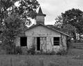
| 05/17/2004 04:49:11 PM |
Abandoned Churchby omnibusComment: This photo doesn't really connect with me... I wonder what you were trying to achieve with this shot. I don't think your choice of b&w helped here, as the result is a bit flat and dull. More sharpening is needed. |
| Photographer found comment helpful. |
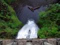
| 05/17/2004 04:47:09 PM |
Down the Fallsby kyrielleComment: This photo makes me REALLY dizzy, as I'm not too fond of heights. I'd have liked to see the edge of the platform at the bottom straightened. I feel the greens are a tad over-saturated. Interesting and unsusual composition, which works well. Nice use of symmetry. |
| Photographer found comment helpful. |
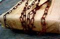
| 05/17/2004 03:28:42 PM |
Rusted Faithby taterbugComment: Critique Club:
First thing that hits you about this photo is that it's simply too small. Almost any image editing program will allow you to change the amount of compression when you save your image so that you can have the longest side 640 pixels long. This simple step will usually add at least 1 whole point to your scores.
The idea here for your photo is intriguing, and raises many questions. Is this person's faith being oppressed? Are the chains rusty because the faith has been oppressed for a long time? It looks like there are some great textures in this shot, but again it is impossible to tell as the picture is so small. It's a shame the top of the bible's spine has been chopped off by the edge of the frame... this looks unintentional.
So far, it looks like you have great talent... let's see larger versions of your photos! Try to have the longest side ALWAYS 640 pixels long! |
| Photographer found comment helpful. |
| 05/17/2004 09:25:05 AM |
|
| Photographer found comment helpful. |
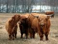
| 05/17/2004 09:23:58 AM |
Familyby MotoCycleBoiComment: Lovely shot, shame about the extra animal on the right behind the horns of the one in front. Superb sharpness. |
| Photographer found comment helpful. |
Home -
Challenges -
Community -
League -
Photos -
Cameras -
Lenses -
Learn -
Help -
Terms of Use -
Privacy -
Top ^
DPChallenge, and website content and design, Copyright © 2001-2025 Challenging Technologies, LLC.
All digital photo copyrights belong to the photographers and may not be used without permission.
Current Server Time: 06/26/2025 08:30:01 AM EDT.