| Image |
Comment |
| 06/10/2004 07:11:20 AM |
Realityby k4rpComment: Wonderful composition, mix of colours and use of dof. I'd like to see this without such an obtrusive border (out of proportion bearing in mind the size of the image), and with the longest side at 640 pixels. |
 Photographer found comment helpful. Photographer found comment helpful. |
| 06/10/2004 07:08:55 AM |
|
| Photographer found comment helpful. |
| 06/10/2004 07:07:53 AM |
|
| Photographer found comment helpful. |
| 06/10/2004 07:07:17 AM |
|
| Photographer found comment helpful. |
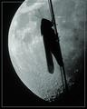
| 06/08/2004 02:16:24 PM |
Lunar Landingby scalvertComment: Very imaginative, I presume this is not the real moon in the background! Superb composition and mood. |
| Photographer found comment helpful. |
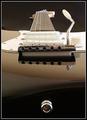
| 06/08/2004 02:13:45 PM |
Fender Stratocaster by ChrisW123Comment: Oh wow, just excellent. I think you could make loads of money off this one, one of the best guitar pictures I've ever seen. Classic. |
| Photographer found comment helpful. |
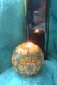
| 06/08/2004 10:02:43 AM |
Candle Litby DianaBComment: Critique Club:
Welcome to DPC! I can see you've already taken on board a lot of constructive criticism, so I won't go overboard with this critique.
Obviously, focus (or lack of it) was the big issue here... you mentioned you would use a tripod the next time, are you sure camera shake was the culprit, or perhaps a very shallow dof caused by using a wide aperture in macro mode? The focus may have been in the centre of the picture, on the reflection of the candle. There were some very interesting contrasts in light, shape and texture, but by using mundane bathroom items I think people look less at it as an abstract picture, and more just as a collection of objects. Also, watch out for burnt-out highlights.
Good luck with your future challenges,
Bob |
| Photographer found comment helpful. |
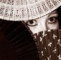
| 06/08/2004 09:51:26 AM |
Peek-A-Boo...by JesuispeureComment: Critique Club:
A wonderful idea, utilising great composition. I think I would have prefered this in colour though, fans are traditionally quite colourful and I'm not convinced there's a good reason for a duotone treatment here. The noise levels don't look effective to my taste, looking more like noise than grain. The black vertical marks in the lower corner of each eye are a bit distracting, and nothing seems quite sharp enough. The lighting has resulted in an unappealing shadow on your subject, thrown by the darkest fan. The eyes don't look sultry, more startled or afraid.
Sorry about all the nitpicking though, as the first impression is good when looking at this photo, these details only become apparent as the viewer looks at it longer. I love a lot of your other work, especially the recent 'Pale Josephine' entry, so I hope to see a lot more!
Bob
Edit: Just read your description, so I see your reason for converting to quadtone... a shame you didn't get better lighting! |
| Photographer found comment helpful. |
| 06/02/2004 03:58:19 AM |
|
| Photographer found comment helpful. |
| 05/29/2004 05:57:06 AM |
one moreby grigrigirlComment: Wow... the tatoos are incorporated into the composition very nicely. Great textures. |
| Photographer found comment helpful. |
Home -
Challenges -
Community -
League -
Photos -
Cameras -
Lenses -
Learn -
Help -
Terms of Use -
Privacy -
Top ^
DPChallenge, and website content and design, Copyright © 2001-2025 Challenging Technologies, LLC.
All digital photo copyrights belong to the photographers and may not be used without permission.
Current Server Time: 06/25/2025 08:51:09 PM EDT.