|
|
|
Showing 121 - 130 of ~317 |
| Image |
Comment |
| 05/29/2003 03:52:39 PM | A Fixer Upperby bobgaitherComment: 5. Fits the theme well enough, and there are no blatant 'you suck!' flaws to it, but neither does it really grab me for any reason at all. For reasons of composition, cropping, or subject choice, it's just a photo, and doesn't do especially much for me, aesthetically. |  Photographer found comment helpful. Photographer found comment helpful. |
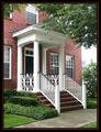
| 05/29/2003 03:52:32 PM | It's the only Brick house on the leftby CreativeFlyPhotoComment: 5. Fits the theme well enough, and there are no blatant 'you suck!' flaws to it, but neither does it really grab me for any reason at all. For reasons of composition, cropping, or subject choice, it's just a photo, and doesn't do especially much for me, aesthetically. | | Photographer found comment helpful. |
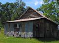
| 05/29/2003 03:52:17 PM | Former Home Sweet Homeby kposeyComment: 5. Fits the theme well enough, and there are no blatant 'you suck!' flaws to it, but neither does it really grab me for any reason at all. For reasons of composition, cropping, or subject choice, it's just a photo, and doesn't do especially much for me, aesthetically. | | Photographer found comment helpful. |
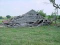
| 05/29/2003 03:51:00 PM | Hickorymanorby David EyComment: 5. Fits the theme well enough, and there are no blatant 'you suck!' flaws to it, but neither does it really grab me for any reason at all. For reasons of composition, cropping, or subject choice, it's just a photo, and doesn't do especially much for me, aesthetically.
If the lawnchair's meant to be the focus, it should be a little less blown out, I suppose, and perhaps in better focus. In general, the greenery overwhelms the rest, and there's no one central 'my eye is drawn *here*' spot. | | Photographer found comment helpful. |
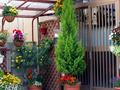
| 05/29/2003 03:45:11 PM | cozy & colorfulby kenboComment: 5. Fits the theme well enough, and there are no blatant \'you suck!\' flaws to it, but neither does it really grab me for any reason at all. For reasons of composition, cropping, or subject choice, it\'s just a photo, and doesn\'t do especially much for me, aesthetically.
The evergreen tree with orange and red flowers at its base seems to be the center of the shot, attentionwise, but the fact that other, relatively similar plants are scattered almost evenly around the rest of the frame is kind of distracting, and doesn\'t add to any one central impression for the shot.
The lighting and color saturation is really good, though. | | Photographer found comment helpful. |
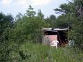
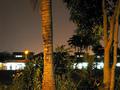
| 05/29/2003 03:41:05 PM | No feeling of belonging... (looking in from the outside)by shadowComment: 5. Fits the theme well enough, and there are no blatant 'you suck!' flaws to it, but neither does it really grab me for any reason at all. For reasons of composition, cropping, or subject choice, it's just a photo, and doesn't do especially much for me, aesthetically.
The similarity of color of tree and sky tends to make the trunks and the glow blend into each other, strangely, and the overbright under-the-overhang areas both rivet the attention and then shove you away with their lack fo detail. IF it were about either of the trees, framed to put them in the center, compositionally, it might be a more interesting shot. If it were about either of the houses, likewise a different framing would have worked better. | | Photographer found comment helpful. |
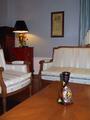
| 05/29/2003 03:39:36 PM | Formal living-roomby cykhansenComment: 5. Fits the theme well enough, and there are no blatant 'you suck!' flaws to it, but neither does it really grab me for any reason at all. For reasons of composition, cropping, or subject choice, it's just a photo, and doesn't do especially much for me, aesthetically. It's, uhm, kind of boring. It does look a little like it'd fit right in in a corner of an article in Better Homes and Gardens, or some other interior design magazine, though.
The color and lighting are nice, and I also like hwo the vase is set at the point where the tabletop's lines converge, but there's really no central thing-to-look-at. The vase might have been central, but it's been arranged far down in a corner, with glare that distracts from its own very busy pattern. The sofas might be, but the lighting makes them fade into the background, largely. The lamp and picture are both off-center enough and unlit enough to not quite be focal points either. | | Photographer found comment helpful. |
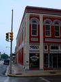
| 05/29/2003 03:37:11 PM | The Antique Flavors of Homeby aimee_skittlesComment: 5. Fits the theme well enough, and there are no blatant 'you suck!' flaws to it, but neither does it really grab me for any reason at all. For reasons of composition, cropping, or subject choice, it's just a photo, and doesn't do especially much for me, aesthetically.
I do like the colors on the building, but the overall tone of the photo seems artificially dark (maybe to keep the sky from being blown out?), as if I'm viewing it through smoky cellophane. Probably due to your lens, the nominally vertical lines of the traffic signal and corner of the building lean to the right as they go up, giving it a slightly vertiginous feel. | | Photographer found comment helpful. |
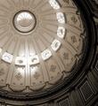
| 05/29/2003 10:12:50 AM | CA State Capital Domeby ChrisW123Comment: Nice detail/lighting/focus, but the overall subject isn't particularly compelling. Maybe a different crop could have drawn the attention to particular architectural details, or something; as-is, the eye just kind of wanders without being drawn to anything especially. | | Photographer found comment helpful. |
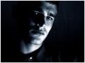
| 05/29/2003 10:11:37 AM | Pensiveby AaronComment: The lighting on the cheek/neck is very harsh, and distracts the attention from his expression. This is a coulda-been-great that is instead just kinda neat. Good concept. Better focus and lighting might well have gotten a 10 from me; as it is, 7. | | Photographer found comment helpful. |
|
Showing 121 - 130 of ~317 |
Home -
Challenges -
Community -
League -
Photos -
Cameras -
Lenses -
Learn -
Help -
Terms of Use -
Privacy -
Top ^
DPChallenge, and website content and design, Copyright © 2001-2025 Challenging Technologies, LLC.
All digital photo copyrights belong to the photographers and may not be used without permission.
Current Server Time: 08/04/2025 07:33:58 PM EDT.
|