| Image |
Comment |
| 11/13/2007 09:23:51 AM |
JJby riversongComment: Nice and simple portrait. Good focus and well composed (although could have had a touch more empty space to the right for a bit more balance). Good choice of warm duotone hue |
 Photographer found comment helpful. Photographer found comment helpful. |
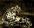
| 11/13/2007 09:05:12 AM |
Spotting the rare. by zxaarComment: In your B&W conversion, if it were possible to give greater seperation between the big cat and the rocks then that would have been better. As it is, the tones of the rocks are very similar. Having the rocks much darker to make the main subject stand out more would have been more dramatic. The head is dead center, composition wise, it maybe would have been better more to the left given it is looking to the right |
| Photographer found comment helpful. |
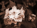
| 11/13/2007 08:57:40 AM |
Blossomby trainComment: Great composition, you main focal point is a third in from the left and this flower head is the brightest point of the image and everything else blurs and fades away from it which is really clever. |
| Photographer found comment helpful. |
| 11/13/2007 08:56:23 AM |
He Loves Meby aimeethetooComment: The border is putting me off, maybe if it was same colour as the deepest colour of image or maybe just a little thinner would have been better IMO. Good focus, like the water droplets and great DOF. |
| Photographer found comment helpful. |
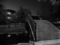
| 11/13/2007 08:55:00 AM |
Elm Parkby holdingtimeComment: Nice and sharp. The light on the left and reflection work well to balance the composition. A slightly wider angle to increase perspective distortion might have made it more dramatic. Could even have cropped out the concrete base of the bridge in the bottom right hand corner to simplify the subject and put more focus on the nice repetetive patterns. Good choice of duotone colour, very subtle |
| Photographer found comment helpful. |
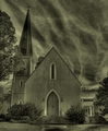
| 11/13/2007 08:51:50 AM |
Closed Doorsby yondermanComment: Nice moody sky enhances the building. Could have maybe increased the levels at the top end in the sky to make it more dramatic. Good symmetry. Possibly a slight ccw rotation during the cropping to square up the steps with the bottom of the frame |
| Photographer found comment helpful. |
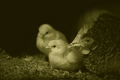
| 11/13/2007 08:49:00 AM |
mother henby StagoleeComment: Could have pumped up the highlights to increase contrast. Good choice of tone for the subject, could maybe have cropped in tighter on the three chickens with some space left of the left hand side |
| Photographer found comment helpful. |
| 11/13/2007 08:47:05 AM |
B&W Border Collieby b4cchusComment: Some people are saying B&W shouldn't count as duotone but I think it should. This is nice and sharp on the eyes, good background blurred and nicely composed |
| Photographer found comment helpful. |
| 11/13/2007 03:34:39 AM |
Bethany - The Goddaughterby SaswaaComment: Indoor flash always produces harsh unsightly shadows on the backdrop. Could have pushed the tonal range harder at the bottom end and given its mono, could have clipped the tonal extremes to make for a more dramatic image |
| Photographer found comment helpful. |
| 11/13/2007 03:30:16 AM |
Magic Takeoutby cannableComment: Nicely lit, not so sure about the composition though, would have lost some of the black space at the bottom and on the right hand side perhaps |
| Photographer found comment helpful. |
Home -
Challenges -
Community -
League -
Photos -
Cameras -
Lenses -
Learn -
Help -
Terms of Use -
Privacy -
Top ^
DPChallenge, and website content and design, Copyright © 2001-2025 Challenging Technologies, LLC.
All digital photo copyrights belong to the photographers and may not be used without permission.
Current Server Time: 08/23/2025 09:21:23 PM EDT.