| Image |
Comment |
| 07/23/2003 06:44:01 PM |
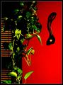
Welsh Love Spoonby BobsterLobsterComment: I think this shot needs something to focus on. I think it is overprocessed a little - the bottom leaves look fake. I think I would like to see this shot with just the red wall and the spoon. just my opinion. |
 Photographer found comment helpful. Photographer found comment helpful. |
| 07/23/2003 06:41:16 PM |
Untitledby tlalondeComment: I am trying to comment on all the photos this challenge, this one i find hard to comment on, I think it is because nothing really strikes me. So I guess my comment would be needs a little more wow factor, in subject choice and maybe in composition. |
| Photographer found comment helpful. |
| 07/23/2003 02:35:43 PM |
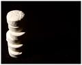
Odd Man Out.by macoxComment: I do like the sharpness(that i can see the texture of the cards), composition and it meets the challenge topic. So technically I think is good. But it is very low in interest, there is nothing that makes me want to 'keep looking' at your photo. I think you have a lot of tecnical skill, maybe need a more interesting subject |
| Photographer found comment helpful. |
| 07/23/2003 02:32:58 PM |
Check That!by justineComment: I think if the blurred part was cropped out it would cause the focued part to get more of my attention and then I would be 'forced" to look at the folds and the lines of the fabric, which I think is the much more interesting part of your shot. I do like how the lower left fold goes into the corner of the shot. just my opinion. |
| Photographer found comment helpful. |
| 07/23/2003 02:28:11 PM |
Alone in the Universeby karmatComment: Well , I like where you placed the subject and the feeling of space around it gives it the 'alone' feel, I am not sure however what that subject is nor do I find it holds my attn. for long. Another words I find it low in wow factor, sorry. I do like the little white speckles. |
| Photographer found comment helpful. |
| 07/23/2003 02:25:25 PM |
Lean twoby JC_HomolaComment: What I do like about your shot is the shadow that looks like a sailboat of sorts, and I also like the way the light hits the left., what I dont like as much is that the subject is too centered, and the objects on left are a bit obscured by the shadow. I like that you tried to do something a little different. |
| Photographer found comment helpful. |
| 07/22/2003 11:47:59 PM |
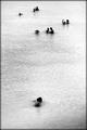
Water Bugsby sjonniComment: The compostion of the clusters of people in the sort of 'empty' water is what I like, interesting too the water is white, nice shades and tones and still did not have any overexposed parts. good job |
| Photographer found comment helpful. |
| 07/22/2003 11:46:04 PM |
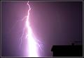
Contrast courtesy of The Heavensby Firstrich1Comment: Good timing and nerves of steal to capture this shot. (I tend to hide under my bed or at least covers when thunder and lightening occur : ) ). Good contrast between the lightening and the dark house. Just curious about the blueish line over the house, is that another lightening strike or a reflection in camera. |
| Photographer found comment helpful. |
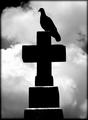
| 07/22/2003 11:43:28 PM |
prey by grigrigirlComment: Great contrasts, in colors and in themes. I like the stark bird and tombstone against the billowing and imposing clouds. This shot could easily be in a horror film to add ambience. Really nice work |
| Photographer found comment helpful. |
| 07/22/2003 11:37:28 PM |
Lines and Swirlsby NatashaComment: The pool of water is a great point of interest IMO. I like your idea with the circles on the bottom but find it a little 'too white', perhaps a slight shade darker? But what do I know. |
| Photographer found comment helpful. |
Home -
Challenges -
Community -
League -
Photos -
Cameras -
Lenses -
Learn -
Help -
Terms of Use -
Privacy -
Top ^
DPChallenge, and website content and design, Copyright © 2001-2025 Challenging Technologies, LLC.
All digital photo copyrights belong to the photographers and may not be used without permission.
Current Server Time: 08/05/2025 12:40:03 AM EDT.