| Image |
Comment |
| 05/14/2003 10:16:24 PM |
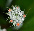
big things, little packageby ellamayComment: Nice sharp macro and well exposed. I think for impact though the image should be cropped more on the left and on the bottom. It's too central IMO. You might even try isolating one of the orange areas, for example the one on the bottom. |
 Photographer found comment helpful. Photographer found comment helpful. |
| 05/14/2003 10:13:34 PM |
African Daisies in a Bed of Fernsby KINGComment: Nice focus on the central part of the flower. For exposure, some of the petals seem overexposed. For composition I think this image would work better is some of the fern was cropped on the right. This would work since the main subject is the centre of the flower and not the entire flower (IMO). |
| Photographer found comment helpful. |
| 05/14/2003 12:45:12 AM |
tulipby UberFishComment: Orange is a stronger colour than purple so for more impact I would have chosen an orange tulip as the center of attention for this image. IIf only one tulip were in focus (shallower DOF) it would add to the impact of the photo as well.
The image is exposed well but the main subject is too central. |
| Photographer found comment helpful. |
| 05/13/2003 07:24:31 PM |
Got Till It's Gone by arnitComment: How many glasses did you have to break to get this one? I would have cropped the image slightly on the left to give more impact. Otherwise well done, 8. |
| Photographer found comment helpful. |
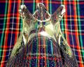
| 05/08/2003 08:28:36 PM |
Vaseby KingLokComment: I like the look of the plaid through the glass and the perspective chosen for this image. the Plaid as a background is very distracting. This shot might have worked better in macro mode since it would be easier to really blur the background. |
| Photographer found comment helpful. |
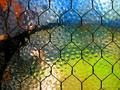
| 05/08/2003 08:20:34 PM |
glassby shutterflyComment: The image as a whole seems dark and there are some areas where the lighting is too harsh. It looks like with more balanced lighting the pattern in the stem could have been brought out. |
| Photographer found comment helpful. |
| 05/08/2003 08:18:45 PM |
|
| Photographer found comment helpful. |
| 05/08/2003 08:09:28 PM |
|
| Photographer found comment helpful. |
| 05/08/2003 08:04:27 PM |
Shaken Not Stirredby frd91gtComment: I like this idea. Either the image is oversharpened or there's a little too much chromatic aberation for my taste. |
| Photographer found comment helpful. |
| 05/08/2003 08:02:52 PM |
3D glass illusionby xertionComment: Excellent composition, well balanced. The exposure could be a little less so the top of the picture is less washed out. |
| Photographer found comment helpful. |
Home -
Challenges -
Community -
League -
Photos -
Cameras -
Lenses -
Learn -
Help -
Terms of Use -
Privacy -
Top ^
DPChallenge, and website content and design, Copyright © 2001-2025 Challenging Technologies, LLC.
All digital photo copyrights belong to the photographers and may not be used without permission.
Current Server Time: 08/01/2025 03:24:37 PM EDT.