| Image |
Comment |
| 07/01/2003 03:18:42 AM |
|
 Photographer found comment helpful. Photographer found comment helpful. |
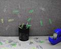
| 06/19/2003 06:28:36 PM |
Erupting Paper Clipsby ladpupmoeComment: *Critique Club*
General: For impact I would have probable chosen different coloured paperclips. Red is a more prominent colour than the green and yellow chosen.
Composition: You'r almost there with the composition. The tape dispenser adds balance though I think the paperclip dispenser is too central horizontally. A different vantage point would adjust this or just including a bit more to the right.
Exposure: The lighting seems a little flat. A little fill flash may have helped. I think if you just exposed it a little more you would blow out the foreground.
Impact: I don't think the vantage point chosen does justice to the image. Maybe shooting more from below and to the left would help here, keeping the same components within the frame.
Keep shooting.
Colette Message edited by author 2003-06-19 18:38:23. |
| Photographer found comment helpful. |
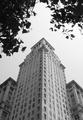
| 06/19/2003 03:40:17 PM |
there it was, in the jungle . . .by tomzinhoComment: *Critique Club*
General: Nice symmetry.
Composition: Framing the image with the tree branch adds interest. The break in the branches matches the corner of the building.
Exposure: My guess is this was taken around midday. The lighting seems to be a bit flat and the building slightly overexposed though you still captured alot of detail at the base. A graduated ND filter might of helped to allow you to expose more for the leaves (to gain detail) without blowing out the sky and building. The framing would probably have been a bit more difficult then. If this could be done I think the image would have more contrast and therefore more impact.
Impact: The perspective chosen here gives the sense of height and therefore adds impact. I always like these types of shots especially when the building is also architectually interesting.
Good effort. Keep shooting.
Colette
|
| Photographer found comment helpful. |
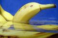
| 06/17/2003 08:57:02 PM |
Milk Bubbles in Oilby ElizaComment: *Critique Club*
First impression: Do you have an underwater (...undermilk) camera? Great angle on this shot.
Composition: I get the feeling that this was taken looking directly up at the bubbles. The only distraction is the small bit of white in the bottom left. If you crop that out on the vertical then the effect is multiplied.
Exposure: The image seems just slightly dark though I think this was probably on purpose so the milk was not so obvious.
Impact: This image has a lot of impact giving the impression of being underwater. More impact I think would be achieve if the small portion of visible milk on the left were cropped out.
Well done. Keep experimenting, no matter how messy things get.
Colette |
| Photographer found comment helpful. |
| 06/16/2003 09:29:57 AM |
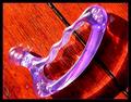
Tool of the tradeby kosmikkreeperComment: *Critique Club*
General: I like how the light hits this object and reflects onto the table. The focus seems to be a little bit off but this could be due to the bright light.
Exposure: IMO it's just a tad over exposed. There are a few points on the object that are totally washed out due to the strong lighting. 1/3 of a stop less might have helped.
Composition: I like the reflection. It looks like a hand trying to grab the object. I think the composition might be better if the entire reflection were included in the image. This might also help with the placement of the object within the frame (not so central). The table is gorgeous but it distracts the viewer from your center of interest. Also, maybe use a background that more relates to the object. This would help place it and give the image some context.
Impact: I had to look at this image for a long time before I was drawn into it. This is probably due to the tight crop. The strong lighting also takes away from the impact of this image. Using a more neutral background would also draw the viewer to the object.
Hope this is what you were looking for. Feel free to disagree with any of it. Remember, photography is very subjective.
Keep shooting and experimenting.
Colette |
| Photographer found comment helpful. |
| 06/05/2003 11:50:56 PM |
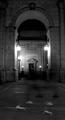
Ghost Travelersby blemtComment: *Critique Club*
General: Interesting effect with the visible shoes and barely visible legs. Also, good choice to shoot this in the vertical position.
Composition: On the most part the composition is good. The narrow view of the arch suits the vertical position of the image though I do feel it is a bit too tight on top. You may have tried standing back further or shooting from a lower vantage point and pointing the camera up slightly. (I know this would have generated some perspective distortion but you could play with the angle to limit this.)
Exposure: The image is quite dark and therefore doesn't show much detail. Depending on what part of the image you want to emphasize you could spot meter on the back wall or the sides of the arch. You might try spot metering in a couple of places and take and average or bracket to see what the effects of your different choices are. To increase the contrast you need more exposure here.
Impact: Unfortunately due to the lack of contrast there is not much punch to this image.
Keep experimenting..... |
| Photographer found comment helpful. |
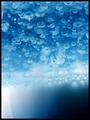
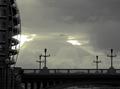
| 06/04/2003 11:45:28 PM |
Just Beyondby mbardeenComment: I came back to finish the critique but for some reason the edit and quote buttons both returned a 404 error. Excuse the dual entries. (I created the quote manually)
Originally posted by cpanaioti:
*Critique Club*
General: Overall I like the choice of subject, clouds. They have a lot of texture.
Composition: This image seems very flat. Unfortunately, due to the tight crop one gets the feeling that the clouds are billowing out of the bridge. More space is required on the bottom and to the right to balance the image. One way to accomplish this is to choose a vantage point that still allows for the photo to be mostly clouds but also includes enough of the bridge to give the image a 3D feel.
Exposure: The clouds could possibly be exposed a touch more to provide more detail. The bridge being under exposed, lacks detail. By using a graduated filter you could have exposed the bridge more without blowing out the clouds. This would reduce the flatness of the image. Using a graduated red filter would both help with exposure as well as with contrast. |
Impact: The clouds caught my eye first but there is not really anything to draw the viewer into the image. The bridge acts as a barrier.
Edit now works again.....
I need to check the brightness of my monitor at home. I'm looking at this again at work and you captured a lot of detail in the bridge though I'd still like to see a bit more of it. I will stick with the suggestion of a graduated filter to keep the sky from getting washed out while allowing a slower shutter speed or smaller aperture.
Well done. Message edited by author 2003-06-05 08:42:23. |
| Photographer found comment helpful. |
| 06/04/2003 10:57:01 PM |
Just Beyondby mbardeenComment: *Critique Club*
General: Overall I like the choice of subject, clouds. They have a lot of texture.
Composition: This image seems very flat. Unfortunately, due to the tight crop one gets the feeling that the clouds are billowing out of the bridge. More space is required on the bottom and to the right to balance the image.
Exposure: The clouds could possibly be exposed a touch more to provide more detail. The bridge being under exposed, lacks detail. By using a graduated filter you could have exposed the bridge more without blowing out the clouds. This would reduce the flatness of the image. Using a graduated red filter would both help with exposure as well as with contrast.
****** not quite done yet, will edit later *****
|
| Photographer found comment helpful. |
| 06/03/2003 09:34:52 PM |
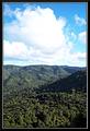
My back yard.by peter_kComment: These types of images tend to work better in lanscape (horizontal) rather than portrait (vertical). Also, it is usually best to put the horizon either 1/3 from the top or bottom and not through the middle. You were probably trying to emphasize the landscape as well as the sky. Choose one and shoot to get that effect. I think in this case more sky would be the best choice due to the interest in the clouds. |
| Photographer found comment helpful. |
| 06/03/2003 09:29:59 PM |
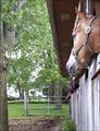
Horses' View of Home Sweet Homeby MarjoComment: Nice idea but I think a different vantage point (higher and to the right) would have served you better. Your camera is not on the same level as the horse's eyes. |
| Photographer found comment helpful. |
Home -
Challenges -
Community -
League -
Photos -
Cameras -
Lenses -
Learn -
Help -
Terms of Use -
Privacy -
Top ^
DPChallenge, and website content and design, Copyright © 2001-2025 Challenging Technologies, LLC.
All digital photo copyrights belong to the photographers and may not be used without permission.
Current Server Time: 08/04/2025 11:41:44 PM EDT.