| Image |
Comment |
| 06/29/2004 09:34:02 PM |
heads or tails ?by zjnztComment: *** Critique Club ***
Composition: The hand and the coin seem to balance well with the black background. There appears to be just enough negative space. Cutting of the arm just above the wrist seems to work for you here due to the context.
Lighting: The lighting appears to be a bit too harsh and/or the white balance is a bit off. The skin tone does not appear natural. It looks a bit too orange. The light appears to be very strong coming from the right.
Exposure: The strong light has created some very strong highlighted areas on both the hand and the coin, however, the overall image appears to be exposed correctly. A slightly different angle for the light may help reduce the strong hightlights and give a more balanced exposure.
Impact: The coin frozen in midair and the hand frozen in the flip position seem to make the image static. A slower shutter speed to catch the motion of the coin and/or the movement of the thumb I believe would portray the sense of choice better and produce more impact.
Keep shooting.
Colette |
 Photographer found comment helpful. Photographer found comment helpful. |
| 06/10/2004 09:48:22 AM |
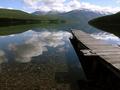
Kintla Lake by jodiecostonComment: Well balanced, well exposed. Must be very early since the water is so still. Great clarity in the reflection. There seems to be a little noise in the sky which is probably due to jpeg compression.
Well done. 10
edit... I had to correct the spelling Message edited by author 2004-06-14 01:06:40. |
| Photographer found comment helpful. |
| 06/10/2004 09:10:28 AM |
Where Skyscraper Meets Skyby waterliliesComment: The clouds blend nicely from sky to reflection, however I think the contrast needs a bit of a boost in the reflection. The pattern of the windows also adds some nice texture to your image. 7 |
| Photographer found comment helpful. |
| 06/09/2004 04:04:17 AM |
|
| Photographer found comment helpful. |
| 06/08/2004 03:37:22 PM |
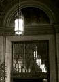
Sun Light, Electric Light, Reflected Light - Still a dark dayby bobdaveantComment: *** Critique Club ***
Bright lights in dark areas can be a challenge depending on the dynamic range. Also, bright areas usually command more of the viewer's attention. I feel most of the interest in this image is in the reflection, however the light in the foreground draws my attention away from it. Also, the plant on the left is a bit distracting.
The top of the image seemss a bit dark. Filling the frame with just the mirror and the detail within may provide more impact, maybe with a higher vantage point. This, to me, is where most of the impact of your image comes from.
Choice of black and white gives your image a nostalgic feel.
Keep shooting.
Colette |
| Photographer found comment helpful. |
| 06/08/2004 10:51:18 AM |
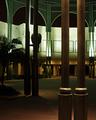
City Hall Courtyardby BradComment: *** Critique Club ***
The soft lighting here sets a nice mood. Also, the blend of colours gives a deserted feel to your image.
Brighter areas tend to draw more attention than darker ones and I think here the light green is competing with the pillars in the foreground. The pillars draw my attention since they are very prominent in the foreground, however the main lit areas keep drawing my attention away. Bringing out more detail in the foreground pillars might alleviate this.
Compositionally, I don't think the palm tree and the light behind add much. Cropping the image just to the left of the pillars next to the palm would balance the image better. Also, a slightly different angle, to make the front entrance more visible might also help with the balance of the image.
Keep shooting.
Colette |
| Photographer found comment helpful. |
| 05/30/2004 02:09:24 AM |
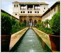
Alhambra Palaceby BobsterLobsterComment: ** Critique Club **
Good use of leading lines. The crop works very well to emphasize the leading lines and eliminate most of what seems to be a bright sky.
A wide range between highlights and shadows is always a challenge to capture. Some of the shadows are lacking detail and some of the hightlights on the right seem a bit blown out, however the overall contrast of the image is good.
The colours look natural and blend together well. The soft focus gives a dreamy feel to the image.
Even though the roofline at the top is level with the edge of the frame, the image still feels a bit tilted to the right.
Keep shooting.
Colette
|
| Photographer found comment helpful. |
| 05/30/2004 01:51:30 AM |
Hello, Grandma?by OneSweetSinComment: ** Critique Club **
Overall I believe you've captured your little boy's expression well and the exposure seems right. The hot spots on his shirt and a small area of the banana are not much of a distraction. The lightest areas of a photo tend to draw the most attention.
Compositionally, I think the image may have worked better in portrait mode, including more of the boys arm would be preferred. One thing I always hear about portraiture is to never cut off appendages at a joint (ie. wrist, elbow, knee etc). Just what I've heard.
The colour desaturation doesn't seem to work since the t-shirt probably has some yellow in it (orange shirt?). The shirt being totally desaturated may have helped with the impact of the image.
Keep shooting.
Colette |
| Photographer found comment helpful. |
| 05/28/2004 12:28:17 AM |
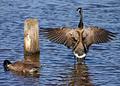
Rear viewby Dim7Comment: This is a great capture. The timing had to be just right. However, the goose on the left does not add to the composition. 7 |
| Photographer found comment helpful. |
| 05/24/2004 08:43:07 AM |
Got Milk?by NeuferlandComment: Sharp and well exposed, however a little more of an angle on the jug (showing more of the side on the left) may have worked better. 6 |
| Photographer found comment helpful. |
Home -
Challenges -
Community -
League -
Photos -
Cameras -
Lenses -
Learn -
Help -
Terms of Use -
Privacy -
Top ^
DPChallenge, and website content and design, Copyright © 2001-2025 Challenging Technologies, LLC.
All digital photo copyrights belong to the photographers and may not be used without permission.
Current Server Time: 08/06/2025 08:46:48 PM EDT.