| Image |
Comment |
| 01/27/2006 09:55:03 PM |
Connectedby just-marriedComment: Good capture however I feel it would have more impact if the child were more of a silhouette. |
 Photographer found comment helpful. Photographer found comment helpful. |
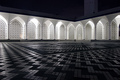
| 01/25/2006 12:54:36 AM |
Shah Alam - Blue Mosqueby henry_buckleComment: As much as the patterns really draw the viewer in, the image seems to be missing something. Maybe if a person were walking along one of the corridors at the top of the image it would have more appeal. 7 |
| Photographer found comment helpful. |
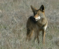
| 01/25/2006 12:24:35 AM |
Cayote (Not Ugly)by ZippyComment: (it's actually coyote)
The coyote is well placed within the frame though the image seems a bit too bright to me. |
| Photographer found comment helpful. |
| 01/23/2006 03:19:11 PM |
|
| Photographer found comment helpful. |
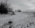
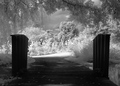
| 01/21/2006 03:25:45 AM |
Travel The Path To ???by chadbComment: Nice leading line with the path however I think the image is underexposed. The snow looks a bit too grey. Snow will fool the cameras meter so you need to dial in some exposure compensation. For this amount of white in the picture you could probably get away with +1 to +1.5. |
| Photographer found comment helpful. |
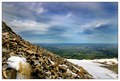
| 01/19/2006 11:46:06 PM |
Canterbury Plains Vistaby SimonjwComment: The distant plains are nice and sharp and the colour offers nice contrast to the foreground hill however I feel the foreground hill takes up too much space in the image. A slight shift to the right and a lower perspective could possibly help. This would also help move the horizon from the center.
There are interesting patterns in the fields as well as in the sky so framing to emphasize either one would work very well. |
| Photographer found comment helpful. |
| 01/19/2006 11:41:16 PM |
|
| Photographer found comment helpful. |
| 01/19/2006 11:37:07 PM |
At the Tomb of the Unknown Soldierby KaDiComment: The point of view is interesting however the crop makes the image feel awkward. This could be due to the crop right at the elbows. Slightly less tight on the top and right I think would work better. 7 |
| Photographer found comment helpful. |
| 01/17/2006 11:21:45 PM |
Into the Lightby pearlseyesComment: An image that doesn't need a title. Before I saw your title I was thinking exactly what it says. One thing though, I think a bit of fill flash to bring out some of the dark areas in the foreground would improve the image. |
| Photographer found comment helpful. |
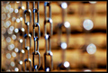
| 12/25/2005 01:43:59 PM |
Raining Chainsby MAKComment: Great pattern from the chains and the sparkle however I think this may have worked better in a vertical format to emphasize the linear aspect of the chains. |
| Photographer found comment helpful. |
Home -
Challenges -
Community -
League -
Photos -
Cameras -
Lenses -
Learn -
Help -
Terms of Use -
Privacy -
Top ^
DPChallenge, and website content and design, Copyright © 2001-2025 Challenging Technologies, LLC.
All digital photo copyrights belong to the photographers and may not be used without permission.
Current Server Time: 08/16/2025 04:36:07 PM EDT.