| Image |
Comment |
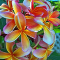
| 02/07/2006 08:29:31 PM |
Frangipani Bouquetby sherpetComment: Yellows and reds are a couple of the hardest colours to get right. A lot depends on the lighting. There's some nice soft light falling on these rendering the colour very well. None of the areas seem over exposed.
Compositionally I think the image may be a bit cluttered however if you play with different angles, from below, from a different side, you may come up with something that works with the clutter. The flower in the lower right may be one to try a lower angle on. |
 Photographer found comment helpful. Photographer found comment helpful. |
| 02/07/2006 01:18:59 PM |
selfpby polkopComment: It is an interesting composition and there is plenty of detail on the left side of the face despite the overall darkness of the image. One thing that I think would improve it though is to crop the right side of the image off right at the point it goes from detail to darkness (center of the nose). Just a thought. |
| Photographer found comment helpful. |
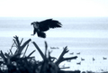
| 02/06/2006 01:08:22 PM |
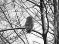
Returning from the huntby jbsmithanaComment: First impression: focus seems a little soft but not distracting
Composition: The direction of the bird leads the viewer out of the image rather than into. I realize that the ducks on the lake were included intentionally however if the eagle were facing the other way the image would be stronger. Also, the blurry log in the foreground is a bit distracting.
Exposure: The dark areas are a little blocked up so the image could possibly benefit from a touch more exposure. (this could be due to resizing as well)
Impact: More impact could have been achieved if the eagle were leading the viewer into the image rather than out.
BTW, I scored this a 6. |
| Photographer found comment helpful. |
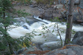
| 02/05/2006 10:59:02 AM |
Rapids in the Woodsby JEFFJSBComment: *** Critique Club ***
First impressions: Water has a nice silky feel without really blowing out any of it.
Composition: The position of the rocks and the tree on the left are the strongest parts of the composition. Though there is one branch from the left and a sapling on the right of the frame that are a bit distracting since they are blocking the view to the water.
Exposure: This looks like a tough lighting situation. I think the silky feel of the water is what you were going for so in that regard the exposure seems right with only a couple of spots that look blown out. However other parts of the image seem underexposed.
Post processing may help bring out detail in the shadows a bit more.
Impact: Some impact is present from the feel of the water. For more impact, framing the water a bit better with the trees and bringing out more detail in the shadows I think would help.
Creating these kinds of effects in running water is always fun. Keep experimenting and have fun.
Colette |
| Photographer found comment helpful. |
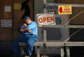
| 02/04/2006 02:53:57 PM |
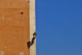
Open For Businessby BRCPRESComment: I love how his pose matches somewhat the figure on the door. The image seems a bit out of balance though with the empty space on the right. |
| Photographer found comment helpful. |
| 02/01/2006 08:03:56 PM |
Seagullby GuGiComment: I like the idea however the gull seems too blown out. |
| Photographer found comment helpful. |
| 01/31/2006 03:33:42 AM |
|
| Photographer found comment helpful. |
| 01/30/2006 10:38:33 PM |
Mediterranean Afternoonby saiphfireComment: Nice colours and amazing luck to have included the bird, however I feel the image is out of balance. The gold area has some nice texture to it however the blue area is too flat and uninteresting to add much to this image. Cropping most of the blue (not all) so that it is about half the width of the gold I think would make for a much stronger image. |
| Photographer found comment helpful. |
| 01/28/2006 10:07:15 AM |
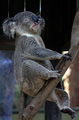
My Best Sideby roadrunnerComment: Nice pose however the three bright lines make the koala look like a marionette. Since this challenge allowed advanced editing, cloning them out would have been an option. |
| Photographer found comment helpful. |
| 01/28/2006 09:53:48 AM |
|
| Photographer found comment helpful. |
Home -
Challenges -
Community -
League -
Photos -
Cameras -
Lenses -
Learn -
Help -
Terms of Use -
Privacy -
Top ^
DPChallenge, and website content and design, Copyright © 2001-2025 Challenging Technologies, LLC.
All digital photo copyrights belong to the photographers and may not be used without permission.
Current Server Time: 08/16/2025 02:53:59 PM EDT.