| Image |
Comment |
| 03/06/2008 08:31:53 AM |
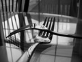
Intimateby minjazComment: too many lines. the chair, the railing, the window, the reflection of each on the table. |
 Photographer found comment helpful. Photographer found comment helpful. |
| 03/06/2008 08:21:30 AM |
|
| Photographer found comment helpful. |
| 03/05/2008 08:12:55 PM |
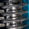
Wrench Works Parking Ramp at Sunset :Pby JMartComment: it is so hard to get the exposure correct without getting those blown out spots on a metalic finish (see my lighter macro, same thing.) I really like the crop you used. Not a fan of the light blue background, but thats just my opinion. |
| Photographer found comment helpful. |
| 03/05/2008 12:20:04 AM |
|
| Photographer found comment helpful. |
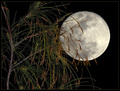
| 03/04/2008 08:16:39 PM |
Pine Tree and Full Moonby senor_kasperComment: did you use two bracketed photos with different FOCUSes??? I like it, but something about the harsh contrast between the pine and the black sky keeps me from loving it. |
| Photographer found comment helpful. |
| 03/04/2008 08:09:24 PM |
Dreaming of Springby jpochardComment: pretty flowers, but the harsh lighting difference between the sunshine and shadows isn't helping. |
| Photographer found comment helpful. |
| 03/04/2008 08:05:29 PM |
Sunsetby iyadrallyComment: I'm not sure what you did to light your model, but it makes the background look like a paper backdrop.(is it?) Also the horizon line in the BG appears to be tilted. |
| Photographer found comment helpful. |
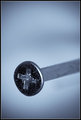
| 03/04/2008 09:29:12 AM |
Mar 04.jpgby Mr_PantsComment: very sharp throughout the head of the screw. too much negative space at the top for my taste, although opening it up more to the right may have minimized that. I think i just suggested a square crop. ;) |
| Photographer found comment helpful. |
| 03/04/2008 09:21:54 AM |
the nose knowsby ShutterPugComment: great detail on the upper portion of the photo, however i do believe that if you are going to occupy the entire photo with the nose you should try to have the whole nose in focus. |
| Photographer found comment helpful. |
| 03/04/2008 08:26:35 AM |
|
| Photographer found comment helpful. |
Home -
Challenges -
Community -
League -
Photos -
Cameras -
Lenses -
Learn -
Help -
Terms of Use -
Privacy -
Top ^
DPChallenge, and website content and design, Copyright © 2001-2025 Challenging Technologies, LLC.
All digital photo copyrights belong to the photographers and may not be used without permission.
Current Server Time: 08/27/2025 08:11:27 PM EDT.