| Image |
Comment |
| 07/08/2009 01:17:34 AM |
|
 Photographer found comment helpful. Photographer found comment helpful. |
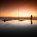
| 07/06/2009 01:26:05 AM |
Sunday Evening BMXby QikiComment: I have had BMX freestyle images published in a couple of different BMX magazines, so I hope this helps a bit. Your shote is panned fairly well, but I think that the big problem with your image is the subject matter. BMX/freestyle is a great subject, but timing plays a huge part in creating a memorable shot. When a person is shooting an action sport, the goal is (usually) to capture the participant at the peak of action. The rider in your shot is riding up the transition, he's preparing to jump into the air (or do a grind) which would make a much more interesting photo than what he is doing in this shot. That's just my quick two cents on your shot, if you have any more questions, feel free to PM me.
Quad
|
| Photographer found comment helpful. |
| 07/04/2009 08:25:40 AM |
Gardens and Cosmosby DistantColoursComment: The subject is an amazing fit to this challenge, and executed perfectly. I can't stop starting at this shot...top 3 in my book. |
| Photographer found comment helpful. |
| 07/04/2009 08:24:04 AM |
waiting...by halopesComment: Very well thought out and executed image, my choice for top three to be sure. |
| Photographer found comment helpful. |
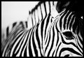
| 07/04/2009 08:21:31 AM |
Stripesby em3Comment: Incredible shot. The subject, composition, adherence to theme and DoF are all very well done, I really love this picture. |
| Photographer found comment helpful. |
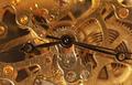
| 11/19/2004 05:33:41 AM |
Too litttle timeby tristaliskComment: Greetings from the critique club!
A few of the things I’ve noticed have already been commented on, but I’ll still mention them along with what I feel are acceptable solutions to the issues.
The first thing I noticed was the softness of the clocks inner workings. The intricate golden metal screams for sharp detail and while I can see some of that detail, it isn’t quite as sharp as it deserves to be in my opinion. This appears to be caused by a fairly shallow depth of field (DOF) which keeps the hands sharp, but drops off from there. While a shallow DOF works in some situations, it seems a bit distracting with this particular subject. I’m not sure what your f-stop was set to, but by opening it up a bit more (larger number) and adding a bit more light you would create a deeper DOF and easily get the whole image in focus.
Another thing that I noticed (which could also effect the sharpness), is the lack of contrast in the golden inner workings. I see light and medium tones, but nothing that gives this image a nice dark contrast to the lighter tones. By stopping down as mentioned above and moving the light a bit further left, you could increase the contrast on the edges and within the inner workings. It looks like you might have had a reflector or fill light filling in the shadows; you could decrease this a bit as well. I guess experimentation would tell if my suggestions are pertinent to your image or not.
One more thing that noticed right away was the fact that the tip of the minute & second hand were cut off. It’s an unwritten rule that most clocks or watches be set at 10:10, I have no idea why, but this would have helped keep all of your hands in the image while keeping it fairly well balanced. For some examples of what I’m talking about, check out ROLEX and TIMEX for examples.
I have to say that I really like the fact that you centered the subject, normally people would try to mess around with the “rule of thirds”, but I’m glad you didn’t. Overall, with a few minor adjustments, this could easily be ribbon material, nice work!
I hope this helps,
Quadrajet
|
| Photographer found comment helpful. |
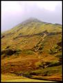
| 11/17/2004 05:31:13 AM |
Novembers free study of colloresby DufusComment: Greetings from the Critique Club!
The first thing that stuck me about this shot was the odd combination of yellow, green and orange. Apparently some rain came through (water running down the mtn) and saturated the dead and living grass to give you those great colors! The centered composition of your shot works well for what you’re given. I like the way the clouds slightly obscure the top while giving some atmospheric perspective to the upper quarter of the mountain. The small streams working their way down the mountain side adds a great dimension to the shot.
Someone mentioned the border being out of place. I don’t necessarily think the border is out of place, just a bit thick. Perhaps a border half the pixel width would get the job done without overpowering the image?
Truthfully, there isn’t a lot in this shot for me to critique, other than the border, I think this is a fantastic shot.
Quadrajet
|
| Photographer found comment helpful. |
| 11/17/2004 03:33:22 AM |
black and whiteby visaksenComment: It looks like this shot wasn't desaturated, as I can still make out some color in it. |
| Photographer found comment helpful. |
| 10/25/2004 03:39:04 AM |
|
| Photographer found comment helpful. |
| 04/08/2004 12:05:24 AM |
|
| Photographer found comment helpful. |
Home -
Challenges -
Community -
League -
Photos -
Cameras -
Lenses -
Learn -
Help -
Terms of Use -
Privacy -
Top ^
DPChallenge, and website content and design, Copyright © 2001-2026 Challenging Technologies, LLC.
All digital photo copyrights belong to the photographers and may not be used without permission.
Current Server Time: 07/15/2026 12:57:49 PM EDT.