| Image |
Comment |
| 11/11/2008 08:16:35 AM |
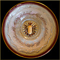
One A Day (Ca, P, I, K, Mn, Cr, Mg, Zn, Se, Cu, Cl, Mo, B, Ni, Si, V, Fe)by JuliBocComment: Nice image, but it took me a minute to realize that there was a tablet in the middle.... |
 Photographer found comment helpful. Photographer found comment helpful. |
| 11/11/2008 08:15:33 AM |
|
| Photographer found comment helpful. |
| 11/11/2008 08:15:10 AM |
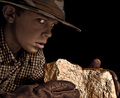
Hunter's Goldby DrPhotoComment: I like the image and composition. The first thing that strikes me is the glare off the "rock"...it distracts. Also, I think it would have been better if his eyes were toward the rock rather than toward the lens....too much white in the eyes. |
| Photographer found comment helpful. |
| 11/05/2008 08:17:12 PM |
|
| Photographer found comment helpful. |
| 11/04/2008 04:45:56 PM |
|
| Photographer found comment helpful. |
| 11/04/2008 04:42:18 PM |
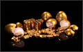
Growthby rinacComment: Money tree? For me this has too much dead space and the money is so small that the message is lost. There seems to be a light stripe down the image. Perhaps a spot would have been better? A little more contrast might have helped as well. |
| Photographer found comment helpful. |
| 11/04/2008 04:41:05 PM |
Good, Clean Moneyby colorcarnivalComment: Nice idea, it looks like you have the focus and exposure down well. There is a bit of glare on the quarter. For me, I guess the composition and the impact of the image aren't sufficient to drive the score high. |
| Photographer found comment helpful. |
| 11/04/2008 04:39:32 PM |
|
| Photographer found comment helpful. |
| 11/04/2008 04:38:53 PM |
What money can buyby justamistereComment: You may suffer some DNMC voting with this....I haven't. The image is well exposed and focused, but lacks the zing or message to give it a higher score. |
| Photographer found comment helpful. |
| 11/04/2008 04:37:50 PM |
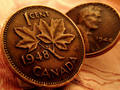
If They Could Just Tell...by gg3rdComment: I like the color tone to this image and the focus on the coin is very nice. Good choice of background color. I would have liked a little more room for the coins in the image (edges clipped). |
| Photographer found comment helpful. |
Home -
Challenges -
Community -
League -
Photos -
Cameras -
Lenses -
Learn -
Help -
Terms of Use -
Privacy -
Top ^
DPChallenge, and website content and design, Copyright © 2001-2025 Challenging Technologies, LLC.
All digital photo copyrights belong to the photographers and may not be used without permission.
Current Server Time: 08/25/2025 05:47:57 AM EDT.