| Image |
Comment |
| 11/17/2008 01:48:10 PM |
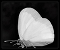
At the Heart of Natureby SandyPComment: Where are the legs....strikes me as a little odd without legs. I like the idea and a nice image, but a little flat....but the heart might not come out in color. |
 Photographer found comment helpful. Photographer found comment helpful. |
| 11/17/2008 01:47:07 PM |
Cuore Dolceby h2Comment: nice image, well exposed, well light, it strikes me as a little dark, but other than that it is great. |
| Photographer found comment helpful. |
| 11/17/2008 01:04:08 PM |
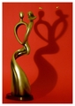
Now and forever with all my heart :)by FocusPointComment: Had this been an image of a statue, it would not have scored well, but converting it into a shadow was a novel idea and it comes off very well. I like the red background as well. A little more DOF might have helped, but this is being really picky. |
| Photographer found comment helpful. |
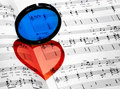
| 11/17/2008 01:02:37 PM |
Heart full of colorsby sekarmalathyComment: Unique idea, wonderful color, good composition, good lighting.....no complaints from me on this one (and I have had improvement comments on every image except this one so far) |
| Photographer found comment helpful. |
| 11/17/2008 01:01:30 PM |
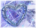
Mirror Heartby naomikComment: having seen others try to photography sparkling objects...very good job on the light management. The thing that hurts it for me is the background...a colored cloth, black cloth, a loving face or something like that in the background would have pumped this up. |
| Photographer found comment helpful. |
| 11/17/2008 12:59:49 PM |
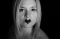
the voice of my heartby magenmarieComment: Technically a strong image, good lighting. For me somehow and I can't define it, the placement of the subject in the image doesn't feel right. I don't have problems with cropped heads, but somehow this doesn't work for me. Maybe an angle on the face or a vertical image would have appealed to me more. |
| Photographer found comment helpful. |
| 11/17/2008 12:57:52 PM |
Heart of Darknessby chaliceComment: The play of dark and light and the extent of the contrast between them is very nice. It would have been stronger if the heart image were more evident. I might have cropped it a little tighter. |
| Photographer found comment helpful. |
| 11/17/2008 12:56:40 PM |
The Prisonerby PrashComment: Use of the shadows and the idea of a jail is cute, although the cup's role is only as carrier of the heart....somehow it isn't singing to me. I would have liked the cup further down in the image...there is a lot of area that is out of focus in the image. |
| Photographer found comment helpful. |
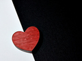
| 11/17/2008 12:54:34 PM |
Heartby ElaineComment: Simple, well exposed, the shadow to the left of the heart adds to the image, it perhaps lacks some crispness because of texture of the black cloth and the wood on the box. |
| Photographer found comment helpful. |
| 11/17/2008 12:53:39 PM |
Laylaby TrollManComment: I like this and like the way the filter color turns into red. There is nothing to criticize in the image, but as you know others have used it before so you will lose some originality points. |
| Photographer found comment helpful. |
Home -
Challenges -
Community -
League -
Photos -
Cameras -
Lenses -
Learn -
Help -
Terms of Use -
Privacy -
Top ^
DPChallenge, and website content and design, Copyright © 2001-2025 Challenging Technologies, LLC.
All digital photo copyrights belong to the photographers and may not be used without permission.
Current Server Time: 08/25/2025 11:54:14 PM EDT.