| Image |
Comment |
| 05/03/2007 02:21:44 PM |
|
 Photographer found comment helpful. Photographer found comment helpful. |
| 05/03/2007 02:19:09 PM |
Surreal Landscapeby ShamanComment: Rarely do I like this kind of thing - this is one of the times I do. The bright color is jarring, but because it's just one color it works. Very moody sky. I think of dry storms on the great plains; it looks like rain is needed but it just won't fall. |
| Photographer found comment helpful. |
| 05/03/2007 02:16:58 PM |
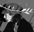
Oliveby sevComment: what I like:
This picture has almost a screen print feel, from the posterization. Reminds me of soviet-era artwork, which I've always liked.
But...
she seems a bit crowded by the composition; she's looking off screen but there's not room in front of her. Also I find the branch (an olive branch? could be...) as the brightest thing distracting. |
| Photographer found comment helpful. |
| 05/03/2007 02:10:49 PM |
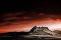
Light up the Skyby karinnComment: Very cool - what's the lightsource for the mountain/hill there? I might consider editing the star trails back to points, but that's me. |
| Photographer found comment helpful. |
| 05/03/2007 02:09:00 PM |
Waiting for the Windby ElaineComment: I absolutely love this. The pale greeny tinge in parts is great; the way the seeds seem to just float - amazing. No complaints. 10. |
| Photographer found comment helpful. |
| 05/03/2007 01:35:42 PM |
Not so ugly ducklingsby silverscreenComment: Pros:
They're adorable! Hard to beat baby ducks for cuteness.
Color, detail, lighting, all great.
The ripples on the water really communicate the bouncy, frenetic swimming baby ducks are wont to do.
Cons:
I'd like a little more space to the right, so the little guys have someplace to swim to! Also (and I almost hate to say it) but the fella at the top left is just a skosh out of focus. |
| Photographer found comment helpful. |
| 05/03/2007 01:30:46 PM |
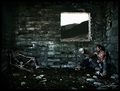
Abandonedby LalliSigComment: "Alas, poor Yorick! I knew him, Horatio; a fellow of infinite jest, of most excellent fancy."
Nice and creepy! |
| Photographer found comment helpful. |
| 05/03/2007 01:28:53 PM |
|
| Photographer found comment helpful. |
| 05/03/2007 01:27:29 PM |
Salvationby nicklevyComment: Nice color, texture, and tonal depth, I like the angle a lot (diagonals in composition and all). My biggest complaint is that the "aura" be a little softer and more subtle; it would look less "processed" that way. Also I'd continue the dodging clear to the edge of the frame on and around the building... |
| Photographer found comment helpful. |
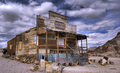
| 05/03/2007 01:24:51 PM |
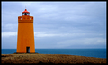
Mercantileby LanceWComment: Ooh, it's for sale! Looks like a bad investment.
Wonderful colors, great sky treatment (is this HDR? must be). The wide-angle effect is always a winner for me, as are scenes of desolation and decay.
If it were my photo, I'd provide a little more negative space around it, to show the building as small in the hugeness of nature. But that's my tastes... 9. |
| Photographer found comment helpful. |
Home -
Challenges -
Community -
League -
Photos -
Cameras -
Lenses -
Learn -
Help -
Terms of Use -
Privacy -
Top ^
DPChallenge, and website content and design, Copyright © 2001-2025 Challenging Technologies, LLC.
All digital photo copyrights belong to the photographers and may not be used without permission.
Current Server Time: 06/19/2025 08:04:10 AM EDT.