| Image |
Comment |
| 10/25/2005 08:21:27 AM |
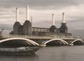
Bygone Eraby AlexSaberiComment: Interesting shot. The grain is very subtle, but there. It almost shouldn't quite work. But it does make me start thinking art deco. Which evokes the mood, which is part of what makes grain cool. :) The crane to the left is a smidge distracting and might benifit from cropping out. Otherwise, very neat image. 7 |
 Photographer found comment helpful. Photographer found comment helpful. |
| 10/25/2005 08:16:38 AM |
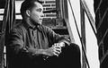
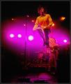
Missing Youby toddheadComment: This has a great 50s feel to it. The grain is almost too subtle here. That keeps it just shy of and 8. Nice pose, great pensive look. 7 |
| Photographer found comment helpful. |
| 10/25/2005 08:12:04 AM |
Echo of a Time Gone Byby trtfeasorComment: Good idea, but the grain here looks more like noise than grain. Which I'm sure makes no sense. :) Hmmm, okay, better explination. The sky noise/grain stands out in a way that is visually unappealing. I'm thinking it's a color conversion issue. Possibly a different quadtone conversion would give the same impact....wait, just figured it out. There's a bit of a hint of the green in the sky noise. This makes it less grainy and more noisy...and you are still looking at me like I'm smoking crack. Sorry. :) 6 |
| Photographer found comment helpful. |
| 10/25/2005 07:32:21 AM |
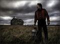
Desolation by Joey LawrenceComment: The grain is highly effective here, but the figure in the foreground is overly sharp. When/if you repost process this one it might help to not sharpen him when sharpening the rest of the image. Very cool shot. 7 |
| Photographer found comment helpful. |
| 10/25/2005 06:33:29 AM |
Rock On!by arnitComment: One of the few examples of color grain that I've seen in this challenge that works. Very nice. |
| Photographer found comment helpful. |
| 10/25/2005 05:59:59 AM |
|
| Photographer found comment helpful. |
| 10/25/2005 05:58:57 AM |
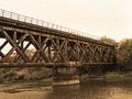
Guiding Lightby gsalComment: Interesting approach here. It's got a very gothic feel to it. It's a bit too centered for me. I'd move a bit to get more of the building or the light on a thirds line. |
| Photographer found comment helpful. |
| 10/18/2005 02:21:08 AM |
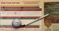
First Aceby jimmspComment: This image ends up being a bit two dimensional for me. I would consider trying to reshoot at an angle, possibly a table with some green visable behind the card to give the illusion of a putting green. |
| Photographer found comment helpful. |
| 10/18/2005 02:19:55 AM |
|
| Photographer found comment helpful. |
| 10/18/2005 02:15:41 AM |
Nature's Proudestby elsapoComment: Nice bokeh, excellent macro. Not sure that it convays the challenge topic strongly enough for me. Still a wicked cool macro though. As is 6, stronger connection to the topic would put it at a 9. Awesome shot. |
| Photographer found comment helpful. |
Home -
Challenges -
Community -
League -
Photos -
Cameras -
Lenses -
Learn -
Help -
Terms of Use -
Privacy -
Top ^
DPChallenge, and website content and design, Copyright © 2001-2025 Challenging Technologies, LLC.
All digital photo copyrights belong to the photographers and may not be used without permission.
Current Server Time: 07/30/2025 12:38:46 PM EDT.