| Image |
Comment |
| 08/03/2006 08:00:06 PM |
Ahhhhh... Hot Rock Massageby SunnieeComment: Great interpretation of zen, but the white things in the background and the towel are distracting. Also the rocks don't seem quite sharp. And last but not least, the skin color looks very unnatural. |
 Photographer found comment helpful. Photographer found comment helpful. |
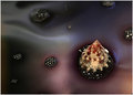
| 07/24/2006 11:36:31 PM |
|
| Photographer found comment helpful. |
| 06/26/2006 06:31:20 PM |
Lavaby smilebig4me1xComment: Like this one a lot too, excellent lighting and subtle gradients of color. Only thing I might have tried different would be to angle the camera such that the tip and the base of the shell were both inside the narrow DOF. |
| Photographer found comment helpful. |
| 06/26/2006 06:28:05 PM |
Virulence in Purpleby smilebig4me1xComment: This one is my favorite of the 11 you posted. The blue glow just gives you such an immediate sense of wonder, makes you want to know what's inside that shell. I don't think the other colors work as well simply because they provide less of a color-contrast. That being said, I'd prefer this image with more texture on the outside of the shell and less of a sharpening halo. Did you use a good bit of NeatImage/NoiseNinja? Finally, a bit of a contrast kick at the bright end of the curve might make the image stronger still. |
| Photographer found comment helpful. |
| 06/05/2006 12:29:33 PM |
Nude Study 5by MakkaComment: I'm much more fond of your #4 from this shoot. I think it's her expression that's bothering me. Because she is closer, you can read her expression much better, but all it's telling me is "how much longer do I have to hold this smile?!?". Having her look into the camera would probably have helped too. |
| Photographer found comment helpful. |
| 06/05/2006 12:23:46 PM |
Nude Study 4by MakkaComment: Very classy! I really can't think of obvious ways to improve the photo. I do agree though that with such a lovely face, it would have been better if she inched her shoulder down a bit so we'd see her chin. Also cropping half of the empty space above her leg might emphasize the angular composition more. But all in all, a truly professional looking shot. |
| Photographer found comment helpful. |
| 06/04/2006 11:53:18 AM |
The Sculpture´s Domeby gsalComment: Brilliant idea. The flat white gives a definite 2D feel, which sets up tension with the obvious 3D curvature of the windows. Ã�smundarsafn in ReykjavÃk? |
| Photographer found comment helpful. |
| 06/04/2006 11:49:23 AM |
|
| Photographer found comment helpful. |
| 06/04/2006 11:46:55 AM |
|
| Photographer found comment helpful. |
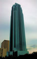
| 06/04/2006 11:45:09 AM |
Williams Towerby CamComment: I like the subtle color gradients, but not the over-sharpened look |
| Photographer found comment helpful. |
Home -
Challenges -
Community -
League -
Photos -
Cameras -
Lenses -
Learn -
Help -
Terms of Use -
Privacy -
Top ^
DPChallenge, and website content and design, Copyright © 2001-2025 Challenging Technologies, LLC.
All digital photo copyrights belong to the photographers and may not be used without permission.
Current Server Time: 08/06/2025 09:46:01 PM EDT.