| Image |
Comment |
| 11/27/2007 10:41:03 PM |
|
 Photographer found comment helpful. Photographer found comment helpful. |
| 11/27/2007 10:41:01 PM |
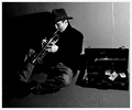
Mean Street Smartsby Herblacklist12Comment: Bumping to 10. Excellent challenge interpretation. Street smarts is the first thing this image makes me think of. The blur and blown highlights somehow add to the non-conventional feel. That's what the street is about, right? Like the off-centered composition as well. My choice for blue ribbon. |
| Photographer found comment helpful. |
| 11/27/2007 10:41:00 PM |
|
| Photographer found comment helpful. |
| 11/27/2007 10:35:57 PM |
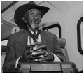
An Ingenious Gentleman Of Our Days by nutzitoComment: Very good portrait, seems to capture the essence of the individual. I don't normally like a point of view from below the face, but here it seems to work well. |
| Photographer found comment helpful. |
| 11/27/2007 10:33:23 PM |
In My Hood - Ode to 50 Centby elizadebComment: Very good challenge rendition, facial expression and contrast with the t-shirt. There's something about it that I don't really like... I think it's the background with it's dominating mid-tone gray. |
| Photographer found comment helpful. |
| 11/27/2007 10:29:52 PM |
Walking to work.. And loving every second of it!by Graeme44Comment: Wouldn't normally care for the blown sky, or the cut-legs composition, but matches the challenge perfectly so a high score from me. Suggestion for blown overcast sky: convert to black & white. The colored stripes steal too much attention from the face anyway. |
| Photographer found comment helpful. |
| 11/27/2007 10:15:05 PM |
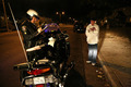
Bustedby TomComment: The street is here, not sure where the smarts are :) Good candid. |
| Photographer found comment helpful. |
| 11/15/2007 11:34:29 AM |
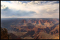
Big Bowlby HoserComment: Hmmmm - excellent! Magnificent sky - that really makes the photo! Very often people forget when shooting landscapes that one of the crucial elements is... the sky.
I agree with previous comment that horizon should not be in the middle - I've made that mistake myself many times. Now the problem is - where do you move it, up or down? You don't want to cut out the canyon, but you don't want to crop that great sky either! Tough choice, I guess maybe on the spot, through the lens, it's easier to make this decision.
Yes, colors are muted and hazy, but I don't think there is anything you could have done differently photographically - this is properly exposed. Any more and you would have blown out the sky. So either shoot at a different time of day (not easy, it's not like this view is from your backyard, I know) or maybe a GND filter?
Now, this problem can be somewhat solved in Photoshop. I will give it a quick go later and see if the beautiful tones and textures in the rock can be brought back to life.
Great shot.
Matei
Edit: oh, and the close-up rock in the bottom left contributes more to the balance and "impact" of the image than it would seem at first glance. Message edited by author 2007-11-15 11:35:19. |
| Photographer found comment helpful. |
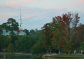
| 11/14/2007 09:19:04 PM |
Lake Ella Churchby bennettjamieComment: I actually like the composition here quite a bit... I think the church the upper left is balanced by the strong reds in the tree in the bottom right. Unfortunately, the church spire gets lost a bit in the sky, which is about the same intensity.
Again - tough scene to expose properly. Trees are a bit underexposed (no other way to get the sky in right). Plus the lighting on the trees is a bit "flat" which is a pity given the nice colors. I would suggest bringing the trees back with Levels adjustement in Photoshop. I also enhanced the contrast on the church a little bit, not entirely sure that worked well though:
 Message edited by author 2007-11-15 10:11:42. Message edited by author 2007-11-15 10:11:42. |
| Photographer found comment helpful. |
| 09/12/2007 09:55:45 AM |
|
| Photographer found comment helpful. |
Home -
Challenges -
Community -
League -
Photos -
Cameras -
Lenses -
Learn -
Help -
Terms of Use -
Privacy -
Top ^
DPChallenge, and website content and design, Copyright © 2001-2025 Challenging Technologies, LLC.
All digital photo copyrights belong to the photographers and may not be used without permission.
Current Server Time: 06/17/2025 02:19:34 AM EDT.