|
|
| Image |
Comment |
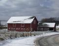
| 01/26/2003 04:09:51 PM | THE BARN IN GLENWILLOWby STEINRComment: Critique Club Critique
(1) COMPOSITION (CONTENT) – If the subject was only the barn, then this is very good. However, for a landscape shot, you have the barn too large and prominent in the photo. This would have been much better if you expanded the photo on the right side, keeping the barn on the left side. Then, with the apparent downhill slope, the eye would start on the left, and follow the road and fence down and right. I don’t mind the centered horizon, as the barn is below center.
(2) BACKGROUND – The cloudy skies are a nice plus to this shot.
(3) CAMERA WORK ,TECHNICAL – Focus and DOF are good. Given the shutter speed you posted, you had more room to pick a smaller aperture (eg f/22) and get better DOF. I don’t know if your camera has an exposure compensation feature you should have used (see below).
(4) DIGITAL PROCESSING ,TECHNICAL – I think this should have brightened in Photoshop ( or the like) using the levels command. With the snow, your camera probably underexposed the original that you should have corrected for. The shadows show, so there is plenty of sun.
(5) MY OPINION ON THE PHOTO – A good picture of a barn that would have become a very good landscape with 1) more area on the right, and 2) a brightening of the picture.
Jim msp
|  Photographer found comment helpful. Photographer found comment helpful. |
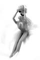
| 01/24/2003 09:02:29 PM | Head Up!by RemieComment: Critique Club Critique
(1) COMPOSITION (CONTENT) – Overall, quite good. Everything is generally centered, probably ok. I would like to see a version where the doll is moved to the right a tad, with a little more angle where the legs are aiming more left. I think this would help the overall flow. With the current angles, the head looks too large for the body. Good choice of vertical format.
(2) BACKGROUND – Very good. The white is the right choice, and this is well executed; smooth in all the right places.
(3) CAMERA WORK ,TECHNICAL – Looks good. The top of the head is blown out a little, probably could have done ok with a little smaller aperture.
(4) DIGITAL PROCESSING ,TECHNICAL – Looks ok to me. Good choice of B&W for this one.
(5) MY OPINION ON THE PHOTO – Meets the humor challenge, brings on a smile. So good idea, and well executed.
Jim msp
| | Photographer found comment helpful. |
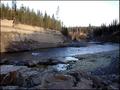
| 01/21/2003 09:45:00 PM | As The River Turnsby spillerComment: Critique Club Critique
(1) COMPOSITION (CONTENT) - Overall, I like the composition of the shot. From the title, your subject of interest was the curve in the river. Good choice. It is nicely located off center to the right, where the flowing water leads me. I also like the line of the far wall, sloped down and to the right, drawing the eye to the bend. Personally, I like the rocks in the foreground; I disagree with those that did not. They add another element to the river, and they add texture.
(2) BACKGROUND – Generally good. The use of a polarizer might have added to the sky – made it more blue.
(3) CAMERA WORK ,TECHNICAL – Looks good. You would have gotten a sharper picture with a smaller aperture (f/16?) and a tripod.
(4) DIGITAL PROCESSING ,TECHNICAL – No recommended changes.
(5) MY OPINION ON THE PHOTO – The main item in question, in my opinion, is the time of day you took this. I liked the contrasting sunlight and shadows. However, your main subject, the river bend, is in the shadows. If you had reversed the time of day (i.e., am instead of pm) and gotten the bend in the light, you would have greatly improved this. I wouldn’t like to see it taken at noon; the shadows work well. They are just reversed.
BTW, with the light & dark, and good textures, did you try converting this to B&W? I think it would be a good one.
Jim msp
| | Photographer found comment helpful. |
| 01/16/2003 11:02:31 PM | Two Tribesby albright1Comment: Critique Club Critique
(1) COMPOSITION (CONTENT) – When I first look at this photo, my eye goes to the centered camel. Then it moves up to the background, moves right to the camel master (?), and finally to the left to the visiting couple. The people on the sides balance this out well. If I could have placed the young lady, I’d like to see her closer to the center & the camel. I like the variation in color here.
(2) BACKGROUND – Good. A bright sky, but that’s the way it is.
(3) CAMERA WORK ,TECHNICAL – Very good. Girl’s pink sweater is a tad bright from the low sun.
(4) DIGITAL PROCESSING ,TECHNICAL – No recommended changes.
(5) MY OPINION ON THE PHOTO – A great photo, and technically meets the challenge well, as the couple are “in a strange land” for them. But they are not really the main subject here. That doesn’t detract from the quality of the photo, but it might have affected the way some saw it as precisely meeting the challenge. (I’m guessing here, how else to explain the 5’s?)
Jim msp
| | Photographer found comment helpful. |
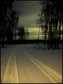
| 01/16/2003 10:38:13 PM | Lonely Ol' Night by John Cougarby spillerComment: Critique Club Critique
(1) COMPOSITION (CONTENT) – Very good composition. I like the way the trees frame the scene. The curve of the road is nice, adding to effect of drawing me into the photo and heading for the sunset.
(2) BACKGROUND – Very good. While you may have taken the shots, I would like to see a slightly darker sky for comparison. It might bring out the feeling of loneliness a little more.
(3) CAMERA WORK ,TECHNICAL – Very good. I see no recommended changes. Good choice on the portrait format.
(4) DIGITAL PROCESSING ,TECHNICAL - Very good. I see no recommended changes.
(5) MY OPINION ON THE PHOTO – Quite good. As I said above though, my first reaction to it is that the sky is a tad too light for the mood you want to convey. Still, a very good photo.
Jim msp
| | Photographer found comment helpful. |
| 01/13/2003 09:43:19 PM | Skybirdby rcrawfordComment: Critique Club Critique
(1) COMPOSITION (CONTENT) – I really like this capture. Though you got a few negative comments about the bushes (trees) in the lower left, I disagree. I think they help add balance to the overall shot. They also give some perspective that would be missed if they were missing. If they were bright red (or something) I’d agree – but they are not. I also love the placement of the bird against the sky-cloud boundary.
(2) BACKGROUND – Excellent. Everything to the right could be considered “negative space”. Well done.
(3) CAMERA WORK ,TECHNICAL – Excellent. Did you use a polarizer?
(4) DIGITAL PROCESSING ,TECHNICAL – No recommended changes.
(5) MY OPINION ON THE PHOTO – I really like this. The colors are great, and the bird is very well placed in the photo.
Jim msp
| | Photographer found comment helpful. |
| 01/13/2003 09:28:46 PM | I've Got You under My Skinby 'PongComment: Critique Club Critique
(1) COMPOSITION (CONTENT) - Great colors, and the “burr” works well centered. Assuming it’s a burr (it could be other things), it meets the challenge well.
(2) BACKGROUND – nice complimentary color, and nicely out of focus – good DOF
(3) CAMERA WORK ,TECHNICAL – Main subject is out of focus. A few of the appendages are in focus, though. A smaller aperture would have helped here to get the whole thing in focus. The background is nicely out of focus.
(4) DIGITAL PROCESSING ,TECHNICAL – No recommended changes.
(5) MY OPINION ON THE PHOTO – Since I’m not really sure what I am looking at, I expect the main subject to be in focus. It is not, and really hurts this. The colors are great though.
Jim msp
| | Photographer found comment helpful. |
| 01/13/2003 08:56:23 PM | a resolution waiting to be brokenby shedonistComment: Critique Club Critique
(1) COMPOSITION (CONTENT) - The idea of the scale and weight loss is clearly a New Year’s challenge for many people. However, this is a photo with everything “centered” (feet & scale). This tends to make it uninteresting. I don’t think B&W helps.
(2) BACKGROUND – OK. The floor does not distract from the photo.
(3) CAMERA WORK ,TECHNICAL – Good. I’m not sure that B&W is the best format for this. There is really not a lot of contrast; certainly no mood in evidence.
(4) DIGITAL PROCESSING ,TECHNICAL – Nothing to suggest. Everything looks fine.
(5) MY OPINION ON THE PHOTO – A good symbolic photo, but doesn’t draw me in. I can’t say that it gives me a lot more than a “good shot” feeling. On the other hand, I don’t have any great suggestions as to how to modify it. I don’t think color would change my opinion a lot. Maybe if you added a “Goal = 175” paste on sign.
| | Photographer found comment helpful. |
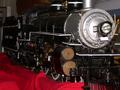
| 01/06/2003 08:59:36 PM | of yesteryearby BJComment: Critique Club Critique
(1) COMPOSITION (CONTENT) – I really like the engine as the focus of the photo. I might have liked to have seen a little more of the front of the engine, including smoke stack and cow catcher.
(2) BACKGROUND – While out of your control, I don’t care for the background in the upper quarter of the photo. And I really can’t tell if the brown object (top, left center) is part of the engine or in the background. Finally, the red sheet should have been straightened and smoothed.
(3) CAMERA WORK ,TECHNICAL – Very good use of DOF; very good lighting.
(4) DIGITAL PROCESSING ,TECHNICAL – I have no recommendations.
(5) MY OPINION ON THE PHOTO – A good photo; clearly meets challenge. I scored it a little better than your average score. I think the red sheet was probably the primary detractor here, though out of your control. Too bad you couldn’t have hung a blue sheet behind the whole engine to clean up the entire background.
Jim msp
| | Photographer found comment helpful. |
| 12/21/2002 09:55:33 PM | BB'sby AnachroniteComment: Critique Club Critique
(1) COMPOSITION (CONTENT) – A good abstract (which I generally like), but no single place to focus my eyes. Once I’ve looked at it, nothing really drags me back to it. It would be a great background photo, or computer wallpaper. The lighting effects are very uniform, in part leading to the low interest.
(2) BACKGROUND - None
(3) CAMERA WORK ,TECHNICAL – Pretty good. Good uniform focus. I’d like to see a little less brightness in the reflection. A light coming in at a low angle from the left (right) might have really changed the effect, producing some shadows that added structure. Likewise, a point source would have also changed the effect.
(4) DIGITAL PROCESSING ,TECHNICAL – Looks good to me.
(5) MY OPINION ON THE PHOTO – Well executed, but not of the highest interest. Nothing to make me think about or appreciate. Too uniform (which may be what you wanted).
Jim msp
| | Photographer found comment helpful. |
Home -
Challenges -
Community -
League -
Photos -
Cameras -
Lenses -
Learn -
Help -
Terms of Use -
Privacy -
Top ^
DPChallenge, and website content and design, Copyright © 2001-2025 Challenging Technologies, LLC.
All digital photo copyrights belong to the photographers and may not be used without permission.
Current Server Time: 08/19/2025 09:56:42 PM EDT.
|