| Image |
Comment |
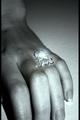
| 07/11/2004 03:04:13 PM |
Jewelleryby letheComment: Her fingers should not be cropped. It looks odd and disturbing. |
 Photographer found comment helpful. Photographer found comment helpful. |
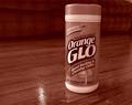
| 07/11/2004 03:00:38 PM |
GLOby DianaComment: Duotone doesn't seem appropriate for this. Because of the name of the product, we really should see some orange (presumably in the label). The composition isn't bad. The product is a bit tilted. |
| Photographer found comment helpful. |
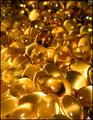
| 07/11/2004 02:58:58 PM |
Cod Liver Oilby marboComment: Interesting composition but I'm not really getting the idea of advertisment from this. |
| Photographer found comment helpful. |
| 07/11/2004 02:58:25 PM |
|
| Photographer found comment helpful. |
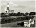
| 07/09/2004 08:27:18 PM |
The View of Decadesby LtHousLadyComment: What I liked quite a bit about this shot (and I did look at a few times) is the shadow in front of the bench. That is actually what raised it from a 5 to a 6 for me after looking at it for about the third time. I really liked the bit of graphic and tonal contrast it added. Which leads me to think that what may have been lacking for me in was a bit more dynamics in tone. I like the scene and it should appear somewhat serene but perhaps it is a bit too restful. I wonder if perhaps a bit of dodging and burning to add some drama to the sky might improve things. I can already see a section of sky that could be darkened a tad by judiciously burning some middle values and brightening the highlights at the edges of the clouds. This would add depth and drama to the sky which now appears rather flat. |
| Photographer found comment helpful. |
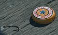
| 07/08/2004 01:25:28 PM |
Catch of the Dayby Hye5Comment: Really effective! I think it would be better to show a frosty bottle alongside the cap, even if it is just the lower portion of the bottle (since the label is shown prominently on the bottle cap). Still, this is cleverness at its best and the composition is quite nice. There is a bit of shadow area in the corner below the hook. Also, maybe a bit more of the fishing line should be evident. As it is, it kind of looks like a found object. |
| Photographer found comment helpful. |
| 07/08/2004 12:58:17 PM |
How Chicago spends the summerby ChasSourekComment: Wow, what a refreshing sight. And I don't mean the beer, although that looks nice. But this looks like an real honest attempt at advertising (forgive the contradiction in terms). The product is prominently placed against a simple but attractive (and appropriate) background. The beverage actually looks refreshing in it's frosty glass and I can read the label. The glass itself is attractive and harmonizes with the environment. A winning effort! |
| Photographer found comment helpful. |
| 07/08/2004 12:51:42 PM |
Pre-Lovedby chookieComment: The idea was to make a photo that looked like an ad not a photo showing advertisement. This looks like what you would see on a yard sale table. Not real appealing product. Photographically, it just seems to be a point-and-shoot snap shot. |
| Photographer found comment helpful. |
| 07/08/2004 12:40:08 PM |
|
| Photographer found comment helpful. |
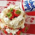
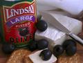
| 07/08/2004 12:38:36 PM |
Lindsay Olive - A Tradition of Qualityby bledfordComment: Not a bad effort at all. The cheese and crackers look tasty (it is hard to photograph food well). I think the knife was overduing it a tad. The viewer knows how that one slice of cheese got there and the knife doesn't add anything aesthetic to the composition. It actually leads the eye toward the napkin in the background. |
| Photographer found comment helpful. |
Home -
Challenges -
Community -
League -
Photos -
Cameras -
Lenses -
Learn -
Help -
Terms of Use -
Privacy -
Top ^
DPChallenge, and website content and design, Copyright © 2001-2025 Challenging Technologies, LLC.
All digital photo copyrights belong to the photographers and may not be used without permission.
Current Server Time: 08/27/2025 02:05:22 AM EDT.