| Image |
Comment |
| 07/17/2004 05:25:59 PM |
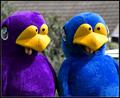
Embarrassmentby KonadorComment: Greetings from the Critique Club!
Ha! My very next photo on the cue after reading your email regarding my first critique!
I liked the humour of this photo but it wasn't a perfect viewing experience for me. I've looked at it pretty carefully and I can only conclude that I find the cropping a bit tight. I think the intent was to get a good capture of their expressions but I would like to see a bit more of the ridiculous costumes and maybe some context, like a smirking glance from a passerby. While I'll agree this is quite obviously an embarrasing situation, their embarrasment would be more keenly felt by the viewer if their humilation was being witnessed by someone other then himself.
I like the color combination quite a bit. I'm not crazy about what appears to be a desaturated background. I think the blurring would have been sufficient to separate the subjects. As it is, the delineation is so sharp they seem almost super-imposed on the background.
I liked the originality of the subject and the street photography quality of the effort. |
 Photographer found comment helpful. Photographer found comment helpful. |
| 07/17/2004 03:08:34 PM |
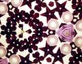
Kaleidoscopeby flip89Comment: Greetings from the Critique Club!
I found myself wanting to like this image more than I did. I like the colors quite a bit. The flower and star sequins are particularly pretty. I think it is the randomness of the composition that detracts from my enjoyment of the subject matter. The pale round beads don't add much interest yet there are quite a few of them in the frame. The lavender object at the right of the frame, while very pretty, isn't a strong focal point.
Therein the problem lies. There doesn't appear to be a main focal point for the eye to rest on long enough to create a satisfying viewing experience. If I were viewing this through a kaleidascope the changeable nature of the toy would create the pleasing viewing experience I'm after. As a still life, this is just too busy for me. You don't mention how many shots you took before settling on this one. It is possible that without enough attempts, the very randomness of the nature of kaleidoscopes would have yielded a more pleasing arrangement then this one. It is certainly worth experimenting with again if you are motivated to do so.
I am impressed at the quality of the image considering you took it from a kaleidascope. That can't have been easy. |
| Photographer found comment helpful. |
| 07/14/2004 09:05:37 PM |
Design Districtby GinaRothfelsComment: Whoo, the color hurts my eyes. Framing the shot this way creates a tangible connection to the words on the sign. Very good. |
| Photographer found comment helpful. |
| 07/14/2004 09:02:00 PM |
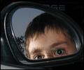
... Closer Than They Appearby GeneralEComment: Not very original. The focus is a little soft. The extreme pinpoint highlights in his eyes have a creepy effect. This isn't a great use of the surrounding areas of the frame. |
| Photographer found comment helpful. |
| 07/14/2004 05:01:26 PM |
Sweet readingby xoaoComment: Where have I seen this before? This trick is getting tired for me. It's a good shot so I have to give it at least a five but can this be the last one of these? Please? |
| Photographer found comment helpful. |
| 07/14/2004 04:49:27 PM |
|
| Photographer found comment helpful. |
| 07/14/2004 04:47:04 PM |
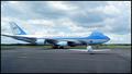
Air Force Oneby Silent BobComment: Other than identifying the origins of the plane I don't find that the words play a creative role in this rather literal representation of the plane. |
| Photographer found comment helpful. |
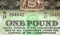
| 07/14/2004 04:45:54 PM |
Words : "Money Talks" 1953 Banknoteby StagoleeComment: "Take a photograph where complete words -- not just individual letters -- play a creative role in your composition."
I don't see anything creative in this literal, close-up representation of an old pound note. There is nothing of actual artistic merit that the photographer can take credit for. Technically, it is fairly sharp but there is no outside context to create a meaningful experience for the viewer except to show what a 1953 Australian one pound note looks like. |
| Photographer found comment helpful. |
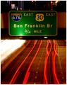
| 07/14/2004 04:34:32 PM |
Playing with trafficby jmleliiComment: I don't find that the words on the sign add creative value to this shot which is more about the streaking lights.
"Take a photograph where complete words -- not just individual letters -- play a creative role in your composition."
|
| Photographer found comment helpful. |
| 07/14/2004 04:30:36 PM |
Bargainby JPRComment: The passerby walking her baby doesn't really add much meaning or interest to the sign. There isn't a a surprise factor to add humour or irony. This looks like a random snap shot. It is very blurry. |
| Photographer found comment helpful. |
Home -
Challenges -
Community -
League -
Photos -
Cameras -
Lenses -
Learn -
Help -
Terms of Use -
Privacy -
Top ^
DPChallenge, and website content and design, Copyright © 2001-2025 Challenging Technologies, LLC.
All digital photo copyrights belong to the photographers and may not be used without permission.
Current Server Time: 08/27/2025 05:54:14 PM EDT.