| Image |
Comment |
| 10/21/2004 11:54:46 AM |
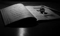
The Early Daysby fotodudeComment: Nikce lighiting and good still-life set-up. The black and white looks a bit cold to me. I suggest warming it up a bit by adjusting the Red in the RGB Levels. |
 Photographer found comment helpful. Photographer found comment helpful. |
| 10/21/2004 11:53:58 AM |
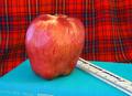
Teachers Petby kennytComment: I like the colors. I would suggest that it might have been better to crop it so that the title of the book doesn't show. It's not a particularly significant title and the white lettering at the bottom is a bit distracting. The lighting is a tad flat -- although the exposure looks good I'd like to see a bit more rounding of form on the apple with a slightly darker shadow area falling on the book for a bit of depth. |
| Photographer found comment helpful. |
| 10/21/2004 08:34:44 AM |
|
| Photographer found comment helpful. |
| 10/21/2004 08:29:32 AM |
10 Seconds to Go - Home Timeby saintnicholas_25Comment: I like the simple graphic quality of this image. I like the extreme right positionong of the clock. I just wish you submitted a bigger example. You should really take advantage of the 640 pixel max. It looks like there is some really nice subtle shading of blue in the background. It's just too hard to tell about the image quality when the photo is this small. That said, this is probably one of the best examples I've ever seen during my time at DPC that was submitted this small. This is probably due to the extreme simplicity of the image. Nice job. |
| Photographer found comment helpful. |
| 10/21/2004 08:26:33 AM |
The Trendy and Chic... Engineering Majorby yeouaComment: Ha! I just got done explaining how high key lighting didn't work for the last photo and here I see a nice example of where it does work! High key is great for giving a modern,high tech, trendy look and you've used it pretty appropriately here. It could be toned down a bit---I'd like to see a little more detail in the skin tone and the denim but this is a great effort. |
| Photographer found comment helpful. |
| 10/21/2004 08:24:17 AM |
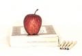
For the Teacherby kirtiebuComment: A nice still life set up but I don't find that the extreme high key approach is the right mood for the theme. It looks like you knew what you were doing in terms of lighting so I won't suggest how you could tone it down but I think it needs it. The high key approach is nice for a slick, modern look but IMO warmer lighting is called for. If the apple had been resting on a lap top than this approach would have worked beautifully for me (although it still needs toning down a bit as the details in the apple and the colors just aren't popping like they should). Nice effort! |
| Photographer found comment helpful. |
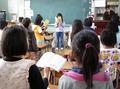
| 10/21/2004 08:20:17 AM |
Grade 2 singing their Morning Songby Pug-HComment: This has lots of potential. I llike the somewhat wide angle approach. It puts the viewer right in the picture. I feel like I could reach out and tweak the ponytail of the nearest little girl. It's a bit overexposed (the detail in the book is completely blown out for instance) and a tad noisy. I would like to see more detail and the skin tones and in the highlights. A very good effort. |
| Photographer found comment helpful. |
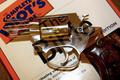
| 10/21/2004 08:17:32 AM |
Misinterpretationby plumber711Comment: I don't really understand the connection to the challenge. I'm not sure I understand the theme of this photo, actually. I realize there is a cultural statement being made but I'm not sure what it is. Guns and the Bible? How does this relate to school and education? If it were a Bible and a copy of Darwin, or a gun resting on some school books I would get it. This I don't get.
In terms of the quality of the photo---either you did some good trick work with a long exposure or the gun has an acrylic barrel? I can't tell because the transparency isn't quite ephemeral enough--the gun looks fairly solid. There are some very distracting highlights. Overall, this just doesn't work for me. Keep trying! |
| Photographer found comment helpful. |
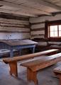
| 10/21/2004 07:35:34 AM |
One Room Schoolhouse c.1820by lagavulinComment: Great subject. Decent lighting. It's still lacking a bit, for me. I'm not sure what. It may be the cropping. I think I'd like to see more of the room in a wider angle shot. I wonder if stopping down the EV setting (i.e., shortening your exposure time) would have heighened the contrast of the play of light and shadow on the benches and across the floor? |
| Photographer found comment helpful. |
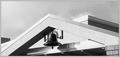
| 10/21/2004 07:24:42 AM |
School Bellby FrostyPawsComment: A nice find for the challenge. I'm nut nuts about the composition and it is a bit overexposed. This is a typical type of lighting challenge (strong contrast between bright sky and shadowy areas). If your camera has an EV setting you could fiddle with that. I find stopping it down to somewhere between -.7 and -1.0 usually makes a dramatic difference. |
| Photographer found comment helpful. |
Home -
Challenges -
Community -
League -
Photos -
Cameras -
Lenses -
Learn -
Help -
Terms of Use -
Privacy -
Top ^
DPChallenge, and website content and design, Copyright © 2001-2025 Challenging Technologies, LLC.
All digital photo copyrights belong to the photographers and may not be used without permission.
Current Server Time: 08/26/2025 11:15:09 PM EDT.