| Image |
Comment |
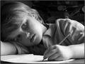
| 10/21/2004 04:07:08 PM |
Homework Daydreamerby whatdewucComment: Nice mood with good use of available light. The model is beautiful which gives the photo a universal appeal. This is important because some kids just aren't photogenic enough for anything but the family photo album. If this is your child, consider yourself blessed to have such a natural subject close at hand! Other good details are the classic yellow No.2 and eraser cap and the traditional shirt the boy is wearing. To many folks underestimate how distracting licensed t-shirts and trendy clothing can be in portraits of children which should have a timeless quality (IMO).
My only complaint is the bluish cast. I prefer a warmer black and white (not to be confused with sepia which I find overused). But kudos for a great, believable capture.
Hi there again! After realizing that I've left a few comments for b&w photos regarding the bluish cast (and noticing it on my own b&w entry) I took a look at the grayscale bar and realized the greys there have a definite bluish cast so it is obviously the monitor on my laptop! I did my entry on my other computer and it definitely did not look blue) Please disregard my comments regarding this. :-D |
 Photographer found comment helpful. Photographer found comment helpful. |
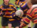
| 10/21/2004 01:25:39 PM |
Wednesday afternoon - Double Gamesby johnmComment: A really good effort but I find the motion blur is just too much of a good thing. Don't get me wrong---I like some motion blur. I just feel that a greater area of sharp focus on the boy holding the football would have created a bit more visual impact, IMO. As it is, the onlyl sharp area of focus is on his wrist andpart of his sleeve. Even the ball and most of his hand suffer from some motion blur. As it is, a quick viewing leaves the impression that the blur is created by camera shake. |
| Photographer found comment helpful. |
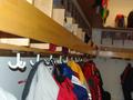
| 10/21/2004 01:08:43 PM |
Kindergartenby ArnarpComment: This meets the challenge but, sadly, it has a very amateurish, snapshot quality to it. A kindergarten coat room has a lot of potential for evoking nostalgia in the viewer but this just hasn't captured that. It looks like the photographer just stuck his/her head into a closet and snapped the shot. The flash hurts the mood quite a bit (flash frequently does). For an interior shot a tripod is usually necessary to take advantage of natural light. A suggestion for how a shot of a coat room could evoke an emotional response from the viewer is to create a set-up using just a few familar items you would find in the setting being sure to choose timeless, non-branded (no cartoons, sports teams, etc) items. Example---a brown paper lunch bag or plain colored lunch pail. galoshes (rain/winter boots), a simple nylon windbreaker or rain coat, Chuck Taylors' or Keds' sneakers (they've been around for several decades in pretty much the same form). |
| Photographer found comment helpful. |
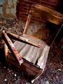
| 10/21/2004 12:59:35 PM |
Rusted Learningby fstopopenComment: Good choice of subject and nice exposure. I don't really care for this overhead point of view, however. It winds up looking too literal to me--as if the photographer came across the chair and just looked down and snapped the shot without really considering the best approach. The fact that it was shot at a bit of angle in the frame suggests otherwise to me. I think you did think it out and chose this POV for a reason. I'm just not in agreement with your choice. The angle adds a nice diagonal tension to the frame but it doesn't make much sense to me in terms of the subject--an old, rusted and rotting school desk and chair suggests a 'quieter' approach then the 'exciting' visual tension that diagonals create. |
| Photographer found comment helpful. |
| 10/21/2004 12:52:57 PM |
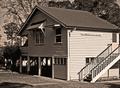
Remember the days of the old school yardby NodeComment: I would enjoy this more if there were children playing in the school yard or some kind of old play equipment. The building itself is rather boring architecturally. It looks too newly renovated to really evoke nostalgia despite the use of grainy black and white. Without the title and the identifying sign this just appears to be a commonplace house. No complaints about the technical quality. |
| Photographer found comment helpful. |
| 10/21/2004 12:49:04 PM |
Hold the Elevator! Late for My 1 o'clock Class!by flip89Comment: A little bit cramped in terms of cropping but I like the blur of students heading toward the elevator and the bright red "Welcome back..." sign leads the eye through the frame and back again in a nice way. |
| Photographer found comment helpful. |
| 10/21/2004 12:46:54 PM |
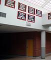
FORENSICSby medinfo2000Comment: This does meet the challenge but it does so in a very dull and literal way, IMO. This might be of some interest to the students at this school who care about sports and want to know the recent history of their team but there really isn't anything here to attract an impartial viewer's interest. The signs themselves are not striking in any way (to me, anyway) and most of the frame is taken up with the ugly institutional building. |
| Photographer found comment helpful. |
| 10/21/2004 12:40:52 PM |
Emptied pocketsby RussComment: Cute take on the challenge. I find the lighting rather flat and dull. I'm not a fan of shooting still-lifes from above like this. I prefer to shoot across the objects---like anything else, your camera is generally best positioned as close to the point of view of the subject as possible. Shooting from above tends to flatten everything into two dimensions. This can work if you are going for an abstract , graphic, quality. In this case, it just looks like visual clutter to me. Typically, a still life should show more modeling of form through the play of shadow and light over the obejcts. Also, fewer objects would have made the statement just as well with less clutter. This may be exactly what was in the students pockets but the viewer doesn't need to know that. Also objects that are familiar to a general audience are important. My choices would be the marble, rubber band, die, sharpener, coins,and the candy. That shoelace/chesnut (conker?) thing looks like some kind of homemade toy which is cute but not very clear to the viewer (this viewer anyway). I have no idea what that orange cap thing is. |
| Photographer found comment helpful. |
| 10/21/2004 12:23:21 PM |
Dictionaryby dogzComment: Interesting abstract take on the challenge. Nice dramatic contrasts in light and dark and the various lines and shapes. I'm not nuts about the composition as a whole. I might have liked a more 3/4 view then this to create more diagonals and to take better advantage of the interesting shapes and shadows created by the indexes. The expanse of speckled white is less interesting to me but it takes up more of the frame. |
| Photographer found comment helpful. |
| 10/21/2004 11:59:09 AM |
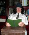
Still Studying at 69by chookieComment: Angus Young? Disturbing. LOL!
It's a funny set-up but it looks a bit snapshot-y to me. The flash lighting is flat and dull and the red-eye and glare on the glasses gives the photo an amateurish quality. To avoid glare on eyeglasses (or windows, etc), particularly when using a flash, try shooting at a slight angle. |
| Photographer found comment helpful. |
Home -
Challenges -
Community -
League -
Photos -
Cameras -
Lenses -
Learn -
Help -
Terms of Use -
Privacy -
Top ^
DPChallenge, and website content and design, Copyright © 2001-2025 Challenging Technologies, LLC.
All digital photo copyrights belong to the photographers and may not be used without permission.
Current Server Time: 08/26/2025 11:15:10 PM EDT.