| Image |
Comment |
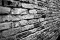
| 12/28/2005 10:18:57 AM |
Brickby AzrifelComment: Nice simple pattern and texture. I'd like focus on the entire image, however, and the triangle of black at the bottom right corner should be cropped out. |
 Photographer found comment helpful. Photographer found comment helpful. |
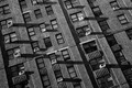
| 12/28/2005 10:14:25 AM |
6th Avenue Facadeby Car54Comment: Very nice. I like the tilted frame. I just wish there was a bit mroe contrast between the dark and middle tones. |
| Photographer found comment helpful. |
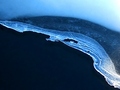
| 12/28/2005 10:13:30 AM |
Icyby basia03Comment: Nice and simple. It shows a thoughtful eye for pattern. I think there could be a bit less of the empty black space in the frame though. Just curious but did you consider experimenting with rotating the frame in post-editing? Sometimes a more interesting composition emerges in abstract shots like these. |
| Photographer found comment helpful. |
| 12/28/2005 10:09:41 AM |
Neon Lightby fotomann_foreverComment: A good effort ruined by including the lighter head. It isn't neccessary for an effect image and it breaks up an otherwise pleasing abstraction of shape and color. The other beef is the whole image needs to be in sharp focus. |
| Photographer found comment helpful. |
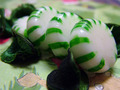
| 12/28/2005 10:08:40 AM |
Green in a Rollby evylynComment: This is way too busy and incomprehensible. Isolating a single object against a simple background would be much more effective. I have no idea what those dried-up looking green things with the mints are but they sure aren't helping this composition. The drawing in the foreground area, particularly the staring eyes are drawing a lot of focus too no effect. |
| Photographer found comment helpful. |
| 12/28/2005 10:06:19 AM |
Reflecting on Formby benjybobsComment: Very interesting. I like the soft focus, though I suspect others won't. I have a single beef and that is the sharper focus on the object directly behind his nose and left shoulder. |
| Photographer found comment helpful. |
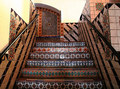
| 12/28/2005 10:04:26 AM |
County Courthouseby GermaineComment: This is too much pattern. It's so busy that my eye doesn't have a chance to rest. I think a tight crop on a single area of tile (either on the stairs or in that area on the wall at the top of the stairs) would have made a more effective statement. |
| Photographer found comment helpful. |
| 12/28/2005 10:02:35 AM |
A Beautiful Mindby crabappl3Comment: I like how flat and contrasty this is. I'm guessing others won't but I could be wrong. My only beef is I'd like to see a boost in the saturation levels. |
| Photographer found comment helpful. |
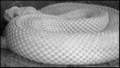
| 12/28/2005 09:59:16 AM |
Serpentineby TammerComment: I think a tighter crop to eliminate the gravel and the snake's face and a bit darker in the shadow areas of the scales. Also, much greater depth of field is needed so that the pattern really stands out. The foreground is too soft. |
| Photographer found comment helpful. |
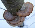
| 12/28/2005 09:56:59 AM |
Descending Fungi Patternby joycobbComment: Very nice. The lines radiating out at the sides are a distraction for me. I can see you tried hard to blur them out....it's the sort of thing that makes you wish for beyond basic editing so you could clone them out. |
| Photographer found comment helpful. |
Home -
Challenges -
Community -
League -
Photos -
Cameras -
Lenses -
Learn -
Help -
Terms of Use -
Privacy -
Top ^
DPChallenge, and website content and design, Copyright © 2001-2025 Challenging Technologies, LLC.
All digital photo copyrights belong to the photographers and may not be used without permission.
Current Server Time: 08/26/2025 01:29:09 PM EDT.