| Image |
Comment |
| 12/30/2005 11:43:09 AM |
Trackby indy79Comment: Simple and effective. It works for the challenge. |
 Photographer found comment helpful. Photographer found comment helpful. |
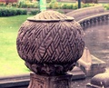
| 12/30/2005 11:38:57 AM |
stone patternby charlievComment: This was an interesting subject for pattern. My suggestion is that tighter focus is needed to isolate the pattern from the background for a really effective shot. When I look at this shot the pattern isn't the immediate focal point. |
| Photographer found comment helpful. |
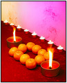
| 12/30/2005 11:33:50 AM |
Keepers of the Orangeby aspelinComment: This is creative but I think there are too many patterns competing here. There is the diagonal blocks of color, the line of the voitve candles, the square shape created by the round oranges, the larger candles and the verticals of their flames. It's all too much so the eye doesn't really know where to rest. |
| Photographer found comment helpful. |
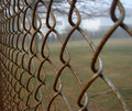
| 12/30/2005 11:32:04 AM |
keep outby nlghttrainComment: I think the angle is a little to wide at the foreground, opening up the links a bit. The result is I get more of a sense of the background beyond the fence then the actual pattern the links make. |
| Photographer found comment helpful. |
| 12/28/2005 11:02:40 AM |
Trapped in a String of Liesby Sunshine86Comment: I didn't get to your photo in the voting. There were a lot of entries. I think it is an original and creative take on the challenge although personally, I don't care for set-ups with titles like this.My feeling is that without the title and the challenge subject the photo doesn't make much sense. I believe a good photograph should be able to be viewed, title-less and outside the DPC world and still make sense and appeal to the viewer. These kind of images never makse sense (to me anyway) outside of the context of a DPC challenge.
It was a good effort in terms of composition and technical details (although I tend to be better with the composition then the technical stuff myself). The subject needs to be further away from the background to avoid the shadows. That, and directing a light just on the background effectively eliminates shadows. |
| Photographer found comment helpful. |
| 12/28/2005 10:48:47 AM |
Drink Coastersby Pug-HComment: Funny idea. Her shirt ruins it. Also, she needs to be moved further away from the background to avoid the shadows. |
| Photographer found comment helpful. |
| 12/28/2005 10:46:50 AM |
Circles of lightby spunckenComment: Nice idea. Great cropping to isolate the pattern. I don't like the blown out highlights, particularly the area in the middle. |
| Photographer found comment helpful. |
| 12/28/2005 10:45:31 AM |
The colours around me.......by KitaComment: Too much pattern. Either the cat or the floor needs to be the focus. As it is the patterns are competing for attention. This looks like a snapshot. |
| Photographer found comment helpful. |
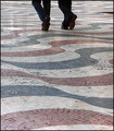
| 12/28/2005 10:44:14 AM |
walking on a patternby alexgarciaComment: Love the composition. Definitely works for the challenge. I think it's a bit overexposed (there isn't much detail in the highlights and shadow areas) and the triangular projection at the top right should have been cropped if possible. |
| Photographer found comment helpful. |
| 12/28/2005 10:42:35 AM |
|
| Photographer found comment helpful. |
Home -
Challenges -
Community -
League -
Photos -
Cameras -
Lenses -
Learn -
Help -
Terms of Use -
Privacy -
Top ^
DPChallenge, and website content and design, Copyright © 2001-2025 Challenging Technologies, LLC.
All digital photo copyrights belong to the photographers and may not be used without permission.
Current Server Time: 08/26/2025 10:53:33 AM EDT.