| Image |
Comment |
| 01/14/2006 03:53:16 PM |
Peek-A-Booby 2hooComment: This is a nice portrait. I love the red of the blanket in contrast with the deep blue of the baby's eyes. I think it is a bit washed out in the highlight areas though. There is quite a large expance of overexposed white blanket in the foreground that isn't doing much for the composition. |
 Photographer found comment helpful. Photographer found comment helpful. |
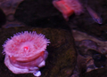
| 01/14/2006 03:51:55 PM |
Anemoneby Mal37Comment: Interesting subject and I like the color scheme. The focus could be sharper on the anemone. |
| Photographer found comment helpful. |
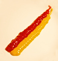
| 01/14/2006 03:45:28 PM |
Mc Burstby keoneComment: Interesting idea. It needs to be sharper in focus and lit better to cut down on the shiny highlights. The white background looks a bit pink in my monitor. |
| Photographer found comment helpful. |
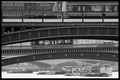
| 01/13/2006 10:25:23 PM |
Crossingsby ImagineerComment: I really like this Jon. I didn't see it during the voting because frankly I only voted on few before I got irritated with myself for not entering one myself (especially after I came across a photo of my beloved Providence!). Anyway, I clicked on your profile to see what you've been doing lately since I took a year-long hiatus.
I really enjoy the curves,lines, and planes created by the bridge and the train. At first it seems flat and abstract (in a good way) and then you begin to feel a bit more depth and feeling of space from the background. This photo makes me think of the paintings of Charles Demuth, a favorite of mine from my highschool years whom I haven't thought about in years.
Congratulations on your top ten.
I just read the other comments and discovered that Ubique put much more eloquently what I was trying to express about the layers and depth of this shot.Message edited by author 2006-01-13 22:31:29. |
| Photographer found comment helpful. |
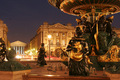
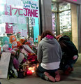
| 01/04/2006 06:43:13 PM |
Life in the city of lightsby esaintpiComment: This might be more effective for me if it actually depicted some life (people, pigeons, anything). I think this could have benefited from including the entire fountain instead of cropping it at the top. This looks a bit cramped to me. |
| Photographer found comment helpful. |
| 01/04/2006 06:42:01 PM |
|
| Photographer found comment helpful. |
| 01/04/2006 06:40:04 PM |
Survival!by chadagaComment: Interesting shot of an unusual scene ruined by bad focus. |
| Photographer found comment helpful. |
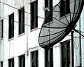
| 01/04/2006 06:39:09 PM |
Multiple Portsby mthrgse49Comment: I kind of like this in an abstract way.The high contrast black and white helps. Ultimately though, I'm too aware that it is kind of a boring view of a satelite dish and an ugly apartment building. |
| Photographer found comment helpful. |
| 01/04/2006 06:37:10 PM |
New York Times by JPRComment: Nice capture of the news guy's expression. I'm not sure whether I like the cropping out of the guy reading the paper or not. I do like that sort of spontaineous cropping but in this instance I think I'd like to see some of his face. |
| Photographer found comment helpful. |
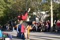
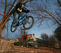
| 01/04/2006 06:34:56 PM |
Streetby MadMan2kComment: Cool action capture but this strikes me as more suburban than city. It could be sharper in focus. |
| Photographer found comment helpful. |
Home -
Challenges -
Community -
League -
Photos -
Cameras -
Lenses -
Learn -
Help -
Terms of Use -
Privacy -
Top ^
DPChallenge, and website content and design, Copyright © 2001-2025 Challenging Technologies, LLC.
All digital photo copyrights belong to the photographers and may not be used without permission.
Current Server Time: 08/26/2025 02:15:11 AM EDT.