| Image |
Comment |
| 02/27/2006 12:25:47 PM |
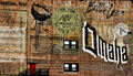
Old Marketby whatdewucComment: Wow! What a great find for this challenge. I'm so irritated with myself that I flaked on this one.
This is a very nice shot. I like the flat, abstract quality of the exposure. The interesting thing about it is at first you can't quite tell what you're looking at in terms of size--is it a flyer or some sort of poster? I thought a postage stamp at first, oddly enough. And then you spot the two windows and that leads you to the door and the steps and it becomes clear it's actually a large expanse of wall. This is an interesting subject that you should explore from different angles and focal lengths, if you haven't already. I think it would be excellent to see this view with a person sitting at one of the windows. Of course, that is very likely something beyond your control. |
 Photographer found comment helpful. Photographer found comment helpful. |
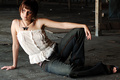
| 02/27/2006 12:15:15 PM |
TBAby PhotiquesComment: This is a very nice candid. You've captured a natural pose and a playful expression. The exposure is very nice for an indoor candid, warm and natural looking. The bit of blurred background lends a sense of the setting which is appropriate for a candid shot. Your wife (?) is a great model. Exploit her! ;D |
| Photographer found comment helpful. |
| 02/27/2006 11:56:38 AM |
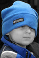
BlueAlex.jpgby PhotiquesComment: This shows a good eye for what makes a nice kids portrait. I hate selective desaturation but I understand the desire to play around with the technique.
This has a lot of potential. The problem I see with it is a lack of a catch light in his eyes. If you are unfamiliar with the terminology, (I read from your profile that you are fairly new to photography) this is the sparkle of highlight we see that brings life to a portrait. This is achieved through sharp focus and good lighting. A good way to create nice catch lights is to use some sort of reflector held near the subject's face. In a pinch, a piece of white paper will do. You can use the kind of poster board you can get at a drug store, or foil wrapped around cardboard also works. Even a book or a newspaper that the subjects holds himself can work as a light reflector. His hat pushed down over his eyes adds a certain amount of personality but if had been pushed up just a smidgen we would probably have seen more of the sparkle that the viewer connects with in a portrait of a living subject. I wonder if you are shooting at a higher speed ISO rating than you need? This photo and the other one in your portfolio seem somewhat grainy considering the quality of your equipment.
What is really nice about this shot is the tight framing and the fact that the viewer sees the child at eye-level and that the subject is looking out at the viewer. The crop might be a bit too tight if your subject was looking off somewhere else but in this case it works. I could use a bit more space to the right of the frame but overall this works.
I hope you don't mind the critique and advise. One never knows how much a person has researched a new hobby on their own so I may just be repeating stuff you've heard or discovered for yourself. Of course, the basics bear repeating. I still review stuff on bracketing exposure, etc just to cement stuff in my mind and I've been into photography for a couple of decades now. I'm going to check out your wife's jewelry now. :D |
| Photographer found comment helpful. |
| 02/27/2006 11:38:19 AM |
Coke Whoreby PhotiquesComment: Sorry this didn't do better. It got a five from me because it was an original idea and I liked almost candid feel. I think I would have scored it higher if it were in black and white. I think what mostly held me back was that it hasn't quite lost the feel of a set-up shot and this type of photography needs to look really raw and candid,IMO. This is just a little too clean. I just looked through a huge book of candid photos from the 80's by this one photographer and this is just the sort of thing that was in there, only his were black and white and generally grainy. Actually, many of his shots would have tanked in a DPC challenge...;D. I wish I could rememember the name of the book or at least the photographer.
Anyway, it's nice to see a fresh perspective. I'm wishing I went back and re-thunk my scoring for this. Sometimes I do that if I have time to review my voting pages. |
| Photographer found comment helpful. |
| 02/25/2006 01:11:08 AM |
|
| Photographer found comment helpful. |
| 02/24/2006 07:18:48 PM |
|
| Photographer found comment helpful. |
| 02/24/2006 07:16:35 PM |
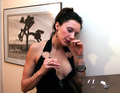
Modoby tjmuellerComment: Eek! The skin tone of her face doesn't match the rest of her. Her hand near her face is several shades lighter! Very unappealing. Someone overdid it on the pancake or the bronzer. This looks like a boudoir photo. I can't really imagine this in a fashion magazine. Maybe Fredericks of Hollywood? |
| Photographer found comment helpful. |
| 02/24/2006 07:13:53 PM |
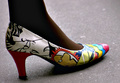
Make Your Own Way Thereby xXxscarletxXxComment: This doesn't have the feel of a fashion editorial to me. I can't recall the last time I saw selective desaturation in a fashion spread (if ever). There are a lot of artifacts in this image, particularly around her arm, the belt and her face. She's a cute model though. |
| Photographer found comment helpful. |
| 02/24/2006 07:08:11 PM |
Warehouseby fadedbeautyComment: Great model (she's actually pretty and has up-to-date hair), good fashion (even accessories!) and fun setting. Works for me. Her top could have a bit more detail (it's a tad overexposed). |
| Photographer found comment helpful. |
| 02/24/2006 06:56:32 PM |
Always in Fashionby ArcanistComment: This looks like it was submitted just to have something entered. It seems more about the Peavy amps than fashion. Judging strictly by the tux, this looks like a wedding entertainer or guest. The image is really grainy in the area of his pants. |
| Photographer found comment helpful. |
Home -
Challenges -
Community -
League -
Photos -
Cameras -
Lenses -
Learn -
Help -
Terms of Use -
Privacy -
Top ^
DPChallenge, and website content and design, Copyright © 2001-2025 Challenging Technologies, LLC.
All digital photo copyrights belong to the photographers and may not be used without permission.
Current Server Time: 08/25/2025 04:34:25 AM EDT.