| Image |
Comment |
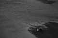
| 04/07/2006 11:55:03 AM |
looking for dinner in the ROUGH waterby nemesise1977Comment: This is a nice composition but I don't think the image quality is quite there.It seems like it could be sharper. This photo doesn't really seem to be about exploring texture. I'm getting very little sense of texture from it. |
 Photographer found comment helpful. Photographer found comment helpful. |
| 04/07/2006 11:52:39 AM |
Velvet Rhapsodyby elee3009Comment: Very nice color and detail. Since this is Advanced Editing, I would have cloned out the bits in the top and lower left corners of the frame for a completely black background. I don't care for the thin red border. |
| Photographer found comment helpful. |
| 04/07/2006 11:50:09 AM |
Fuegoby TychoComment: Very good exposure and image quality. I like the color. I'm not crazy about the horizontal format. I wonder if this would be better rotated 90 degrees clockwise? |
| Photographer found comment helpful. |
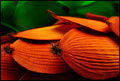
| 04/07/2006 11:49:01 AM |
Gum Dropsby aimeethetooComment: Colorful and fun subject matter. I like the composition. I think there is a bit too much glare and shadow though. |
| Photographer found comment helpful. |
| 04/07/2006 11:47:45 AM |
|
| Photographer found comment helpful. |
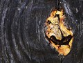
| 04/07/2006 11:47:00 AM |
PILLSBURYby bladComment: I like the subject and the exposure is good, if a bit contrasty. I think it could be cropped a bit at the top and bottom edges. |
| Photographer found comment helpful. |
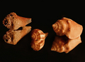
| 04/07/2006 11:45:09 AM |
Naturally Texturedby DigiFotoBuddyComment: Excellent lighting and great capture of detail. I'm not crazy about this composition. I would rather see the smaller flanking one of the other shells rather than placed in the middle. I feel like the shells should be arranged to form the classic triangle shape a still-life painting. This arrangement looks a bit literal and soldierly to me. Also, I'm not sure if the reflections work that well, although they probably would if the shells were arranged more as a group. |
| Photographer found comment helpful. |
| 04/07/2006 11:40:34 AM |
Bristlyby RolandBComment: Very good portrait and a handsome subject. Very direct and intelligent gaze. It draws you in. Great capture of the texture. Those look like the eyebrows of a Scot or Irishman. I wonder if I'm correct? :D I'm not finished voting but this should be in the top 5. |
| Photographer found comment helpful. |
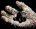
| 04/07/2006 11:36:29 AM |
Got Lotion?by CEJComment: This is weird. I can't figure out what the black, shiny blob in the palm is. The missing digit really makes this odd. At first glance I thought this was a baseball glove. It's a very good capture of texture, I'll give you that. :D Very good lighting. I just don't relate to the asthetic (and I've been missing 1/4" of my right middle finger since I was 6 :D). |
| Photographer found comment helpful. |
| 04/07/2006 11:29:23 AM |
Acrylic on Canvasby LN13Comment: Interesting subject and decent capture of texture. I'm never crazy about extremely narrow cropping though. |
| Photographer found comment helpful. |
Home -
Challenges -
Community -
League -
Photos -
Cameras -
Lenses -
Learn -
Help -
Terms of Use -
Privacy -
Top ^
DPChallenge, and website content and design, Copyright © 2001-2025 Challenging Technologies, LLC.
All digital photo copyrights belong to the photographers and may not be used without permission.
Current Server Time: 08/24/2025 06:44:34 AM EDT.