| Image |
Comment |
| 06/24/2004 10:04:15 PM |
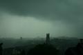
Hurricane hits townby RUEDISCHMUTZComment: Hurricane hits what town? Why be vague? It is journalism, meant to inform.
Photographically, it isn't bad. It looks very undexposed and maybe a tad out of focus. The tree at the lower edge of the center of the frame is very distracting and tends to draw the eye. |
 Photographer found comment helpful. Photographer found comment helpful. |
| 06/24/2004 10:01:57 PM |
Local Artists Display their Talentby NodeComment: A human element would make this much more interesting. Show some people milling about, or the actual artists. This is a pretty dull and literal view of a gallery. Most of the artwork is obscured by glare. The rest of the photo is just a boring view of the gallery floor, ropes, and some plants. |
| Photographer found comment helpful. |
| 06/24/2004 09:58:56 PM |
Sunday Garden Section - Adding Unique Color To Your Gardenby NeuferlandComment: Your headline would be more convincing if this were not an extremely commonplace flower. If you are going to use the word you unique in the headline your content better deliver or your readers will feel cheated.
Photographically, this is a pretty run-of-the-mill composition to stand out amongst the skads of flower shots seen on DPC every month. The overhead midday lighting is literal and dull. |
| Photographer found comment helpful. |
| 06/24/2004 09:50:19 PM |
Heat Wave Continuesby DougPazComment: The headline could use some work. It's kind of grim for the lighthearted photo that is supporting your 'story'. A better title would mention a human element. This would make a nice human interest shot so I can see it as a journalistic photo. It's a really good capture. I have no criticism of the photo except a minor nit about the other child who is discernable as a blur blur in the background. It distracts a bit from the simple background. Still, one of the best I've seen in this challenge. |
| Photographer found comment helpful. |
| 06/24/2004 09:45:34 PM |
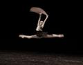
Bolshoi Ballet on Brazilby portComment: This would be so great if some part of it were in focus. I like the blur, don't get me wrong, but with motion blur photos their should be some sharp areas or else it just looks like camera shake. Using your slow sync flash would give you some motion blur but freeze some of the action so that there is some sharpness. I have absolutely no complaints with the capture and the composition. Both are perfect. I think you meant the headline to read, ...in Brazil but if English is your second language I can see where the mistake occured. One of the better one's I've seen, in spite of the technical issues. |
| Photographer found comment helpful. |
| 06/24/2004 09:40:30 PM |
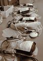
Blood Donors Avert Crisisby ablessgComment: The headline would be more effective if it identified and actual crisis. A more effective supporting photo for a story like this would include a human element. Show the people getting out there in donating blood rather then a shot of blood and medical equipment which makes for very dull subject matter, particularly in black and white. |
| Photographer found comment helpful. |
| 06/24/2004 09:23:52 PM |
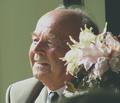
Retirement - The Last Day in Schoolby mannjuditComment: That title is not really a headline making it difficutl for me to make the connection to the challenge.
As a portrait it has potential. The lighting and focus are quite nice.The huge flowers overwhelm the subject. |
| Photographer found comment helpful. |
| 06/24/2004 09:20:38 PM |
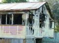
Meteorite destroys 100 year old home.by marlinComment: A human element might make this more convincing as a journalistic photo. Without that, it loses the immediacy of journalism and veers into still-life, landscape territory.
Photographically it is a good subject. It is a bit overexposed to really be able to appreciate the textures and color. |
| Photographer found comment helpful. |
| 06/24/2004 09:18:46 PM |
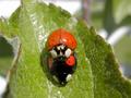
As you can see, I´m not the only oneby tetoComment: This isn't a journalistic photo and your title is not a headline.
Photographically it might be more interesting from a side view. This looks rather flat and the bottom bug is obscured in shadow. Centering the subject doesn't work to well with this composition because the edges of the leaves tend to draw your eye to either edge of the frame and away from the bugs. |
| Photographer found comment helpful. |
| 06/24/2004 09:00:28 PM |
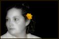
Yellowby cbellerComment: I can only hope the intention was not to make the eyes look yellow also. Unfortunately, that is what I'm seeing and it looks very creepy. The thin yellow border only emphasizes it. The tones in the b&w portion of her skin could be better. There is a very shiny pale area running from her forehead over her left eye and along her nose and down her mouth. It is very distracting. When you convert color to black and white you aren't done. You still need to tone the greys so they aren't so dull looking. An easy way of doing this in PS is to adjust hue/saturation, clicking on the colorize box and then moving the saturation level to very low. You can also adjust the hue level to get the tone you like. I prefer to pretty much leave it in the middle where it is. |
| Photographer found comment helpful. |
Home -
Challenges -
Community -
League -
Photos -
Cameras -
Lenses -
Learn -
Help -
Terms of Use -
Privacy -
Top ^
DPChallenge, and website content and design, Copyright © 2001-2025 Challenging Technologies, LLC.
All digital photo copyrights belong to the photographers and may not be used without permission.
Current Server Time: 08/26/2025 01:19:57 PM EDT.