| Image |
Comment |
| 05/28/2008 09:43:28 AM |
Smileby LMA128Comment: nice comp wish her left eye were in focus. looks a bit green/yellow to me. |
 Photographer found comment helpful. Photographer found comment helpful. |
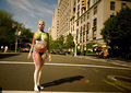
| 05/28/2008 09:41:03 AM |
|
| Photographer found comment helpful. |
| 05/28/2008 09:40:22 AM |
Royal Blueby bigfellaComment: Nice expression and comp and crop... looks out of focus and a little too dark :( |
| Photographer found comment helpful. |
| 05/28/2008 09:39:13 AM |
Amelia Janeby freakin_hilariousComment: With a little more dramatic PP (deeper blacks, punchier colors) this would have stood out even more. Like the blue eyes + blue blanket, good color integration. |
| Photographer found comment helpful. |
| 05/28/2008 09:37:57 AM |
Enjoy the Lakeby rlewisComment: Good comp and pose, but artificial lighting is obvious, detracts from natural scene :( Color balance looks a bit too green/ yellow on my monitor. |
| Photographer found comment helpful. |
| 05/28/2008 09:37:01 AM |
|
| Photographer found comment helpful. |
| 05/28/2008 09:36:26 AM |
Eastern Promise by MAKComment: Nice dramatic lighting and good crop. Best I've seen so far. |
| Photographer found comment helpful. |
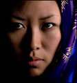
| 05/28/2008 09:35:36 AM |
Geisha Girlby animal_loverComment: Pretty photo, but... her face is too dark, the fan commands way too much attention away from her face, the fan is in focus, not her face. There's also mixed color lighting that doesn't look intentional (blue on the left, red on the right) |
| Photographer found comment helpful. |
| 05/28/2008 09:33:56 AM |
The Girl in the Fieldby CassieDoodleComment: If I tilt my head to look at the pic, that means the tilt wasn't a good idea. I'm tilting my head... too much tilt! Plus the colors make her skin tones look cold / dead. Fix those two things, then her nice smile, the soft lighting and unobtrusive background would stand out as positives more. |
| Photographer found comment helpful. |
| 05/28/2008 09:32:02 AM |
Classic Kaitlinby trnqltyComment: Indeed, classic pose. Would've like to have seen some additional fill for the shadows. |
| Photographer found comment helpful. |
Home -
Challenges -
Community -
League -
Photos -
Cameras -
Lenses -
Learn -
Help -
Terms of Use -
Privacy -
Top ^
DPChallenge, and website content and design, Copyright © 2001-2025 Challenging Technologies, LLC.
All digital photo copyrights belong to the photographers and may not be used without permission.
Current Server Time: 06/17/2025 12:38:39 AM EDT.