| Image |
Comment |
| 08/10/2004 05:05:58 AM |
|
 Photographer found comment helpful. Photographer found comment helpful. |
| 08/10/2004 05:05:28 AM |
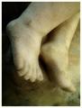
Where Angels Fear To Treadby sherComment: Very nice shot - I hope people don't flame you for not using real feet.
I like the coloring, and it seems soft whilst retaining texture if that makes sense!
8 |
| Photographer found comment helpful. |
| 08/10/2004 05:04:31 AM |
Foothillsby wkoffelComment: the sand around your feet actually looks like pixelation :D
Apart from that this is an OK shot, doesn't grab me in any way to be honest. Obvious that you took it of your own feet.
If you perhaps could have gotten lower it may have been more dramatic. |
| Photographer found comment helpful. |
| 08/10/2004 05:01:28 AM |
"Light - on my Feet"by tfarrell23Comment: Before the challenge I felt that a 'looking down on your own feet' was probably the most unthoughtful shot I could take.
whilst your technique is pretty decent, I do not find it aesthetically pleasing. |
| Photographer found comment helpful. |
| 08/10/2004 05:00:07 AM |
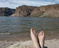
Sweet feetby MotoCycleBoiComment: At first glance this coud easily be a low 3.
Hvaing actually looked at it for a while I really like the dark tones and gloomy scene. Not sure if it was intended that way but regardless I like it ;D. 8 |
| Photographer found comment helpful. |
| 08/09/2004 03:59:40 AM |
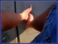
Feet Firstby BruBComment: very nice tones, but too soft for this type of image.
|
| Photographer found comment helpful. |
| 08/09/2004 03:58:34 AM |
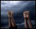
Falling by heidaComment: nice pose and comp, but quality seems very off.
The legs look kind of bumpy & Jarred around the edges. Perhaps a little too much D&B for my tastes. With B&W it works well but sometimes excessive dodging & burning can make it look too artificial.
still it's an 8, just trying to give a little critique of something that will probably get 99% positives. |
| Photographer found comment helpful. |
| 08/09/2004 03:55:10 AM |
Pinnedby moviemanComment: very nice. probably not for DPC, but excellent nevertheless.
|
| Photographer found comment helpful. |
| 08/03/2004 12:12:12 PM |
The Journalistby ImagineerComment: Awesome photograph John.
Can't understand why on earth this didn't hit 7+
slightly sub'ed coloring is just, well, apt & sublime
Edited to remove my original swearing - oops
Message edited by author 2004-10-06 16:33:54. |
| Photographer found comment helpful. |
| 07/14/2004 04:17:10 PM |
Police Lineupby TooCoolComment: Originally posted by micknewton:
I would have given it a 4 or 5. The challenge stated "whole words", and I don't see any, and the selective desaturation gimmick doesn't help this photo in any way. |
Really? I see 4 complete words of POLICE
2 on the screens and 2 above the wheels. |
| Photographer found comment helpful. |
Home -
Challenges -
Community -
League -
Photos -
Cameras -
Lenses -
Learn -
Help -
Terms of Use -
Privacy -
Top ^
DPChallenge, and website content and design, Copyright © 2001-2025 Challenging Technologies, LLC.
All digital photo copyrights belong to the photographers and may not be used without permission.
Current Server Time: 06/19/2025 01:38:27 AM EDT.