| Image |
Comment |
| 10/03/2004 07:28:10 AM |
Mercyby hopperComment: looks like a snapshot to me sorry - the girls expression looks almost blank and her eyes are way too white and flawless.
|
 Photographer found comment helpful. Photographer found comment helpful. |
| 10/03/2004 07:20:13 AM |
Awakeningby kirbicComment: I have gotten up many morning s at 5:00am to find a scen like this and have never managed to catch it. Rolling hill fog is a photographers dream and you have ca[ptured it very well. My only beefs are the format doesn't work to me (square) and if possible I would have gotten higher to look down on the fog.
Still a uniqe and well timed photo. |
| Photographer found comment helpful. |
| 10/03/2004 07:18:23 AM |
Natural Womanby heidaComment: A very nice shot here I like the dark brooding color and her slightly off pose.
She is very well lit too.
What I don't like is the lack of detail on her face - almost looks like she is just about to start melting. not sure if this is makeup neat image or lighting but it looks very tonal and soft/ |
| Photographer found comment helpful. |
| 10/03/2004 07:15:45 AM |
Split Bout....the inner struggleby graphicfunkComment: Very good idea indeed - at last some creativity.
lighting etc is all good - my only beef is the faded line - I really think if would have cut that sharp it would have added a lot more impact. That aside a very good effot.
|
| Photographer found comment helpful. |
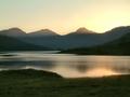
| 10/03/2004 07:11:05 AM |
Soft evening light on Loch Arkletby geewhyComment: As far as quality of light goes - this has been taken at a nice time of day so full marks on that front.
That aside I feel with a little bit more thought one could have made this quite good. I really like to see people use some foreground element to give their landscapes depth but you have decided against this here. Even by using a path or natural trail can add some depth but here this seems to have been neglected.
This results in quite a flat looking scene. |
| Photographer found comment helpful. |
| 10/03/2004 07:05:00 AM |
Paris, Las Vegasby Pep VentosaComment: A very well thought out angle to shoot from. When your shooting such a popular subject it makes it hard to create something that stands out.
However, there isn't much of a focal point here - the top is very nice nd takes your eye, but to me the bottom is just a little bit too messy with what looks like a person, a building, a bush and the bottom of the tower.
|
| Photographer found comment helpful. |
| 10/01/2004 02:59:22 PM |
Solitudeby ZoomdakComment: This is my pick for the winner - however for me it isn't all that special (I can hear the gasps now). I do like the blue that has been captured / enhanced and the cloud formation is very nice too.
but I can't help but feel if a 'better' photographer had been here they would have captured something so much more interesting.
There is no foreground interest what-so-ever and likewise no middle and apart from a small rock or two no background either.
It solely relies on blue and clouds which whilst looks nice for a few seconds - it doesn't go beyond that.
Composition is a little let down - there are some interesting patterns being made and reflections too on the flooring - and I feel perhaps giving 2/3 of the scene to this would have been better. Generally it is said not to place the horizon in the middle, and this is when that rule works.
Another area which looks interesting is the rocks - they are large and looming with some nice ocean spray coming off of them - but you have made them so small they look like small rocks and hardly figure in the photo.
I am being overly harsh here, because I feel this is good - but some scenes are so that one can't help but shoot anywhere and get a fairly decent photo. And considering where you were and at what time - a bit of a waste.
|
| Photographer found comment helpful. |
| 09/20/2004 08:29:23 AM |
Commutionby ImagineerComment: This is too good to be in the top 10 :D
I feel perhaps it was marked down for not containing any black and white parts mixed with color, no neatimage and no over sharpening.
|
| Photographer found comment helpful. |
| 09/01/2004 03:27:19 AM |
|
| Photographer found comment helpful. |
| 08/31/2004 03:16:20 PM |
7081.jpgby heidaComment: Now this is much better in my opinion. Superb light and a touch stronger and more textured.
|
| Photographer found comment helpful. |
Home -
Challenges -
Community -
League -
Photos -
Cameras -
Lenses -
Learn -
Help -
Terms of Use -
Privacy -
Top ^
DPChallenge, and website content and design, Copyright © 2001-2025 Challenging Technologies, LLC.
All digital photo copyrights belong to the photographers and may not be used without permission.
Current Server Time: 06/17/2025 10:18:00 PM EDT.