| Image |
Comment |
| 10/11/2004 05:09:39 AM |
Intensityby duncesComment: One of the best photographs on this site
10 only wish i could give more.
|
 Photographer found comment helpful. Photographer found comment helpful. |
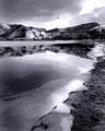
| 10/08/2004 04:12:24 PM |
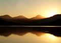
Loch Arklet2by geewhyComment: Wow this is better I think, probably would have taken my place. Very calm and quiet. Simple
|
| Photographer found comment helpful. |
| 10/08/2004 03:26:17 AM |
Haunting Absenceby tyt2000Comment: You should take more pleasure that for some of us - myself included your intended "In this photo, I wanted the viewer to imagine, rather than "see" worked.
People on DPC sometimes just look at aesthetics rather than what a photo does to them.
|
| Photographer found comment helpful. |
| 10/08/2004 03:16:30 AM |
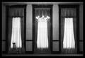
Natural Womanby heidaComment: Darn I didn't guess this was yours i must be loosing my touch. Unlucky not to ribbon with 7.769!
|
| Photographer found comment helpful. |
| 10/08/2004 03:14:59 AM |
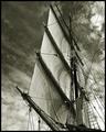
Aloft by BradComment: congrats Brad! Awsome sharpness |
| Photographer found comment helpful. |
| 10/08/2004 03:03:09 AM |
|
| Photographer found comment helpful. |
| 10/06/2004 04:41:46 AM |
|
| Photographer found comment helpful. |
| 10/04/2004 03:53:52 PM |
|
| Photographer found comment helpful. |
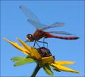
| 10/04/2004 03:53:21 PM |
Red Dragonby JackoComment: very nice balance of color and composure. Not sure if this has been edited in PS or not - but there seems to be a funny bluring going on that seems too strong for in camera (around mid stem at the top is more blurry than at bottom)?
|
| Photographer found comment helpful. |
| 10/04/2004 03:52:06 PM |
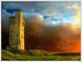
Sunset at Castle Hill by BobsterLobsterComment: Ah! My other pick for the winning ribbon. The range of colors you have shown here is almost sublime - the sky is a deep blue to harsh orange and the Green grass and yellow building make for a very lovely composure of colors.
I hate to have something to pick on, but there is something that just doesn't seem natural to me about this photo. It is slightly over saturated, but that doesn't really bother me as it's something that one needs to do on DPC and I feel it works well here, but there seems to be a lack of detail in the shot which looks artificial.
These main areas are around the tower and around the main mound. Also the small area down the right bottom side where the grass and the sky meet looks very false for some reason.
Overall this is visually one of the best in this challenge - but a touch too computer processed for my own personal tastes. I think if the photographer could ween off photoshop a little then they would be a much improved photographer because they have the hard part already sussed which is the eye for composition and color harmony.
|
| Photographer found comment helpful. |
Home -
Challenges -
Community -
League -
Photos -
Cameras -
Lenses -
Learn -
Help -
Terms of Use -
Privacy -
Top ^
DPChallenge, and website content and design, Copyright © 2001-2025 Challenging Technologies, LLC.
All digital photo copyrights belong to the photographers and may not be used without permission.
Current Server Time: 06/17/2025 08:33:07 AM EDT.