| Image |
Comment |
| 05/10/2003 01:27:24 AM |
A true Rocky Mountain High.by vtruanComment: I like the unusual crop. I think it was a good move for the transportation theme as it helps enhancing the idea of movement. I might have left just a bit more space on the left though. I also think you did a good job on the exposure. To photograph things with the sky as a background is always difficult. You easily get either a washed out sky or an under exposed subject... Well done.
About the subject, I think it fits the theme pretty well. For me a hot air balloon definitely is associated with voyage and transportation. And as mentioned before your crop enhances the idea of movement.
There are two things I can think of to improve your pic. First, it is true that your image displays some unwanted noise. It doesn't fit the subject so you should get rid of it. Second, to have some landscape in the background would boost up this picture a lot. It would enhance a lot the idea of voyage. But I guess it was not easy...
Anyway, you did a good a job already.
The Critique Club |
 Photographer found comment helpful. Photographer found comment helpful. |
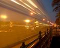
| 05/10/2003 12:27:49 AM |
Ghost Tramby tzsoltComment: Very interesting take on the theme.
What I especially like in this picture is that it is very original. This is a great idea you had, and you developed it perfectly. Technically this pic is perfect: you manage to show the motion of the tram and the lights of the bridge at dusk at the same time... Very well done.
This serves perfectly the idea behind the pic: motion i.e. transportation to go around the planet and see great beautiful distant places...
I'm sorry but I don't find much more to add. There's nothing I can think of to improve this pic, it is very good as it is already.
Congratulations.
The Critique Club |
| Photographer found comment helpful. |
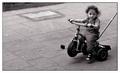
| 05/09/2003 11:39:29 PM |
Easy Rider Pro Modelby miss parkerComment: OK, first I must say I'm really glad to have this picture to critique because I like it a lot. :)
Let's talk of the subject first. I like the distance you took towards the theme picturing this child. She (he?) is definitely being transported, but this is not the typical pic you would expect for the transportation theme. Kudos for choosing an original subject, I like that a lot.
Technically I don't see too much to improve. The composition is great: not to show the parent behind was mandatory for this picture to work. The angle is good too. To kneel down would have been a mistake when the subject was this child being transported. I also like the negative space on the left. This is important to convey the idea of transportation. Once again, vey well done.
About the child's expression, it is perfect. She (he) doesn't seem to care a lot, this child seems more interested about what's going on around. Goes perfectly with the general idea of this pic, this child is being transported no matter what.
About the choice of black and white, I think it is a good move since the color definitely doesn't add anything to the idea you wanted to convey.
Another shot I'm so sorry to see so low on the votes...
Congratulations, this is a great shot. Don't believe your score... :)
The Critique Club
|
| Photographer found comment helpful. |
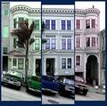
| 05/09/2003 01:09:19 PM |
What color do you like?by Pep VentosaComment: First of all, this is a very creative entry. I like the fact that the images don't perfectly overlap. It makes this entry very original and fits better the theme than a single picture cut in 3 parts. I think you found a good balance in the adjustment of the different images.
The use of different colors for each part of the triptych also perfectly suits the theme and the idea behind your entry. Your choice of colors is very good: they complement each other well and I like the soft tones you chose.
Now let's talk about the cars. :) If this was a "regular" picture, they definitely would distract from the subject. In this case, since they add to the non-overlapping effect, I can't decide if they distract or not. I would love to see the same picture without them. This might be the one thing to do to improve this already very good entry.
Very well done.
The Critique Club |
| Photographer found comment helpful. |
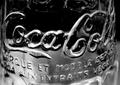
| 05/07/2003 11:42:05 PM |
Born in the USAby RoseytoneComment: I LOVE the way you captured this glass bottle. Great tonal range and lighting.
It would need a slightly bigger DOF to be perfect (the middle of the image seems out of focus). I also notice this a french bottle, so it might actually not be born in the US... :)
Beautiful work, congratulations. |
| Photographer found comment helpful. |
| 05/07/2003 12:44:05 AM |
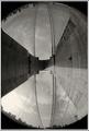
The Magic Wheelby GeocideComment: I like this picture a lot.
Very original idea, and very well executed. I like the abstract touch. My eyes keep being captivated by the shapes. I guess this is the reason you didn't do better at the time of the challenge: this picture is not focused enough on colors. The shapes are too complex: they drive the attention.
But outside the original theme, it is an excellent picture IMO.
|
| Photographer found comment helpful. |
| 03/24/2003 09:50:02 PM |
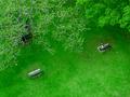
Lottie by dsidwellComment: I'm glad you're rewarded for this shot. One of my favorites this week. I like this picture a lot: original point of view, good composition, lovely subject, and interesting background very well captured at the same time. Very good work. |
| Photographer found comment helpful. |
| 03/24/2003 07:55:03 PM |
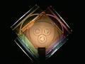
Watching Over Meby 'PongComment: This picture deserves a much better score than that. I like the abstract touch due to the from above point of view. Very well done. |
| Photographer found comment helpful. |
| 03/10/2003 10:50:49 PM |
|
| Photographer found comment helpful. |
| 03/10/2003 10:48:18 PM |
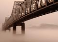
Brooklyn Bridgeby dimitriiComment: Wow, unusual perspective, very original picture. Good, I'm tired of seing those same old shots of this bridge. Very well done. |
| Photographer found comment helpful. |
Home -
Challenges -
Community -
League -
Photos -
Cameras -
Lenses -
Learn -
Help -
Terms of Use -
Privacy -
Top ^
DPChallenge, and website content and design, Copyright © 2001-2025 Challenging Technologies, LLC.
All digital photo copyrights belong to the photographers and may not be used without permission.
Current Server Time: 08/01/2025 02:31:16 AM EDT.