| Image |
Comment |
| 07/24/2003 08:28:11 AM |
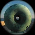
Round²by mbardeenComment: Matt - Fortunately for us I didn't get down to the sea-front during the week else I was going to enter the same, could've stuffed it for both of us. Well done. |
 Photographer found comment helpful. Photographer found comment helpful. |
| 07/22/2003 06:27:55 AM |
|
| Photographer found comment helpful. |
| 07/17/2003 02:48:47 AM |
Body Artby mbardeenComment: Well lit and composed, but as an entry in a "nude" challenge it disappoints. |
| Photographer found comment helpful. |
| 07/16/2003 04:05:05 PM |
Shy by mariomelComment: Great lighing and composition. One of the few cases where a frame is used well - it give the picture a further dimension, the model is being viewed either from above or the front. |
| Photographer found comment helpful. |
| 07/16/2003 03:59:40 PM |
Maestroby albright1Comment: A very striking image. Personally I find the background too bright on the left - it's caused the left wrist and forearm to be over-exposed. There also appears to be spots on the lens or background in the lower third of the left side. |
| Photographer found comment helpful. |
| 07/16/2003 03:55:12 PM |
Raptureby KarenBComment: Very good use of light and colour (or lack of it). In my top 3 for this challenge. Personally I wouldn't have used the frame and the background is too stark and looks unnatural. |
| Photographer found comment helpful. |
| 07/16/2003 03:52:04 PM |
Reflecting on Anna by dan_pendletonComment: In my top 3 for this challenge. Very good use of colour and very well composed (rule of thirds is hade to be broken). Personally I would have attempted to blend the images slightly, the hard edge on the right of the image distracts slightly (but I'm being very picky at this point!) |
| Photographer found comment helpful. |
| 07/16/2003 03:47:30 PM |
Tatooedby kosmikkreeperComment: Very, very good image, in my top 3. Slightly overlit on the left side of the image. |
| Photographer found comment helpful. |
| 07/16/2003 03:39:26 PM |
|
| Photographer found comment helpful. |
| 07/16/2003 03:25:51 PM |
Nude Ceramicby barahooComment: If the lighting had been stronger and more directional I think this would have worked well as a duotone. |
| Photographer found comment helpful. |
Home -
Challenges -
Community -
League -
Photos -
Cameras -
Lenses -
Learn -
Help -
Terms of Use -
Privacy -
Top ^
DPChallenge, and website content and design, Copyright © 2001-2025 Challenging Technologies, LLC.
All digital photo copyrights belong to the photographers and may not be used without permission.
Current Server Time: 07/31/2025 11:43:20 PM EDT.