| Image |
Comment |
| 06/11/2003 02:03:27 PM |
Sports Illustrated Swimsuit Editionby AleciaComment: I could definitely see this on the cover... A couple of small issues you could address and improve the shot would be the blown-out crests of the breaking waves and the dark shadow across your model's face. While the highlight issue is a bit more difficult to address, you could possibly use a bit of fill flash to fix the problem with the shadows. |
 Photographer found comment helpful. Photographer found comment helpful. |
| 06/10/2003 10:55:53 PM |
Loud Colorsby peggyComment: Critique Club critique:
Your title is quite fitting for the shot-- I find that creative (and meaningful) titles can certainly add a great deal to most shots. Overall, I feel your submission meets the challenge well.
The photojournalistic composition and feel suits the subject and busy scene. However, as several commenters noted below, the lack of focus on at least something in the shot makes it difficult to find one single point of interest. If I were to make only one suggestion for improving this shot, it would be to bring some focus into the shot. A fairly shallow depth-of-field would have been appropriate as well, again as long as there were a clear element of focus within the frame.
Obviously, it would have been difficult (if not impossible!) to pose anyone for this shot. However, one perspective I would have considered would have placed the camera slightly higher, providing a better line of sight to the performers and locating the onlookers lower in the frame.
I hope these comments have been of help. If you have any further questions or are baffled by anything I have said, please PM me and I will glady elaborate.
Paul. |
| Photographer found comment helpful. |
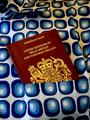
| 06/10/2003 10:39:03 PM |
Travelling Homeby ElizaComment: Critique Club critique:
I must say that I was a bit lost looking at this photo during the challenge... it wasn't until your PM that I realized it was a passport in a shirt pocket! Kind of like one of those optical illusions where you cannot see the obvious. :-)
I like your creative approach to the challenge, which is made particularly meaningful since you truly were on your way home. Unfortunately, although the colors are rich and interesting, I think the pattern of the shirt distracted or camoflagued the overall effect of your shot and negatively impacted the feeling of 'home' you were trying to convey.
The inconsistent lighting across the shot also drew my attention. You have what is probably the ambient light inside the train across the shoulder of the shirt (imparting a very pleasant, warm feeling) contrasting with the sharp lighting and colors from the camera's flash. Given the conditions of your shot, I doubt you could have used the ambient light for the entire shot (no flash or reduced flash intensity), but if it were possible, I think the effect would have been quite 'cozy' and reinforced the feeling of home.
While the composition doesn't immediately jump out as being amazing, it works reasonably well for this shot. Your decision to include part of the collar brings some orientation for the viewer, and the tight crop to the bottom of the shot keeps everything well confined and without many distractions.
I hope these comments are of some help to you; if you have questions or would like me to clarify anything in the critique, PM me and I'd be happy to elaborate.
Paul. |
| Photographer found comment helpful. |
| 06/08/2003 01:47:16 AM |
Anticipationby adineComment: Very nice shot... but in my opinion, the bright red border detracts from the overall quality. --7 |
| Photographer found comment helpful. |
| 06/08/2003 01:42:54 AM |
|
| Photographer found comment helpful. |
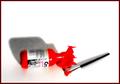
| 06/08/2003 01:37:32 AM |
Paintby loz1Comment: Oversaturated red detracts from your shot, in my opinion, particularly at the top left corner of the bottle. |
| Photographer found comment helpful. |
| 06/08/2003 01:22:40 AM |
Relocatedby ToddhComment: Very pleasing compositionally... duotone gives a nice overall effect. One of my favorites so far this week. --10 |
| Photographer found comment helpful. |
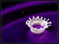
| 06/08/2003 01:16:32 AM |
Dairy Queen by crabappl3Comment: Fantastic splatter shot! I am interested to find out what sort of triggering you're using to catch this so nicely. Only nit I can pick is the very tiny droplets away from the main splatter-- they're just a bit distracting. --9 |
| Photographer found comment helpful. |
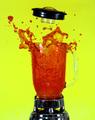
| 06/08/2003 01:10:33 AM |
Blow your topby dan_pendletonComment: Bet that made a mess... :-) Great stop-action shot; the yellow background is a bit strong for the overall shot, however. --7 |
| Photographer found comment helpful. |
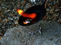
| 06/04/2003 05:47:10 PM |
Flaming Liquid Metalby mbardeenComment: Beautiful shot here-- nice, rich colors! I especially like the metal spatter on the surface below the molten metal; it adds a nice touch. Not much I can suggest here for improvement. --10 |
| Photographer found comment helpful. |
Home -
Challenges -
Community -
League -
Photos -
Cameras -
Lenses -
Learn -
Help -
Terms of Use -
Privacy -
Top ^
DPChallenge, and website content and design, Copyright © 2001-2025 Challenging Technologies, LLC.
All digital photo copyrights belong to the photographers and may not be used without permission.
Current Server Time: 09/01/2025 04:05:20 PM EDT.