| Image |
Comment |
| 07/01/2003 11:53:16 PM |
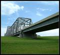
Into The Great Wide Openby sherComment: Great perspective, very interesting bridge, rich color, and a pleasing composition... did I forget anything? :-) Very well done! |
 Photographer found comment helpful. Photographer found comment helpful. |
| 07/01/2003 10:51:17 PM |
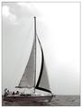
Boatersby AleciaComment: Beautiful shot! I love the choice of black/white with just a slight hint of sepia tone. |
| Photographer found comment helpful. |
| 06/29/2003 10:32:38 PM |
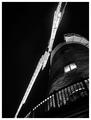
Windmill at Nightby BobsterLobsterComment: Critique Club critique:
Overall, you have created a very striking and engaging shot within the guidelines of the challenge. In my opinion, a pure B/W with a fairly high contrast was an excellent choice due to the lighting and textures within the shot. The dramatic lighting really accentuates not only the blades of the windmill, but also adds a great deal of visual interest around the deck railing and accentuates the texture of the stone construction of the main structure. The shot is well-exposed, with a solid range of tones from white to black.
Given the perspective and constraints of the challenge (off-center subject), I think your composition works quite well. While the center of the blades is also the center of the shot, the visual weight of the subject is well away from center, thereby meeting the requirements of the challenge, in my opinion. The strong negative space of the upper left portion of the frame nicely balances the subject.
I'm sorry I missed this one during my limited voting for the challenge... it would have received a score of 10 from me. Very nicely done!
I hope I have been of some help with this critique. If you have any questions or would like further clarification on anything I have commented on above, please PM me and I will gladly help further. |
| Photographer found comment helpful. |
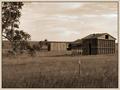
| 06/26/2003 08:55:54 PM |
Life in Western North Carolinaby nbortonComment: Beautiful shot and composition... the clouds in the sky are fantastic, and the sepia tone works very well. The one nit I have to pick, however, is that the edge of the hill in the background seems a bit oversharpened, creating a distraction. |
| Photographer found comment helpful. |
| 06/26/2003 08:52:41 PM |
|
| Photographer found comment helpful. |
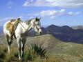
| 06/26/2003 08:50:50 PM |
Worn outby bmarquezComment: Fantastic shot... and some beautiful scenery! The focus seems slightly softened on the horse, imparting a very nice feeling to the shot, in my opinion. One of my favorites so far! --10 |
| Photographer found comment helpful. |
| 06/26/2003 08:44:57 PM |
Once Upon A Timeby BigHusker001Comment: Very nice subject and composition-- and the sepia tone works nicely to set the mood. The natural framing of the tree branches works well, but I wish I could see the object (windmill?) behind it. In my opinion, the border is a bit bland, and detracts somewhat from your shot. |
| Photographer found comment helpful. |
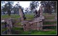
| 06/26/2003 08:32:00 PM |
Stock Rampby LuckydogComment: Very nice subject; the saturated greens work well to offset the weathered wood. Only one problem, in my opinion... the horizon line is uneven, sloping slightly to the left. It's exaggerated by the lines of the loading ramp and fence, making it somewhat distracting. A rotation of a couple of degrees clockwise would fix it right up! |
| Photographer found comment helpful. |
| 06/26/2003 08:11:02 PM |
Dark Eyesby AnnidaComment: Critique Club critique:
My first impression of your self-portrait is that you have created a very striking, engaging shot that obviously meets the challenge well. Overall, it is quite nicely done, creating a very dramatic effect. Your eyes are the first point I am drawn to... they appear so piercing, so penetrating, that it is difficult to focus on the rest of the frame. The dark makeup really enhances the effect.
Your pose and overall composition serve to create a strong interest in the shot. As was noted in the comments during the challenge, however, the point at which you cropped off the bottom portion of the frame leaves the shot looking a bit off. Perhaps extending the bottom of the frame by even one-half inch would provide a more complete feeling to the portrait.
Your lighting contributes a great deal to the overall effect of your portrait. I think it is generally very well done; the oblique angle creates some sharp shadows across your face that enhance the striking feeling of your shot. Unfortunately, one related item that negatively impacts your shot, in my opinion, is the shadow cast by your hair, especially along the top left portion of the frame. The shadows cast by the few errant hairs are particularly distracting.
The fairly shallow depth of field (DOF) you used is fairly evident in this shot, and probably worked in your favor (combined with the lighting) to eliminate any distracting elements aside from your face. I think I would have preferred to see your forehead with as sharp of focus as the bottom portion of your face, however.
I hope this critique has been of some help... If you have any questions or would like clarification of anything I have mentioned above, please feel free to PM me.
Paul. |
| Photographer found comment helpful. |
| 06/25/2003 01:14:29 AM |
|
| Photographer found comment helpful. |
Home -
Challenges -
Community -
League -
Photos -
Cameras -
Lenses -
Learn -
Help -
Terms of Use -
Privacy -
Top ^
DPChallenge, and website content and design, Copyright © 2001-2025 Challenging Technologies, LLC.
All digital photo copyrights belong to the photographers and may not be used without permission.
Current Server Time: 09/01/2025 02:35:03 PM EDT.