|
|
|
Showing 911 - 920 of ~2866 |
| Image |
Comment |
| 12/12/2005 06:48:51 PM | Tomorrow Is Another Dayby jrjrComment: Could use some processing, to start with - would be nice to take the ground completely black if you're working with silhouettes, really - rather than this almost black here. Good to get down for the low POV, always effective. Sharpening needs to be more under control - very noticeable halos around the edges of the plough. The sunset is kind of effective - though also the kind of easy thing that annoys sometimes, but your skyline is a bit random and busy, and your framing of the plough maybe too tight in this shot - give it some room to breath - especially in this 'too late' challenge, it might benefit from seeming more isolated in its environment. |  Photographer found comment helpful. Photographer found comment helpful. |
| 12/12/2005 06:44:24 PM | I'm coming home ...by fiveriversComment: Like this - strong stuff. Especially like the isloation of the scene within frame, and a certain sense of mystery to it. One could quibble about the specifics of meeting the challenge, but it has that vibe to it so it's fine by me - wouldn't be surprise dif you get knocked slightly for it though: though not as much as for the unusualness of it :-) Good work, the most interesting shot so far. | | Photographer found comment helpful. |
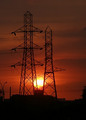
| 12/12/2005 06:28:43 PM | Untitledby TejComment: I couldn't say why, but I think this meets the old challenge there. Composition, however, lets it down for me - the sun betwen the pylons is nice, but the framing of the pylons in your image is clumsy - half-centred, but not cnetred, half-privileged, but not privileged. I think you've falled between giving them more space, and composing tightly to them, and the result feels half-hearted. Groups of subjects are always tricky like that - my feeling is that you either need to treat them as one subject, in which case give them more surrounding and compose for the one subject, or treat them as a pair and try to centre the as a pair, using what symmetry they give you as the strength of the composition. | | Photographer found comment helpful. |
| 12/12/2005 06:24:01 PM | Not a Doublemint Dayby GrayGhostComment: Very blocky composition, the situation itself is likewise blatant - beyond the meter and the penalty and the chewing gum (and that needed your title to explain, and still isn't something familiar), what else is there? There's a very poor resolution feel to the image overall - though whether that's processing or camera I can't say, but it doesn't help you. Joke shots are of course a matter of taste, but also i think to be genuinely effective there has to be more to the image than simply the joke - you want people to come back to the image, then the joke either has to be exceptionally profound or there has to more depth to the photograph. Mind you, enough joke set-ups have won recently that I can forgive the attempt ... | | Photographer found comment helpful. |
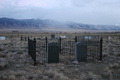
| 12/12/2005 06:17:30 PM | I Should Have Kept in Touch Before It Was ......by JacksonComment: Perhaps a slightly obvious way of meeting the challenge - but it makes it over those whose aproach seems entirely arbitrary. There's some very strong elements to this photography, but it's just a touch let dow n in a couple of areas for me. The central interest of the image seems squeezed to me - some of which will be to do with the point of view - the standing viewpoint always feels quite ordinary, unless your subject is enormously momentous in its own right. A lower POV, framing those gravelstones against the sky and the distant hills would have added enormous impact to the stones and their cage. Alternatively, a wider-angle shot, with the stones more to the foreground, so that you could emphasise the separation between the two worlds, would perhaps have been effective. You could also have sued more contrast here I think - the colours are very washed out, and yet you haven't chosen a black-and-white approach - deeper shadows would make this the more mournful and impressive too.
It has real potential, though, this: just needs some work to bring it out I think - one can see the detail in thsoe hills. | | Photographer found comment helpful. |
| 12/12/2005 06:00:10 PM | #4 Too late or too short?by brens29Comment: The moment is quite interesting - the stillness of the number 13 against her opponents works well. There are a number of things one would like to see to improve n the dynamic and power of the moment though: getting the instant of shutter release right is one thing, but there are others. The angle of shooting is strange - if you could get lower you'd get more impact, and certainly more emphasis of the relative height of the girls and the effort involved in the jumps. The line of the crash mats would be less intrusive also, and you'd perhaps have the added dramam of shooting into the lights, with the great geometric effects to be gained there. Some contrast work in post-processing would also be nice - either to make those colours pop a touch more, or to remove them, and use black and white to get into the physicality of the sport. | | Photographer found comment helpful. |
| 12/12/2005 05:50:04 PM | Umbrella Lamentedby aboutimageComment: Strong shot - though I lament the lack of a touch more environment - a sense of what the hell's going on would, I think, help; where you have simply a portrait - a well done, well toned, great contrast portrait however. I can see the rain, and a sense of steaminess/fogginess behind, but only s sense. Black and white works well, especially in the cpature of that reflected light around his face, but the half-silhouette, and his weak position in frame detract somewhat from great-shot potential. It looks like full frame, so even some juducious cropping might have helped a touch - if it's going to b e a portrait, really force the attention to the subject, huh? Pretty good work, though, for all those points. | | Photographer found comment helpful. |
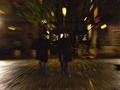
| 12/12/2005 05:45:02 PM | ....by luciferoComment: Don't understand. The lens zoom, or the motion, whatever, is effective as ever - although quite a tired effect to my eyes, iyt still remains a great sense of motion. The point, however, escapes me. My thought was that it had implications of running someone over, but the blocks behind the figures remove that sense. If the implication was more sinister, or even subtle, then i think there is too much going on here for that to come through. Outside of challenge things, there isn't enough sense of process for me to like it at all - I think at least some definition to that central face would be useful to the viewer. | | Photographer found comment helpful. |
| 12/12/2005 05:37:11 PM | sunset substituteby busalshotsComment: Quite clever. Colouring is good, though there seems to be some lack of steadiness to the shot - lack of detail showing in the wires. The composition is fun too - though perhaps keeping slightly more of the wires in shot might have helped overall, this is nevertheless quite effective - that framing of the two sides of the image. Given the absence of any human engagement, this is not at all bad thinking. | | Photographer found comment helpful. |
| 12/12/2005 05:34:11 PM | Too Cold, Now, For Childrenby DonkerDinkComment: Good sense of the onset of winter, particularly aginst the idea of the playground. You've done well also with your exposure, to keep the sky under control and some interest on the foreground. The white line at the top of frame is kind of clumsy. I might have tried to shoot from even lower, to emphasise the silhouettes against the sky without losing so much against the tree-line: whilst the ordinariness of this presentation works in your favour, I think a more imposing composition would have given more effect - and the difference simply kneeling down can produce can be amazing. Some kind of fill-light process, which exists in PSP10 and in RSE might have helped bring back some foreground detail, to enhance the feeling of desertion, without blowing out the sky. | | Photographer found comment helpful. |
|
Showing 911 - 920 of ~2866 |
Home -
Challenges -
Community -
League -
Photos -
Cameras -
Lenses -
Learn -
Help -
Terms of Use -
Privacy -
Top ^
DPChallenge, and website content and design, Copyright © 2001-2025 Challenging Technologies, LLC.
All digital photo copyrights belong to the photographers and may not be used without permission.
Current Server Time: 08/20/2025 07:07:58 PM EDT.
|